kage
kage
ancher.ai
Design analysis
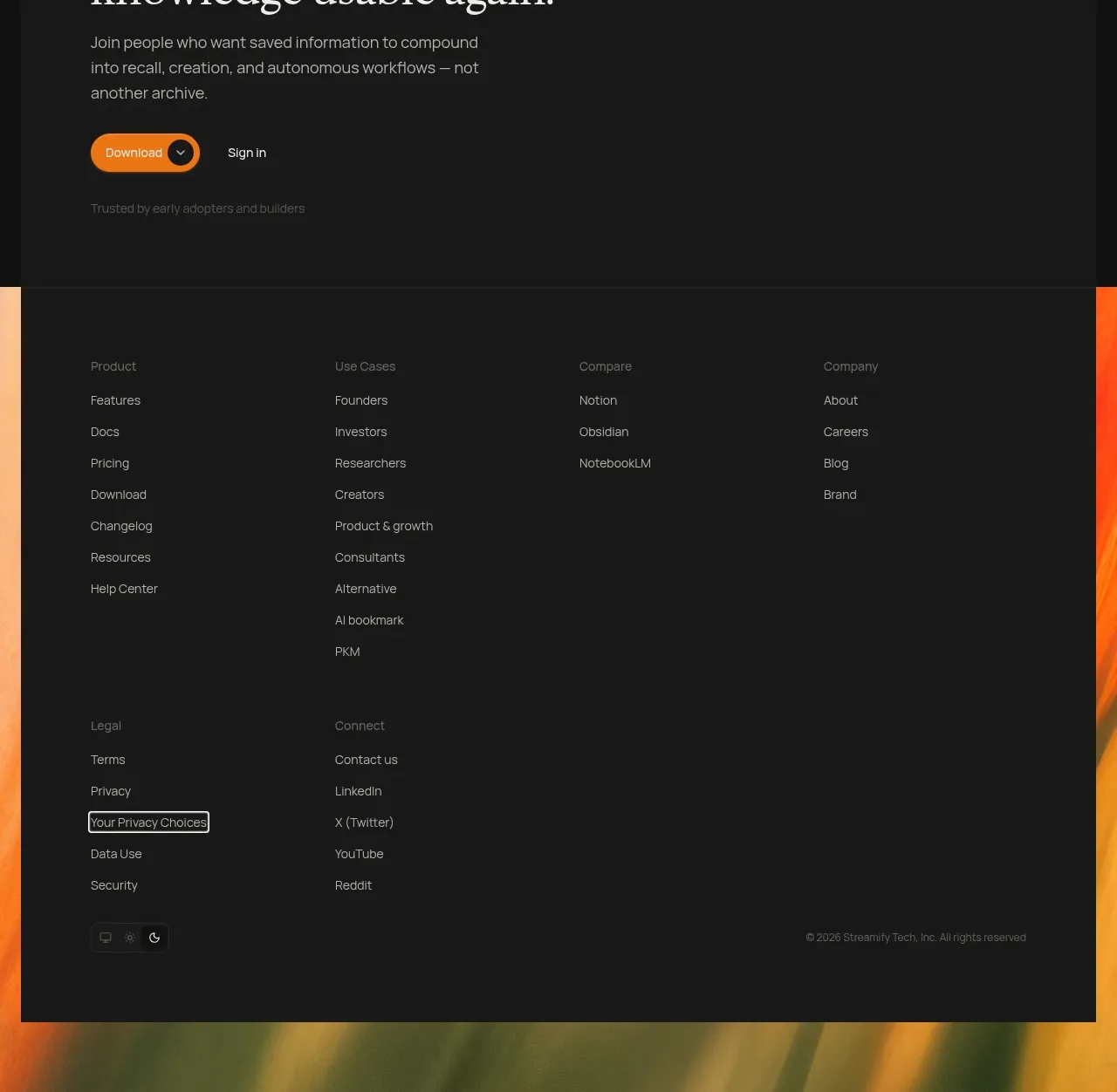
The closing area combines an article teaser grid, a final conversion panel, and a dense multi-column footer, ending the page with a clear next step.
Prompt preview
## Reference images

Study these alongside the description below: hierarchy, rhythm, spacing, colour. Build for the product you are asked about, using this design language.

- Component: https://kage-design-assets.t3.tigrisfiles.io/components/ancher-2-0/49a60068-1f5d-45e9-9623-df337c2895cf-1791871462-11.webp
- Full page it was cut from: https://kage-design-assets.t3.tigrisfiles.io/screenshots/ancher-2-0/49a60068-1f5d-45e9-9623-df337c2895cf-1791871353691-full.webp
- Component on Kage: https://kage.design/component/ancher-2-0-footer

## Before you start
Ask what content, contact, download, or signup action should close the user's product page, and what footer links and legal requirements it needs. Apply the structure to that brand.

Build the page ending as three stacked parts. First, create a stories section with a small eyebrow, a serif heading, a compact browse CTA, and three editorial cards; one can be text-led while two use rounded abstract thumbnails. Next, add a wide inset conversion panel with a small eyebrow, large serif headline, short supporting copy, primary warm pill button, and secondary sign-in or contact action. Finally, create a footer with a restrained multi-column link grid, a small brand placeholder, legal links, social/contact links, and a copyright line. Use #111111 and #171717 surfaces, #eee9e0 headings, #918b83 copy, orange #e7811d CTA, #292929 dividers, 8–12px radii, and 48–72px section padding. Keep the footer dense but readable and collapse columns into accordions on mobile.

Never: use logos, product names, copy, illustrations, or imagery from the reference.