 kage
kage
milepost.club

Design analysis
A quiet footer closes the page with a thin divider and small, low-contrast utility links that do not compete with the CTA.
Prompt preview
## Reference images

Study these alongside the description below: hierarchy, rhythm, spacing, colour. Build for the product you are asked about, using this design language.

- Component: https://kage-design-assets.t3.tigrisfiles.io/components/milepost/daa1b44b-e646-4a0f-860e-b6d9c76440c8-1791871478-8.webp
- Full page it was cut from: https://kage-design-assets.t3.tigrisfiles.io/screenshots/milepost/daa1b44b-e646-4a0f-860e-b6d9c76440c8-1791871382204-full.webp
- Component on Kage: https://kage.design/component/milepost-footer

## Before you start
Ask what legal, support, press, and social destinations the user's product requires. Apply a restrained footer system appropriate to the brand.

Create a slim footer on #f4f3ef with a subtle dotted or solid divider near the top in #d8d6cf. Center a single row of small uppercase or tracked utility links in muted gray #aaa9a2, with 20–28px gaps and clear hover underlines. Add a copyright or accessibility link only if needed. Keep the footer visually quiet, use 11–12px type with generous top and bottom padding, and allow links to wrap into two rows on mobile. Ensure sufficient contrast and keyboard focus states despite the low-key appearance.

Never: use logos, product names, copy, illustrations or imagery from the reference.
More components
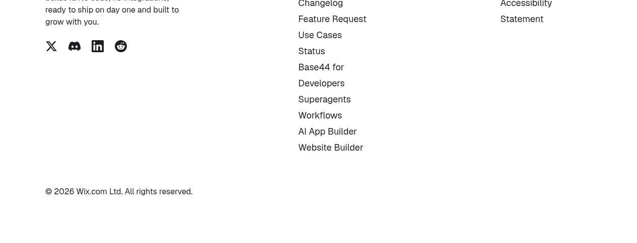
 Multi-column site footer
Base Code · Footer
Multi-column site footer
Base Code · Footer
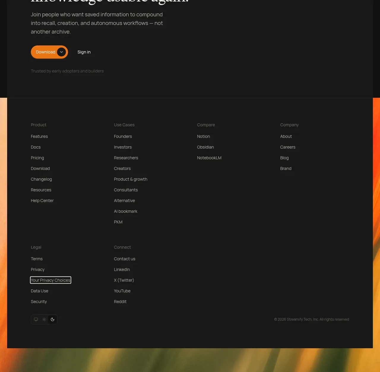
 Editorial stories and conversion footer
Ancher 2.0 · Footer
Editorial stories and conversion footer
Ancher 2.0 · Footer

 Compact site footer
Agibot · Footer
Compact site footer
Agibot · Footer
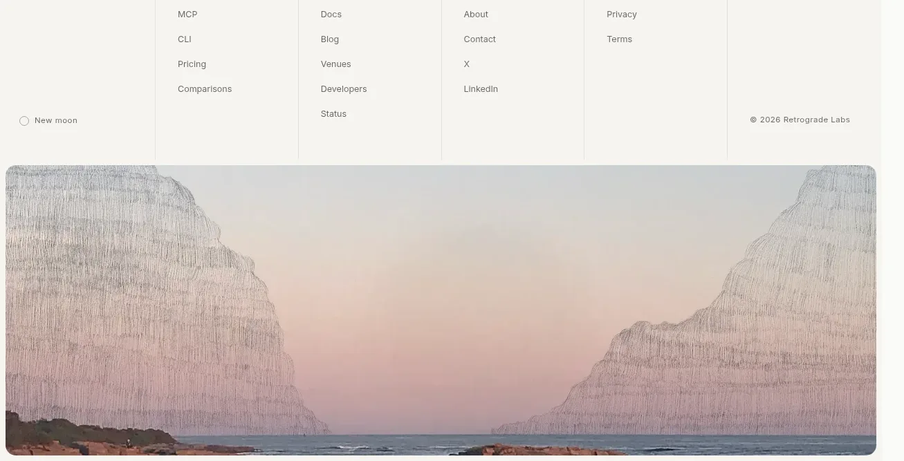
 Multi-column product footer with landscape artwork
Lune · Footer
Multi-column product footer with landscape artwork
Lune · Footer
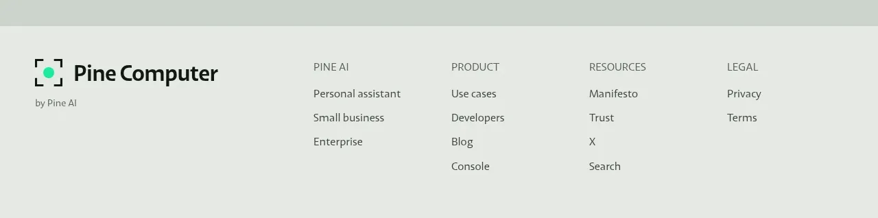
 Multi-column utility footer
Pine Computer · Footer
Multi-column utility footer
Pine Computer · Footer
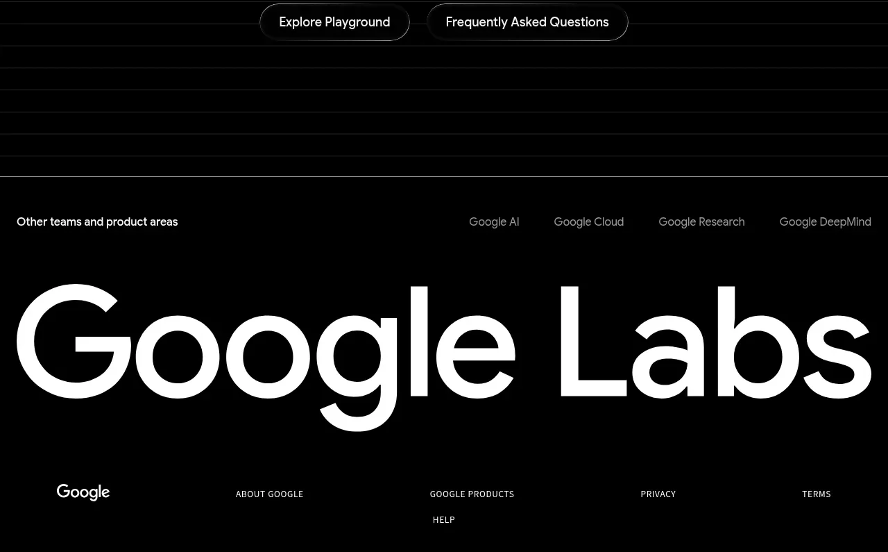
 Labs ecosystem footer
Playground by Google Labs · Footer
Labs ecosystem footer
Playground by Google Labs · Footer