kage
kage
aside.com
Design analysis
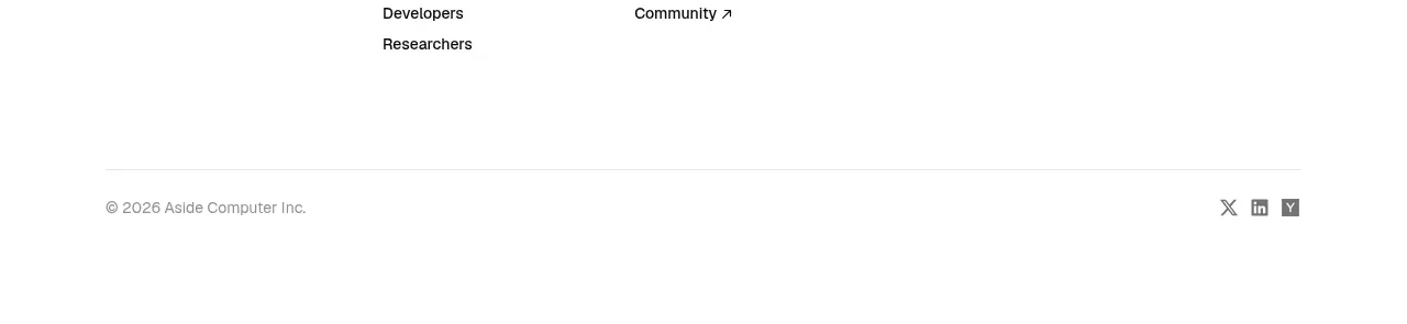
A quiet footer organizes product, use-case, resource, company, and legal links into columns, then ends with a thin divider, copyright, and social links.
Prompt preview
## Reference images

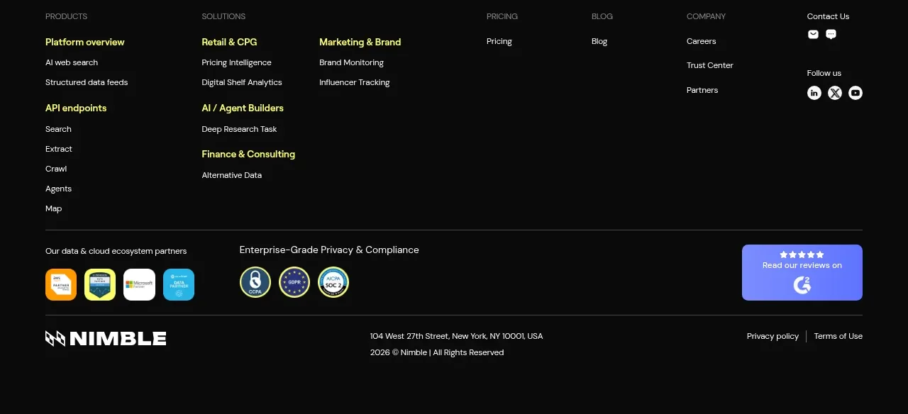
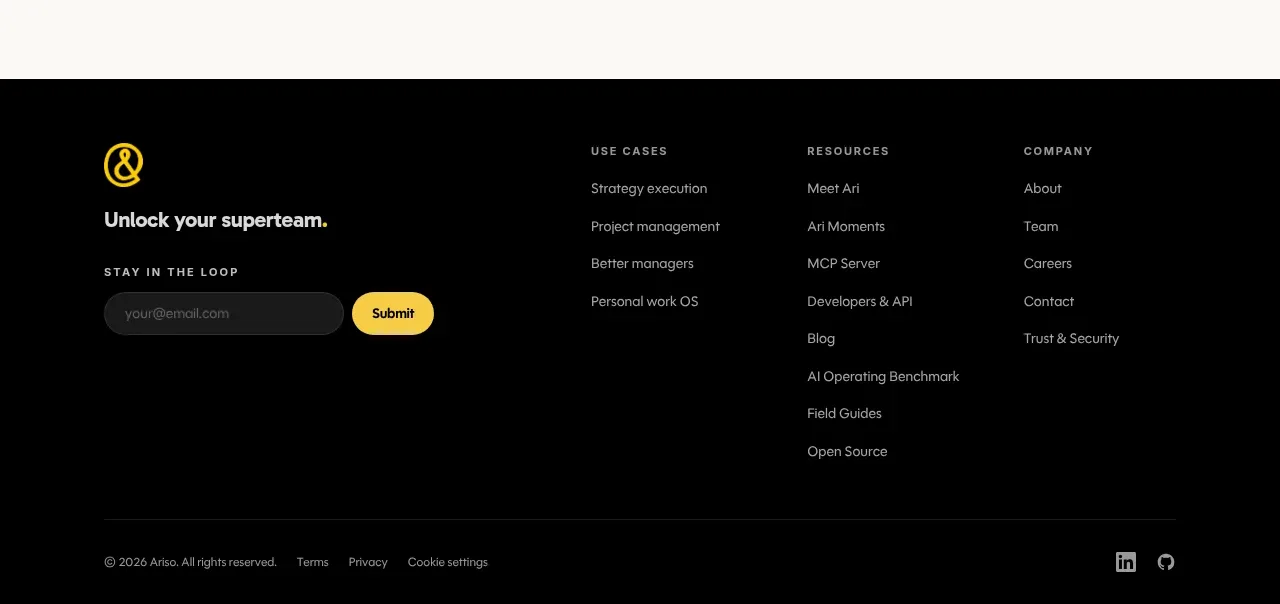
Study these alongside the description below: hierarchy, rhythm, spacing, colour. Build for the product you are asked about, using this design language.

- Component: https://kage-design-assets.t3.tigrisfiles.io/components/aside/f609b01b-1081-4ce1-af9f-cbdda1611f88-1789452077-10.webp
- Full page it was cut from: https://kage-design-assets.t3.tigrisfiles.io/screenshots/aside/f609b01b-1081-4ce1-af9f-cbdda1611f88-1789452037588-full.webp
- Component on Kage: https://kage.design/component/aside-footer

## Before you start
Ask what link groups, legal requirements, copyright wording, and social destinations belong to the user's product. Apply the principles below to that product.

Build a spacious multi-column footer on white. Use five compact link groups with small gray headings and 13–14px black links, generous column spacing, and consistent vertical rhythm. Place a thin #EEEEEE divider above the bottom utility row, with muted copyright text on the left and small social icons or text links on the right. Keep the footer visually quiet: white background, #777777 secondary text, #111111 links, no large logo treatment, and no unnecessary decoration. Add hover underline or colour transitions to links. Collapse columns into a two-column or accordion arrangement on mobile.

Never: copy logos, product names, copy, illustrations, or imagery from the reference.