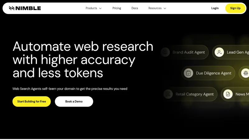
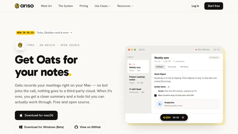
kage
kage
aside.com

Design analysis
A long-form, highly spacious landing page uses a pale blue sky hero with cloud imagery and a large browser product screenshot, then settles into a white, narrow reading column with oversized black headings, muted gray body copy, and small cyan section labels. The rhythm progresses from centered narrative sections to logo and three-column feature grids, benchmark bars, layered product demonstrations, security cards, and a final blue gradient CTA before a restrained multi-column footer; thin rules, soft image treatments, and minimal black pill buttons keep the interface polished without adding visual noise.
Prompt preview
## Reference images

Study these alongside the description below: hierarchy, rhythm, spacing, colour. Build for the product you are asked about, using this design language.

- Full page: https://kage-design-assets.t3.tigrisfiles.io/screenshots/aside/f609b01b-1081-4ce1-af9f-cbdda1611f88-1789452037588-full.webp
- Above the fold: https://kage-design-assets.t3.tigrisfiles.io/screenshots/aside/f609b01b-1081-4ce1-af9f-cbdda1611f88-1789452033232.webp
- Design on Kage: https://kage.design/designs/aside-landing-page

## Before you start
Ask the user what they are building, who it is for, and which brand assets they already have (name, colours, type, logo, imagery, and product screenshots). Wait for their answers before designing. Apply everything below to their product, not to the reference product.

## Page structure
1. **Persistent top navigation** — Place a compact brand mark at the upper left, centered links for the main product areas, and a black rounded download/action button at the right; keep it light and readable over the hero.
2. **Sky-gradient hero** — Use a large rounded rectangular hero panel with a cyan-to-pale-blue sky background and soft cloud forms. Center a small credibility eyebrow, a two-line oversized headline, a black pill CTA, and a large browser/product interface mockup that overlaps the lower portion of the panel.
3. **Introducing section** — Transition to white space with a two-column layout: a small blue text link/eyebrow on the left and a compact explanatory text block on the right, using bold lead sentences followed by muted supporting paragraphs.
4. **Capability headline and app ecosystem** — Center a blue eyebrow and a large two-line statement, followed by a wide arrangement of colourful app/service marks or product surfaces with a soft fade toward the bottom.
5. **Capability explanation** — Add a centered, relatively narrow paragraph explaining the product’s breadth, then a three-column grid of feature cards. Each card has a large pale media placeholder or product visual above a short bold lead and muted explanatory copy.
6. **Benchmark proof section** — Use a narrow text column with a bold heading, explanatory copy, and inline blue link, followed by a clean horizontal comparison chart. Show labelled rows, proportional bars, percentages, and a small segmented benchmark selector beneath.
7. **Memory feature section** — Present another narrow heading-and-copy block, then a wide layered product demonstration: a user task prompt at left and overlapping browser/history/task panels at right. Keep the composition light, with soft shadows and lots of surrounding white space.
8. **Password manager introduction** — Start with a small blue eyebrow, a large left-aligned heading, and two short paragraphs describing the feature. Follow with a three-column grid of colourful illustrated/product cards, each paired with a short bold lead and muted explanation.
9. **Vault split panel** — Use a two-column section with descriptive text, a small learn-more button, and two compact security points on the left; place a dark, glowing product/security illustration on the right.
10. **Privacy and control section** — Center a blue eyebrow, large heading, and muted subtitle on a pale gray-white section. Under it, create a four-column grid of security/control cards with light product diagrams above and concise bold-plus-muted descriptions below.
11. **Final CTA** — Add a large rounded blue sky-gradient panel with a soft white-blue glow and subtle patterned texture near the bottom. Center a two-line closing headline and black pill download CTA.
12. **Footer navigation** — Finish with a spacious multi-column footer grouping links under product features, use cases, resources, company, and pricing. Add a thin divider, small copyright text on the left, and compact social links on the right.

## Design language
- Build hierarchy with a restrained sans-serif type system: oversized 42–56px hero and section headings, 24–32px feature headings, 14–16px body copy, and 11–13px uppercase-or-small-label eyebrows. Use tight line-height for headlines and generous line-height for gray descriptions.
- Keep the page predominantly white with a narrow centered content frame and generous vertical spacing. Let sections alternate between centered editorial compositions, narrow reading columns, and dense three- or four-column grids so the page gradually becomes more information-rich below the hero.
- Use a soft sky palette for moments of emphasis: approximately `#8DDEF0`, `#CFF5FB`, `#DDF8FF`, and electric blue around `#1775E8`. Keep primary text near `#0B0D0F`, body text around `#70757A`, and section backgrounds near `#FAFAFA`.
- Treat colour as a way to mark product moments rather than as a constant decoration: cyan labels and links, black CTAs, colourful app/service imagery, and occasional dark security visuals against an otherwise quiet page.
- Use thin, low-contrast rules around `#E8E8E8` to separate long sections and footer content. Prefer medium rounded corners around 12–18px for hero, media panels, and CTA surfaces; use pill radii for buttons. Avoid heavy shadows, using only soft diffusion beneath overlapping screenshots and cards.
- Make product visuals do the explanatory work: use browser frames, layered task panels, comparison bars, diagrams, and small interface fragments rather than generic illustrations. Preserve generous margins around every visual so they feel like evidence within an editorial page.
- Keep buttons compact, black, and high contrast with white text; use download/action icons sparingly. Links are blue and understated, often paired with a small arrow.
- Use mostly static compositions with gentle hover feedback on links, buttons, and cards. If adding motion, use slow cloud/gradient drift and subtle screenshot reveal or bar animation; never let animation compete with the content.
- On responsive layouts, collapse the centered navigation into a simple menu, stack two-column narrative sections, reduce heading sizes, and turn feature grids into one-column cards while preserving the same white space and visual order.

## Never
- Do not copy the reference product’s logo, wordmark, product name, tagline, exact copy, browser UI, app logos, benchmark labels, screenshots, illustrations, or icon set.
- Do not present the result as Aside or imply an affiliation with it.
- Do not reproduce the reference page verbatim; translate its layout rhythm, spacing, hierarchy, colour treatment, and evidence-led storytelling to the user’s own product and brand assets.
Components from this page
All components
 Minimal product navigation
Aside · Navigation
Minimal product navigation
Aside · Navigation
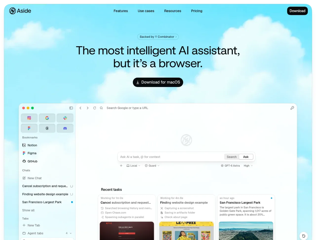 Browser assistant hero
Aside · Hero
Browser assistant hero
Aside · Hero
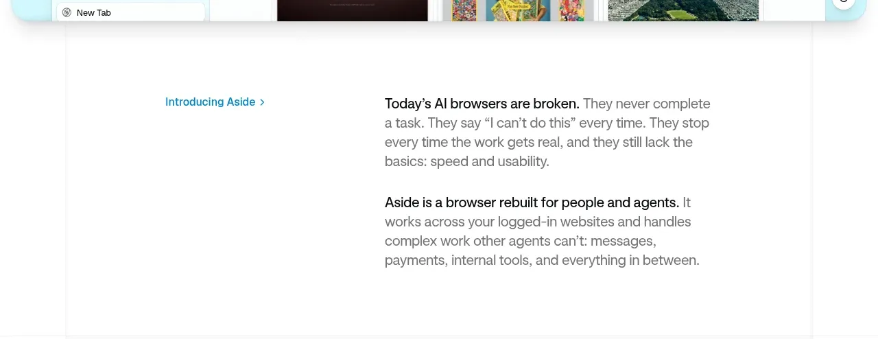 Problem and product introduction
Aside · Card
Problem and product introduction
Aside · Card
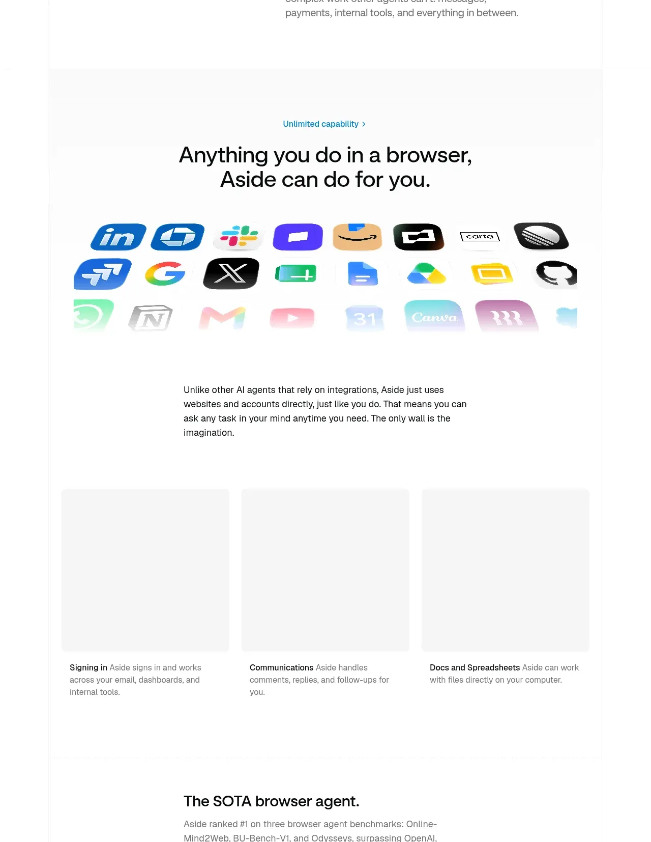 Unlimited capability and integrations
Aside · Feature grid
Unlimited capability and integrations
Aside · Feature grid
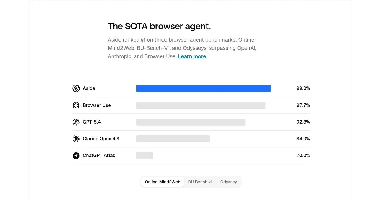 Agent benchmark comparison
Aside · Chart
Agent benchmark comparison
Aside · Chart
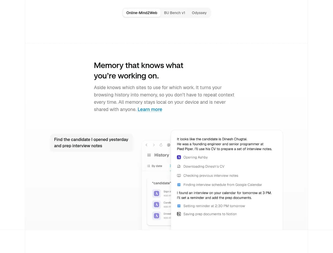 Contextual memory feature
Aside · Feature grid
Contextual memory feature
Aside · Feature grid
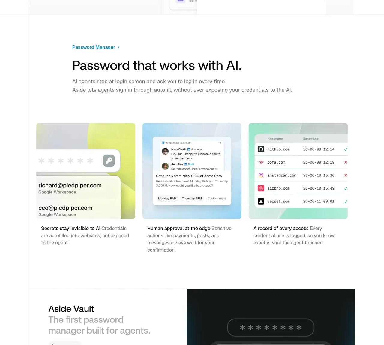 AI password manager overview
Aside · Feature grid
AI password manager overview
Aside · Feature grid
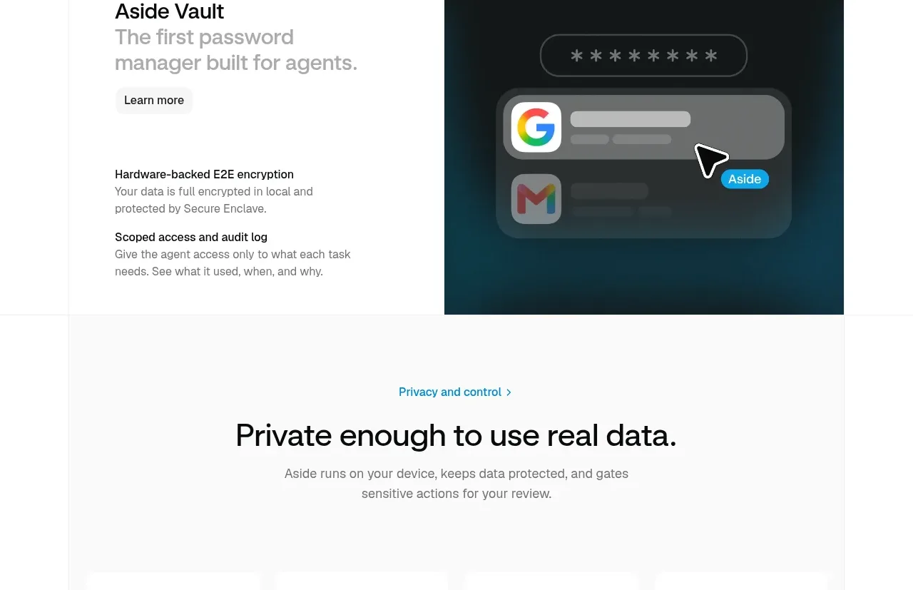 Vault product spotlight
Aside · Card
Vault product spotlight
Aside · Card
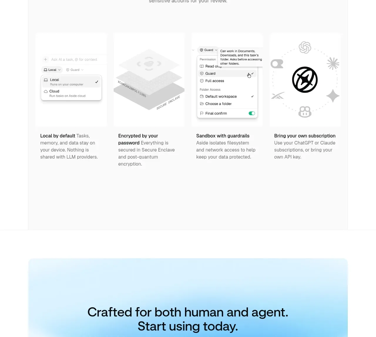 Privacy and control principles
Aside · Feature grid
Privacy and control principles
Aside · Feature grid
 Final download call to action
Aside · Call to action
Final download call to action
Aside · Call to action
 Multi-column site footer
Aside · Footer
Multi-column site footer
Aside · Footer