 kage
menlo.ai

Design analysis
A quiet centered conversion band repeats the product promise and offers two low-friction paths: deposit/order and an alternative invoice request.
Prompt preview
## Reference images

Study these alongside the description below: hierarchy, rhythm, spacing, colour. Build for the product you are asked about, using this design language.

- Component: https://kage-design-assets.t3.tigrisfiles.io/components/asimov-1/d16421bf-78be-4064-9aab-fabd3467d820-1792562775-6.webp
- Full page it was cut from: https://kage-design-assets.t3.tigrisfiles.io/screenshots/asimov-1/d16421bf-78be-4064-9aab-fabd3467d820-1792562736076-full.webp
- Component on Kage: https://kage.design/component/asimov-1-cta

## Before you start
Ask what the user's product, audience, and brand are, then apply the principles below to that product rather than reproducing this reference.

Build a centered conversion section on white with generous top and bottom padding. Use a compact bold heading, one short muted sentence, and a two-button row beneath it. Make the primary action filled with the brand accent (#ff6500) and the secondary action white with a dark 1px border. Keep button heights around 34–40px, radius 8–10px, uppercase small labels, and a visible focus state. The content should be narrow and calm so it reads as a confident final product prompt rather than a promotional banner. On mobile, allow buttons to wrap or stack while preserving equal widths.

Never: use the reference logo, product name, exact copy, product imagery, illustrations, or branded assets.
More components

 First-use credit CTA
Composio Instant · Call to action
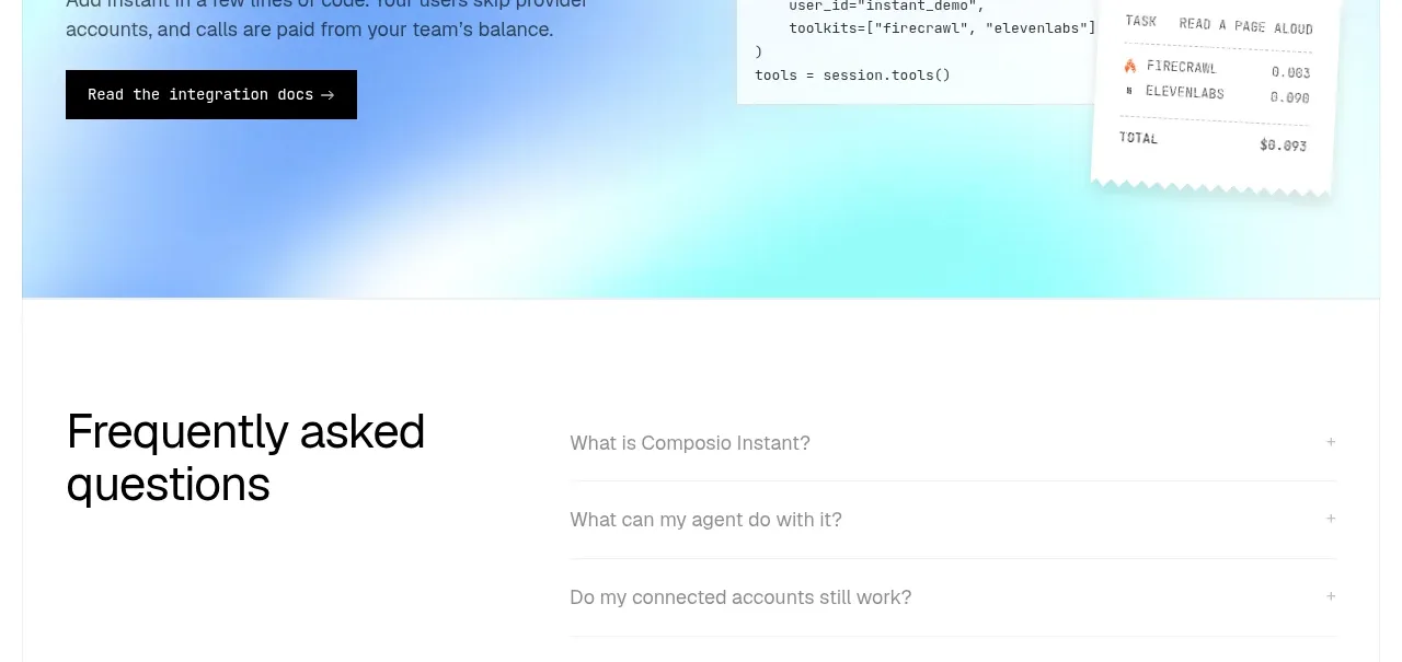 Developer integration CTA
Composio Instant · Call to action

 Final conversion panel
Inflight · Call to action
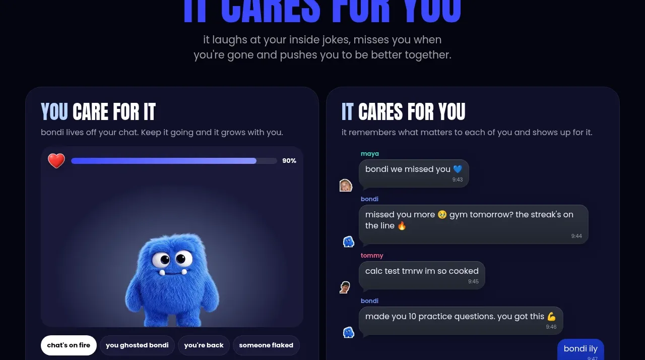
 Download and start CTA
bonds · Call to action

 Cloud to self-hosted switch
OpenShip Cloud · Call to action

 Oversized typographic transition
Tori · Call to action