 kage
openship.io

Design analysis
A compact bordered callout reinforces reversible deployment with a bold statement on the left and explanatory copy on the right.
Prompt preview
## Reference images

Study these alongside the description below: hierarchy, rhythm, spacing, colour. Build for the product you are asked about, using this design language.

- Component: https://kage-design-assets.t3.tigrisfiles.io/components/openship-cloud/9519eed9-0239-434c-a94e-7bf81cfc26ba-1792562628-6.webp
- Full page it was cut from: https://kage-design-assets.t3.tigrisfiles.io/screenshots/openship-cloud/9519eed9-0239-434c-a94e-7bf81cfc26ba-1792562575709-full.webp
- Component on Kage: https://kage.design/component/openship-cloud-cta

## Before you start
Ask what the user's product and brand are, then apply the principles below to that product rather than copying the reference.

Build a slim horizontal reassurance callout beneath a comparison section. Use a rounded white card with a very light border and two columns: a bold two-line promise on the left and a smaller explanatory paragraph on the right. Include a tiny uppercase eyebrow or status label above the promise. Keep the card around 90–130px tall with 24–32px padding, 12–16px radius, and generous separation between columns. On mobile stack the text while keeping the callout compact.

Never: use logos, product names, copy, illustrations, or imagery from the reference.
More components
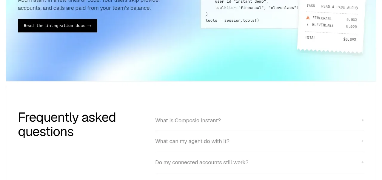
 Developer integration CTA
Composio Instant · Call to action
 First-use credit CTA
Composio Instant · Call to action

 Product purchase call to action
Asimov 1 · Call to action

 Final conversion panel
Inflight · Call to action
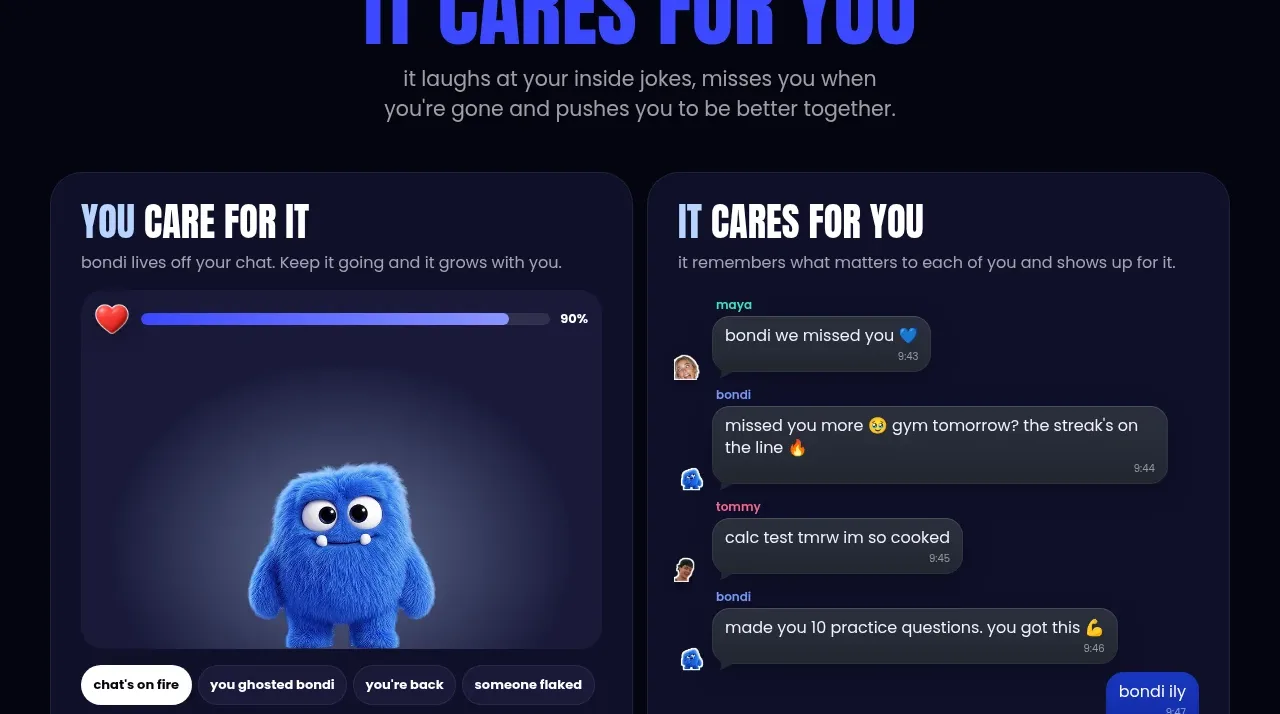
 Download and start CTA
bonds · Call to action

 Oversized typographic transition
Tori · Call to action