 kage
inflight.co

Design analysis
A wide dark rounded panel delivers the final message and a blue pill CTA, creating a strong, contained ending before the footer.
Prompt preview
## Reference images

Study these alongside the description below: hierarchy, rhythm, spacing, colour. Build for the product you are asked about, using this design language.

- Component: https://kage-design-assets.t3.tigrisfiles.io/components/inflight/ac6190d7-6ca0-4ac1-9ff1-df4f4b5185a3-1792562740-9.webp
- Full page it was cut from: https://kage-design-assets.t3.tigrisfiles.io/screenshots/inflight/ac6190d7-6ca0-4ac1-9ff1-df4f4b5185a3-1792562711335-full.webp
- Component on Kage: https://kage.design/component/inflight-cta

## Before you start
Ask what the user's product is and what its brand personality should be, then apply the principles below to that product.

Build a large final CTA panel inside a light page. Use a near-black rounded container, approximately #17181b, with a subtle abstract tonal texture made from low-contrast geometric gradients only. Place a bold two-line heading toward the left, a compact blue pill-shaped button beneath it, and generous internal padding. Use off-white heading text, a vivid but accessible blue around #1877d1 for the button, 18–24px corner radius, and enough contrast against the surrounding background. Make the panel full-width within a max-width container and stack content naturally on mobile.

Never: use logos, product names, copy, illustrations, or imagery from the reference.
More components
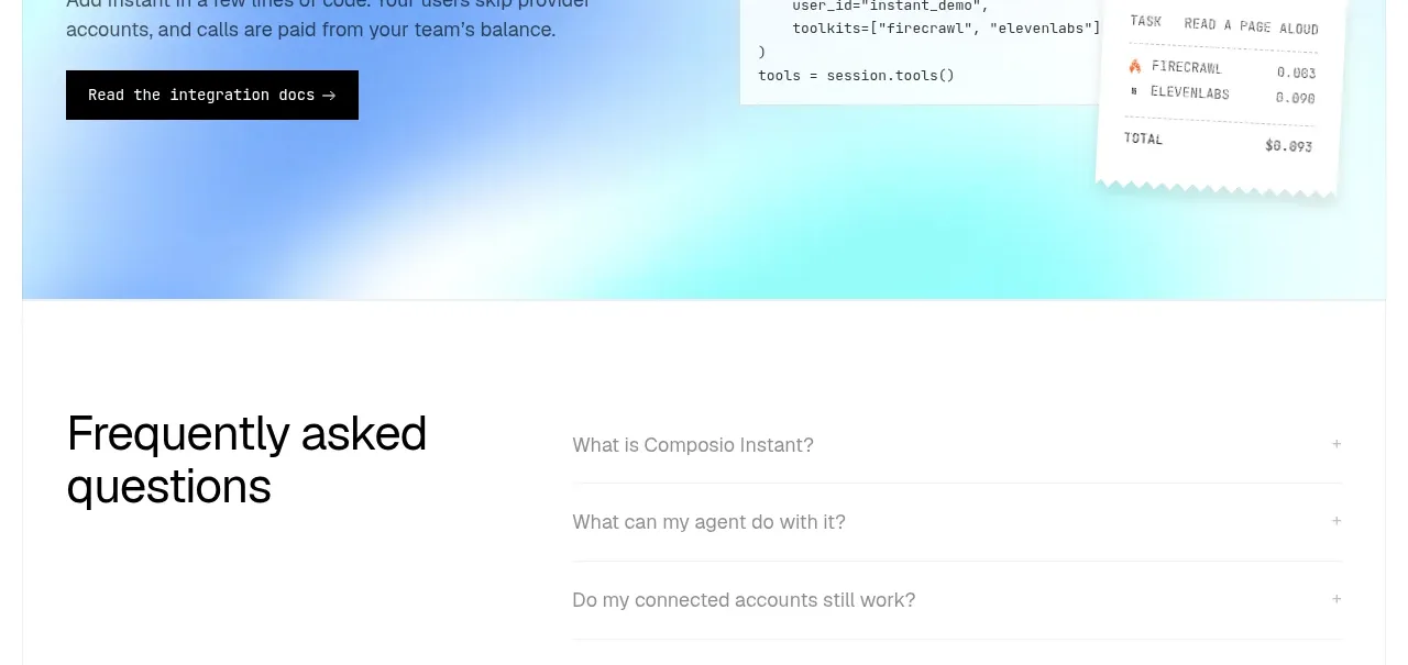
 Developer integration CTA
Composio Instant · Call to action
 First-use credit CTA
Composio Instant · Call to action
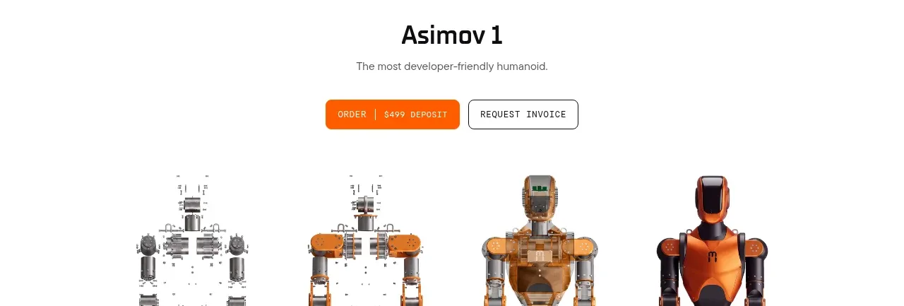
 Product purchase call to action
Asimov 1 · Call to action
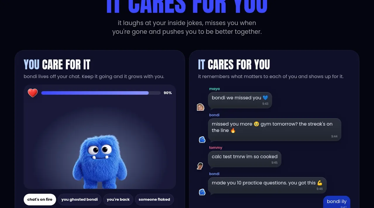
 Download and start CTA
bonds · Call to action

 Cloud to self-hosted switch
OpenShip Cloud · Call to action

 Oversized typographic transition
Tori · Call to action