kage
menlo.ai
Design analysis
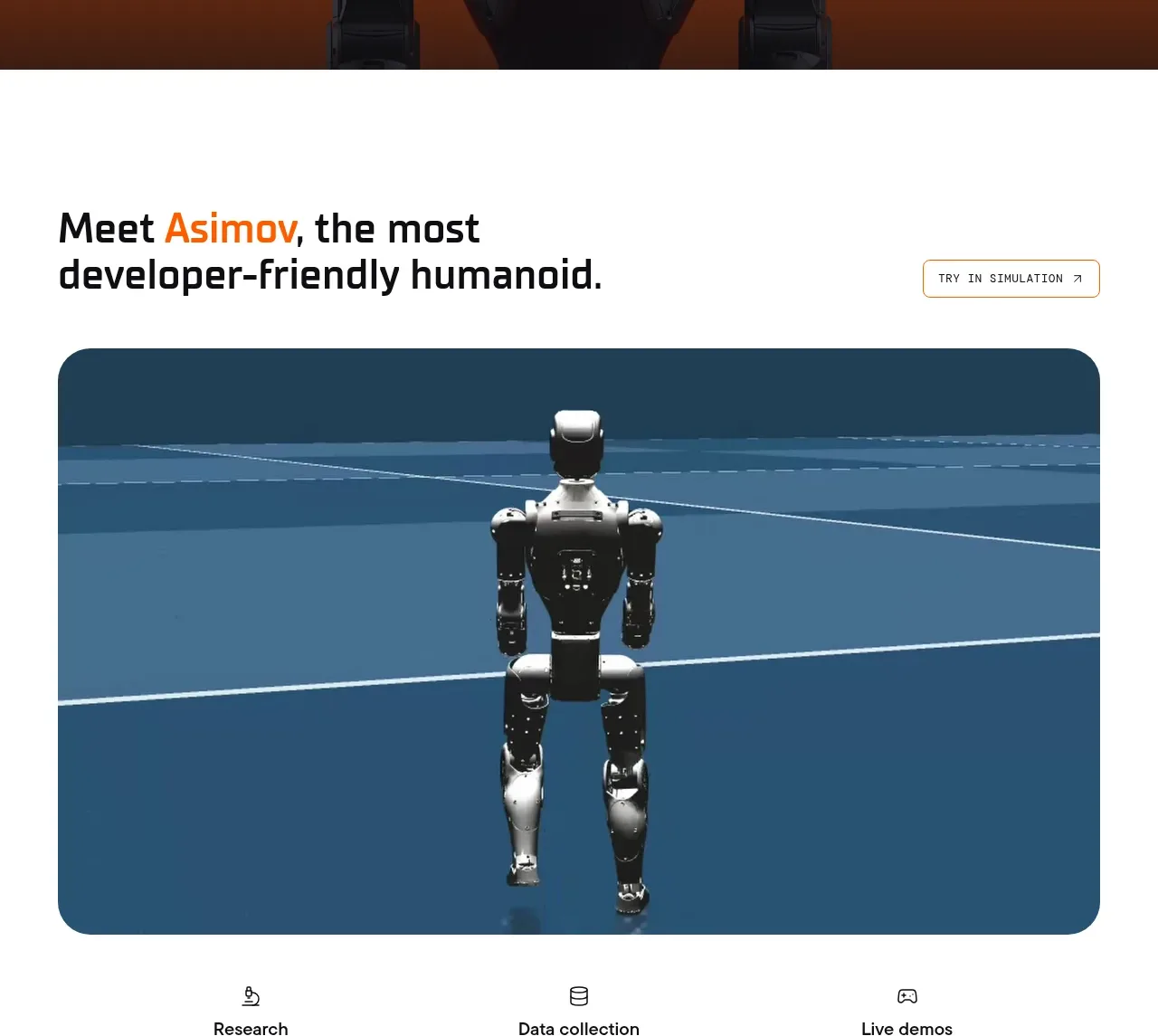
The next band combines a bold introductory statement and a secondary action with a large rounded demonstration image, making the product tangible before the feature details begin.
Prompt preview
## Reference images

Study these alongside the description below: hierarchy, rhythm, spacing, colour. Build for the product you are asked about, using this design language.

- Component: https://kage-design-assets.t3.tigrisfiles.io/components/asimov-1/d16421bf-78be-4064-9aab-fabd3467d820-1792562773-2.webp
- Full page it was cut from: https://kage-design-assets.t3.tigrisfiles.io/screenshots/asimov-1/d16421bf-78be-4064-9aab-fabd3467d820-1792562736076-full.webp
- Component on Kage: https://kage.design/component/asimov-1-hero-2

## Before you start
Ask what the user's product, audience, and brand are, then apply the principles below to that product rather than reproducing this reference.

Build an introductory product showcase section on a clean white background. Align the heading and short copy to a wide content grid, with an understated outlined action aligned to the opposite side. Below it, place one dominant media panel with a 16:9-ish ratio, generous side margins, and a 26–30px rounded corner radius. The media should be the visual proof of the product and may use a muted navy or brand-colour frame (#21455a is a useful starting point). Keep vertical spacing generous: roughly 80px above the heading, 34px between heading and media, and 64px below. Use a bold condensed sans heading in near-black, with one accent word if appropriate, and make the media responsive without distorting its focal point.

Never: use the reference logo, product name, exact copy, robot imagery, illustrations, or branded assets.