kage
composio.dev
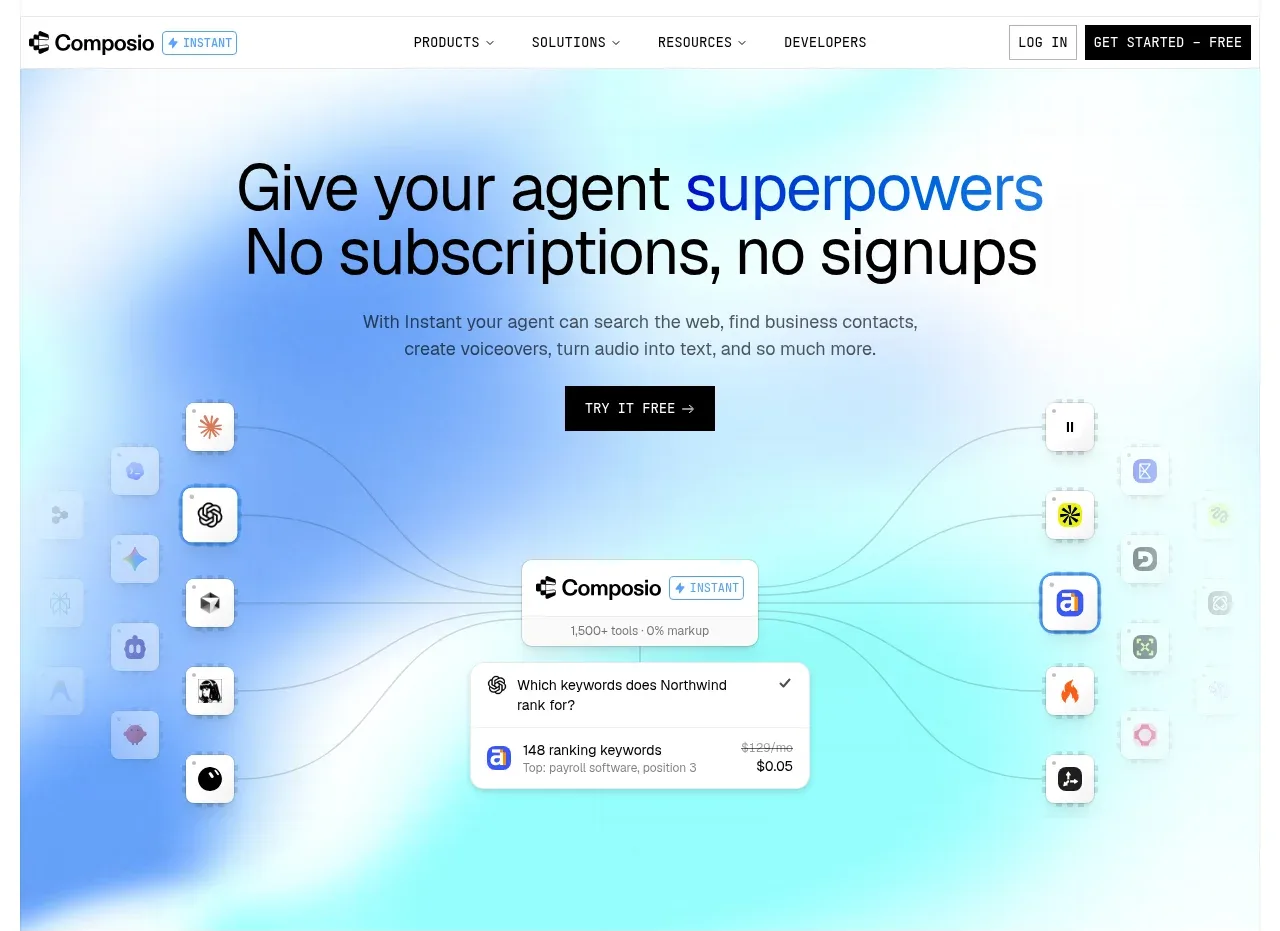
Design analysis
A large centered promise sits over a soft blue-to-cyan atmospheric gradient, followed by supporting copy, CTA, and a networked product visualization.
Prompt preview
## Reference images

Study these alongside the description below: hierarchy, rhythm, spacing, colour. Build for the product you are asked about, using this design language.

- Component: https://kage-design-assets.t3.tigrisfiles.io/components/composio-instant/90b73b03-e2b9-4385-8074-6e8e2bc32f62-1792562871-1.webp
- Full page it was cut from: https://kage-design-assets.t3.tigrisfiles.io/screenshots/composio-instant/90b73b03-e2b9-4385-8074-6e8e2bc32f62-1792562787795-full.webp
- Component on Kage: https://kage.design/component/composio-instant-hero

## Before you start
Ask what the user's product is, who it serves, and what its brand voice and visual identity are. Apply the following principles to that product rather than copying the reference.

Create a tall hero directly below the navigation. Use a centered two-line headline with one emphasized word or phrase in a saturated blue, concise explanatory copy, and a black rectangular CTA. Place an abstract product/system visualization below the CTA: use connected nodes, app-like tiles, or interface cards to communicate breadth without relying on a literal screenshot. Use a very soft blue, periwinkle, and cyan radial/linear gradient fading toward white, with generous whitespace. Typography should be a clean sans-serif: oversized 44–52px headline, 16px supporting text, and 12px compact CTA label. Use subtle 1px borders, 8–12px radii, and delicate shadows on floating cards. Keep the hero visual below the fold of the headline and ensure it remains legible on mobile.

Never: use logos, product names, copy, illustrations, or imagery from the reference.