kage
bonds.chat
Design analysis
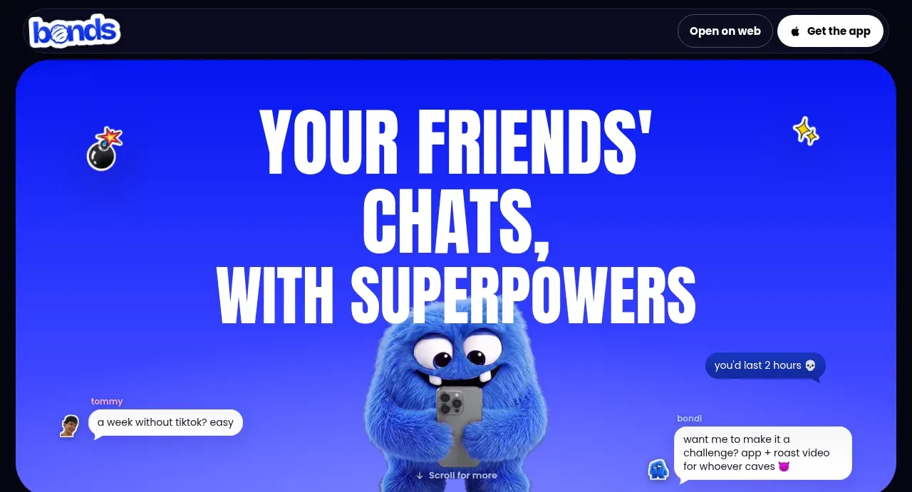
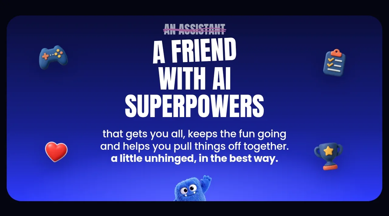
This rounded blue panel reframes the product from an assistant into a friend, combining crossed-out old language, a strong central headline, explanatory copy, and decorative corner objects.
Prompt preview
## Reference images

Study these alongside the description below: hierarchy, rhythm, spacing, colour. Build for the product you are asked about, using this design language.

- Component: https://kage-design-assets.t3.tigrisfiles.io/components/bonds/92b84629-52db-439e-9b50-1b68fbcd9bda-1792562653-3.webp
- Full page it was cut from: https://kage-design-assets.t3.tigrisfiles.io/screenshots/bonds/92b84629-52db-439e-9b50-1b68fbcd9bda-1792562529975-full.webp
- Component on Kage: https://kage.design/component/bonds-hero-3

## Before you start
Ask what the user's product replaces or improves, what emotional benefit matters most, and what visual tone the brand wants. Use those answers to create the section.

Create a full-width rounded positioning panel with a deep blue gradient (`#172aff` to `#2837c7`) on the dark page. Center a hierarchy of text: a small struck-through or de-emphasized old category label, an oversized condensed headline in white, and a short friendly explanatory paragraph in a readable rounded sans-serif. Use 18–24px panel rounding and 48–80px internal vertical padding. Add a few sparse decorative icons or abstract brand motifs in the corners, but keep them secondary to the words. Add a small product visual peeking from the lower edge if useful. Make the contrast accessible and preserve the centered composition on narrow screens.

Never: use the reference's logos, product names, copy, illustrations, imagery, or exact visual assets.