 kage
kage
astro.build

Design analysis
This section works by pairing a framework selector with a large, readable code panel and a partially overlapping product preview. Strong contrast, restrained neon accents, and clear active states make the technical promise feel tangible without overwhelming the page.
Prompt preview
## Reference images

Study these alongside the description below: hierarchy, rhythm, spacing, colour. Build for the product you are asked about, using this design language.

- Component: https://kage-design-assets.t3.tigrisfiles.io/components/astro-build/2448cc02-1e48-497c-9333-8941f9d81557-1789073851-5.webp
- Full page it was cut from: https://kage-design-assets.t3.tigrisfiles.io/screenshots/astro-build/2448cc02-1e48-497c-9333-8941f9d81557-1789073818-full.webp
- Component on Kage: https://kage.design/component/astro-build-code-block

## Before you start
Ask me what my product does, who it is for, and what its brand personality and visual identity are. Then apply the principles below to my product rather than reproducing the reference literally.

## Build a framework-agnostic code showcase
Create a dark, developer-focused feature section that communicates flexibility or interoperability through a framework/category selector, a code example, and a visual preview of the resulting interface. The component should feel like part of a premium software landing page, while remaining adaptable to the user's product, content, and brand.

### Layout and alignment
- Use a wide, near-full-width section inside a centered max-width container, with generous horizontal padding and a large amount of vertical breathing room.
- Align the eyebrow, heading, supporting paragraph, and pill-shaped action to the left on a shared vertical axis.
- Place a horizontal row of five selectable framework or integration items beneath the copy. Each item should have a circular icon medallion above a compact label.
- Separate the selector area from the showcase with a subtle full-width horizontal divider.
- Below the divider, create a two-part visual composition: a large code editor panel on the left and a smaller browser or product preview panel on the right. Let the right panel overlap the lower/right area of the code panel slightly to create depth.
- On smaller screens, stack the panels vertically, preserve readable code, and turn the selector into a horizontally scrollable row or a compact grid.

### Typography hierarchy
- Use a small, semibold eyebrow in the brand accent colour, approximately 14–16px.
- Use a bold, high-contrast heading around 32–40px with tight line-height.
- Set the supporting paragraph in a muted cool-grey, approximately 16px with 1.45 line-height and a comfortable maximum width.
- Use compact 15–16px labels for the action and selector items.
- Render code in a legible monospace font around 12–14px, with generous line-height and syntax colours that remain readable against the dark editor.

### Colour and visual treatment
- Start with a very dark navy-black background, approximately `#060914` to `#0B1020`.
- Use near-white for primary headings, approximately `#F2F5F7`, and a desaturated blue-grey for body copy, approximately `#A7B0C0`.
- Choose one vivid brand accent for active states and key highlights; a cyan or aqua accent around `#4DD7F5` works well, but adapt it to the user's brand.
- Use a warm secondary accent for the eyebrow only when it supports the brand, approximately `#E34D68`.
- Keep inactive selector icons subdued with charcoal, slate, and soft grey tones. Give the active item a brighter border or glow and a clearer label colour.
- The code panel should use a slightly lighter charcoal surface, approximately `#17191F`, with blue, cyan, green, and lavender syntax accents. Highlight one or two important code lines with a low-opacity blue accent band.
- The preview window should be darker than the surrounding section, with a subdued browser chrome bar and a faint internal surface contrast.

### Borders, radius, and depth
- Use thin, low-contrast borders, approximately `rgba(180, 200, 220, 0.18)`, around panels and controls.
- Give the code and preview panels a medium-large radius around 16–20px; use fully rounded pills for the action and smaller controls.
- Keep shadows soft and broad rather than dramatic. Add a restrained accent glow around the active selector and any highlighted code line.
- The code editor should have a compact top bar and a copy control in its upper-right corner, visually separated but not attention-seeking.

### Interaction
- Make each framework or integration item selectable. The active item should update the code sample and preview content or state, with a short fade or crossfade transition.
- Add hover states that brighten the icon ring, label, and border without shifting layout.
- Make the copy button keyboard accessible, provide a clear tooltip or temporary “Copied” state, and preserve focus visibility.
- Ensure the preview is illustrative and responsive rather than a static image; use simple UI primitives to demonstrate the selected integration.
- Respect reduced-motion preferences and ensure keyboard users can navigate the selector and copy control.

### Content guidance
- Use the user's own framework names, integration categories, code, and preview UI. Keep the code sample short enough to scan while showing a meaningful relationship between source code and rendered output.
- Make the active line or selector communicate the primary product benefit, such as portability, extensibility, or low migration cost.

### Never
- Never copy the reference's logos, product names, framework names, code, labels, or marketing copy.
- Never reuse the reference's exact illustration, product preview, icon artwork, or imagery.
- Never make the section depend on a screenshot; construct the editor, controls, and preview as real HTML/CSS/UI components.
- Never sacrifice code readability for decorative effects, and never use low-contrast text or inaccessible interaction states.
More components
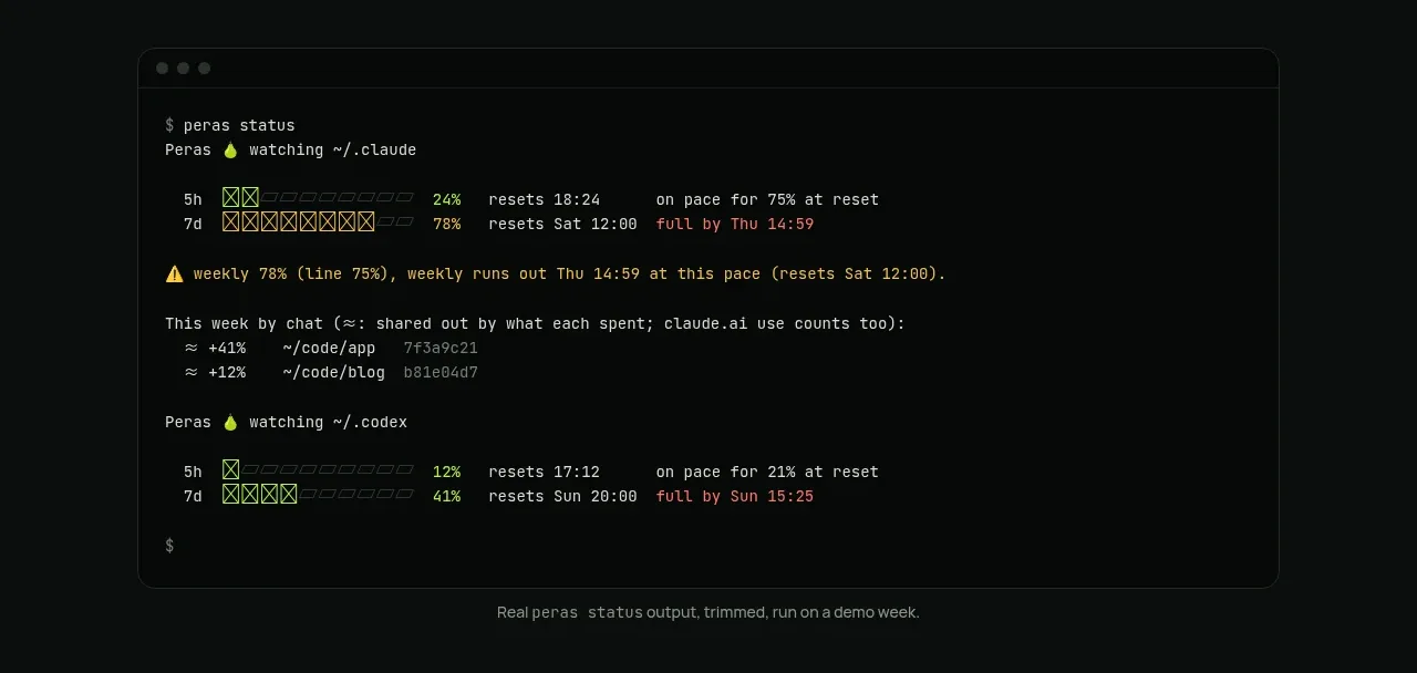
 Terminal status proof
Peras · Code block
Terminal status proof
Peras · Code block
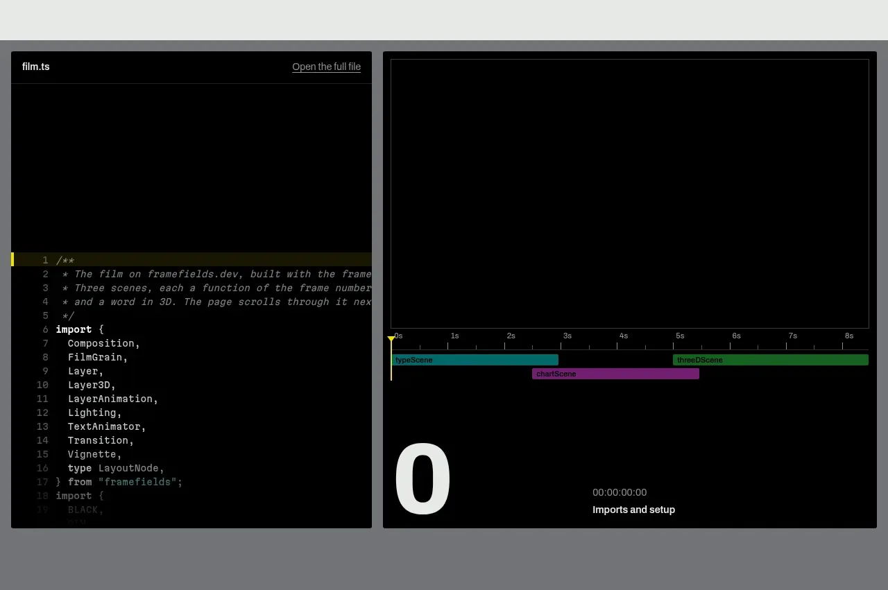
 Live render and code preview
Framefields · Code block
Live render and code preview
Framefields · Code block
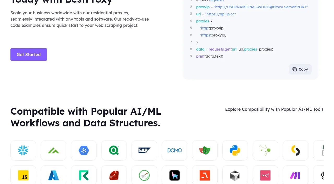
 Developer integration
bestproxy.com · Code block
Developer integration
bestproxy.com · Code block
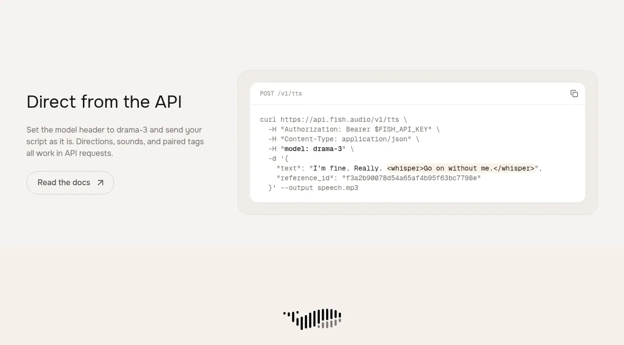
 API integration example
Fish Audio Drama 3 · Code block
API integration example
Fish Audio Drama 3 · Code block
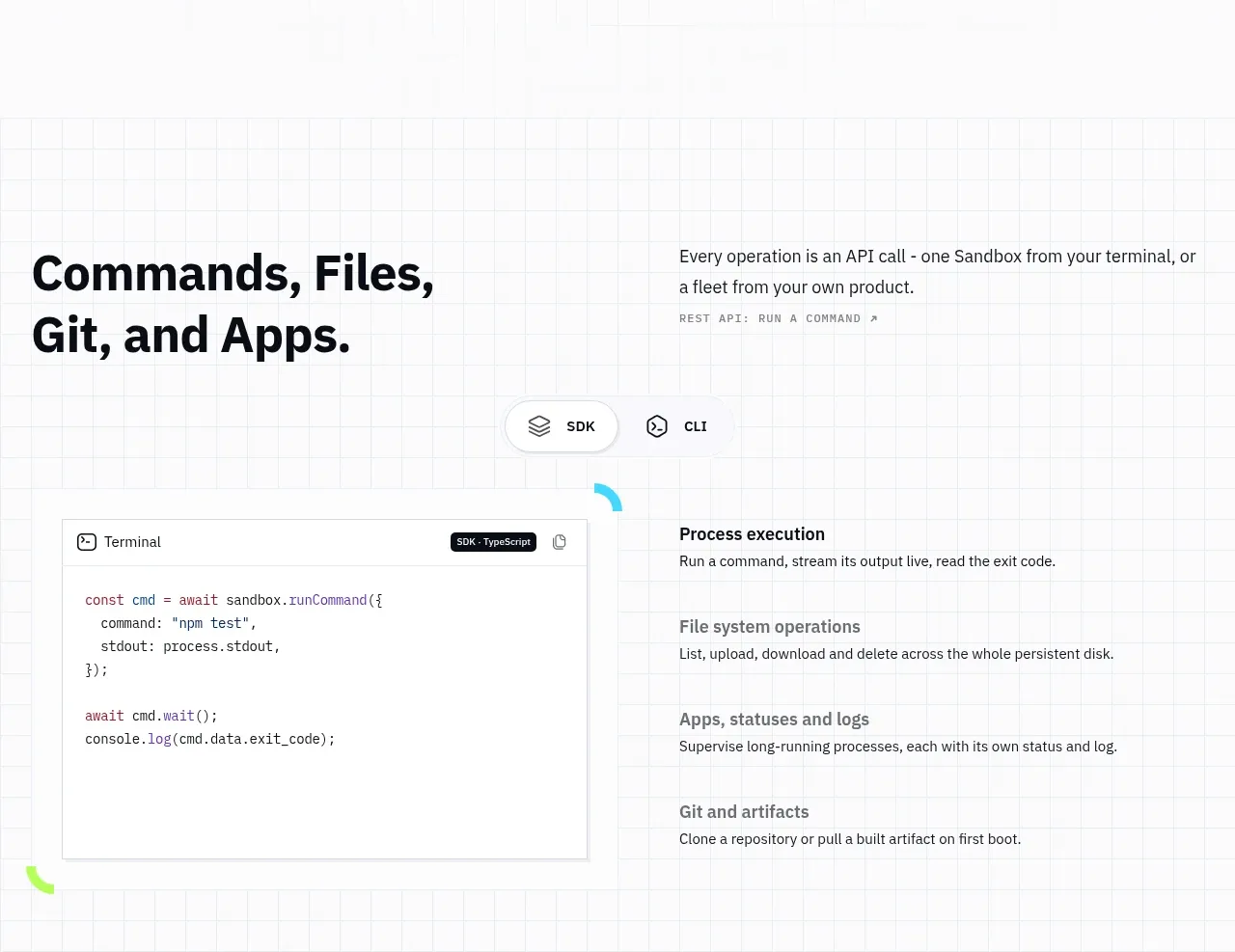
 Commands and API surface
AI Sandboxes by Buddy · Code block
Commands and API surface
AI Sandboxes by Buddy · Code block
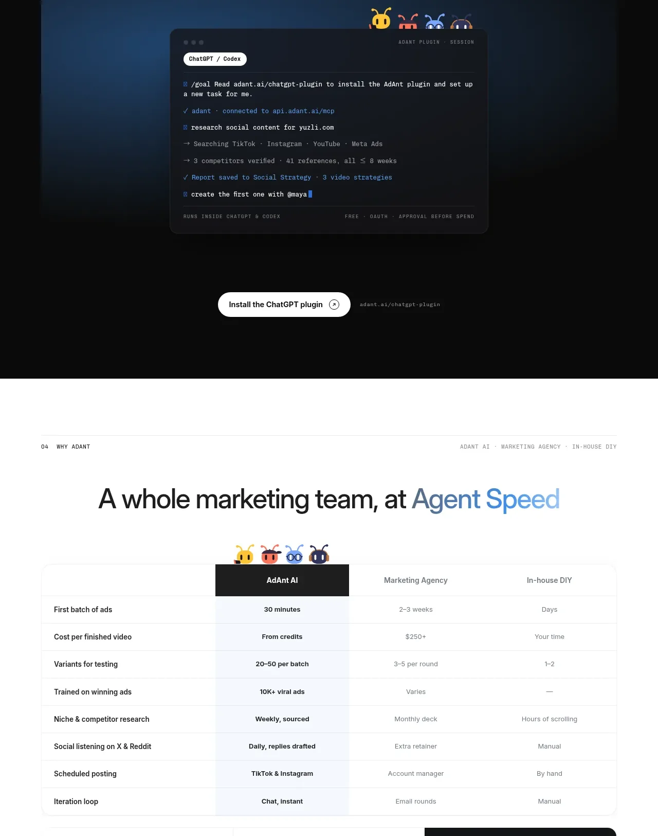
 Chat workspace plugin showcase
AdAnt 2.0 · Code block
Chat workspace plugin showcase
AdAnt 2.0 · Code block