 kage
kage
adant.ai
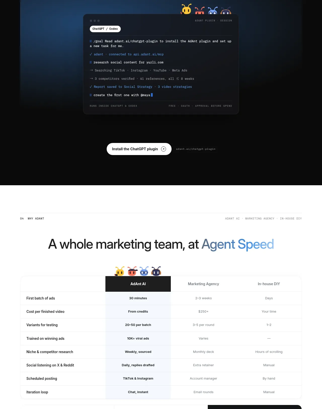
Design analysis
A dark integration section positions a strong headline above a glowing code/workspace preview and a clear installation button.
Prompt preview
## Reference images

Study these alongside the description below: hierarchy, rhythm, spacing, colour. Build for the product you are asked about, using this design language.

- Component: https://kage-design-assets.t3.tigrisfiles.io/components/adant-2-0/1b13b0a2-e64e-418d-a933-0f40a66c40ee-1792044359-5.webp
- Full page it was cut from: https://kage-design-assets.t3.tigrisfiles.io/screenshots/adant-2-0/1b13b0a2-e64e-418d-a933-0f40a66c40ee-1792044250464-full.webp
- Component on Kage: https://kage.design/component/adant-2-0-code-block

## Before you start
Ask which integrations matter to the user's product, what setup action users must take, and whether the brand should feel technical, playful, or enterprise. Then create an original integration showcase.

Build a dark, centered integration section with a small overline, a two-line headline, a brief explanation, and a large code or command-console preview. The preview should sit inside a softly glowing navy-blue stage with a dark translucent panel, syntax-coloured lines, a compact context badge, and a few restrained status indicators. Place one primary installation CTA below, plus a quiet inline install hint. Use #080A0C, #0E2847, #151B27, #F5F7FA, muted #8E98A6, and cyan/blue accents around #65A7FF. Use 44–56px heading type, 13–15px body text, 12px monospace code, 20–28px radii, and soft radial glow rather than heavy shadows. Add copy-to-clipboard and clear focus states where appropriate.

### Never
- Never use logos, product names, copy, illustrations, or imagery from the reference.
- Never reuse the reference's plugin name, commands, code, or mascot graphics.
- Never show technical detail without an obvious next step.
More components
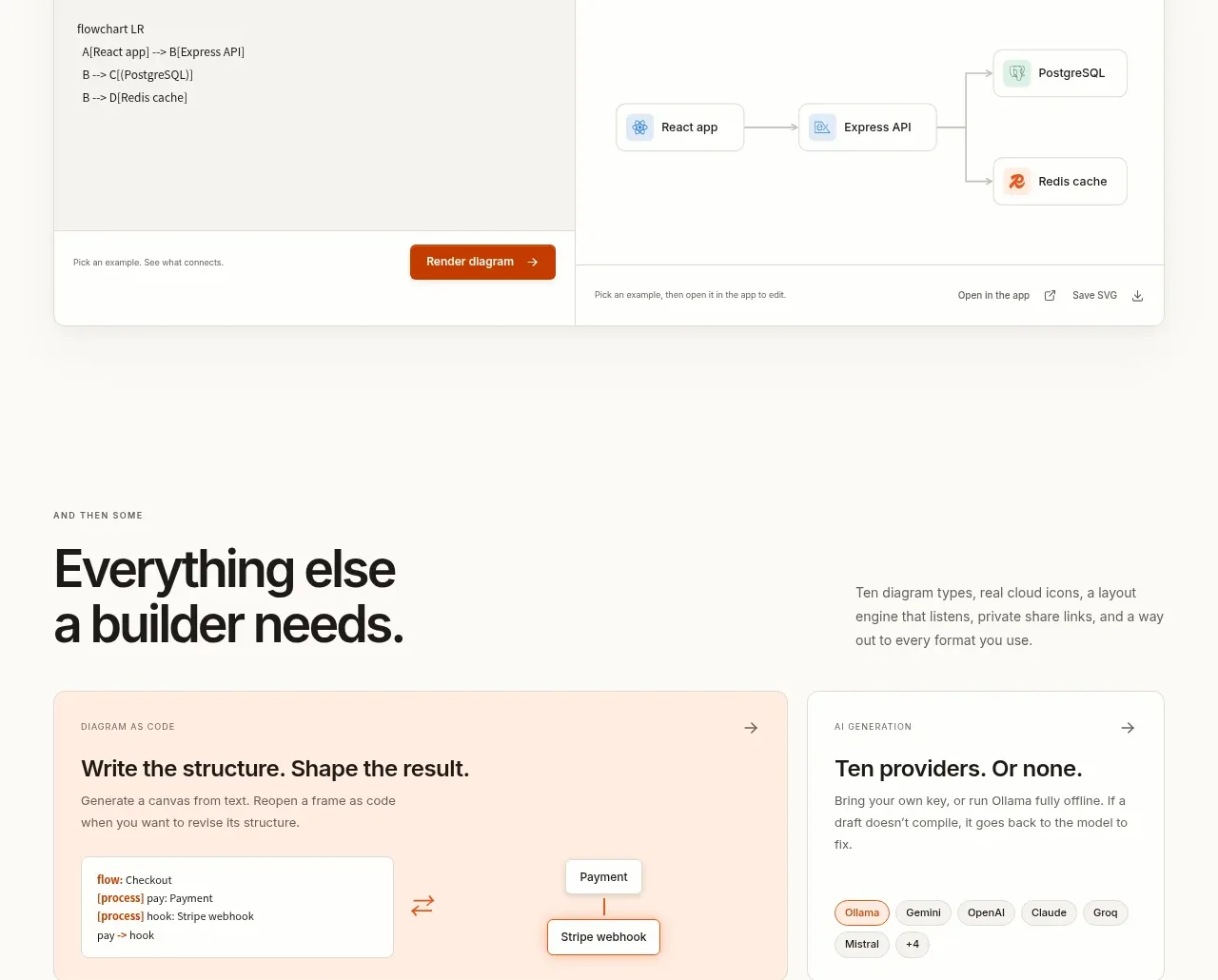
 Code-to-visual editor
OpenFlowKit 2 · Code block
Code-to-visual editor
OpenFlowKit 2 · Code block
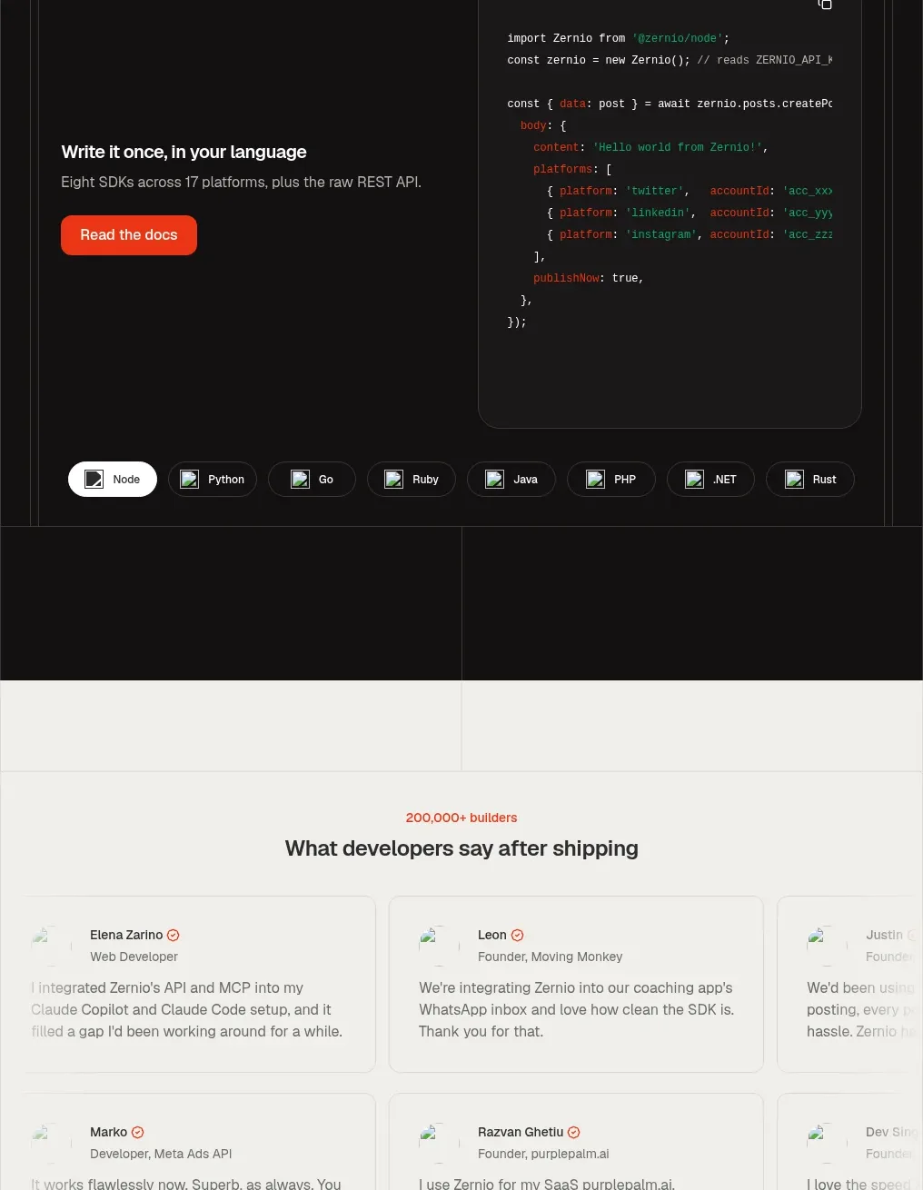
 Developer integration code showcase
Zernio · Code block
Developer integration code showcase
Zernio · Code block
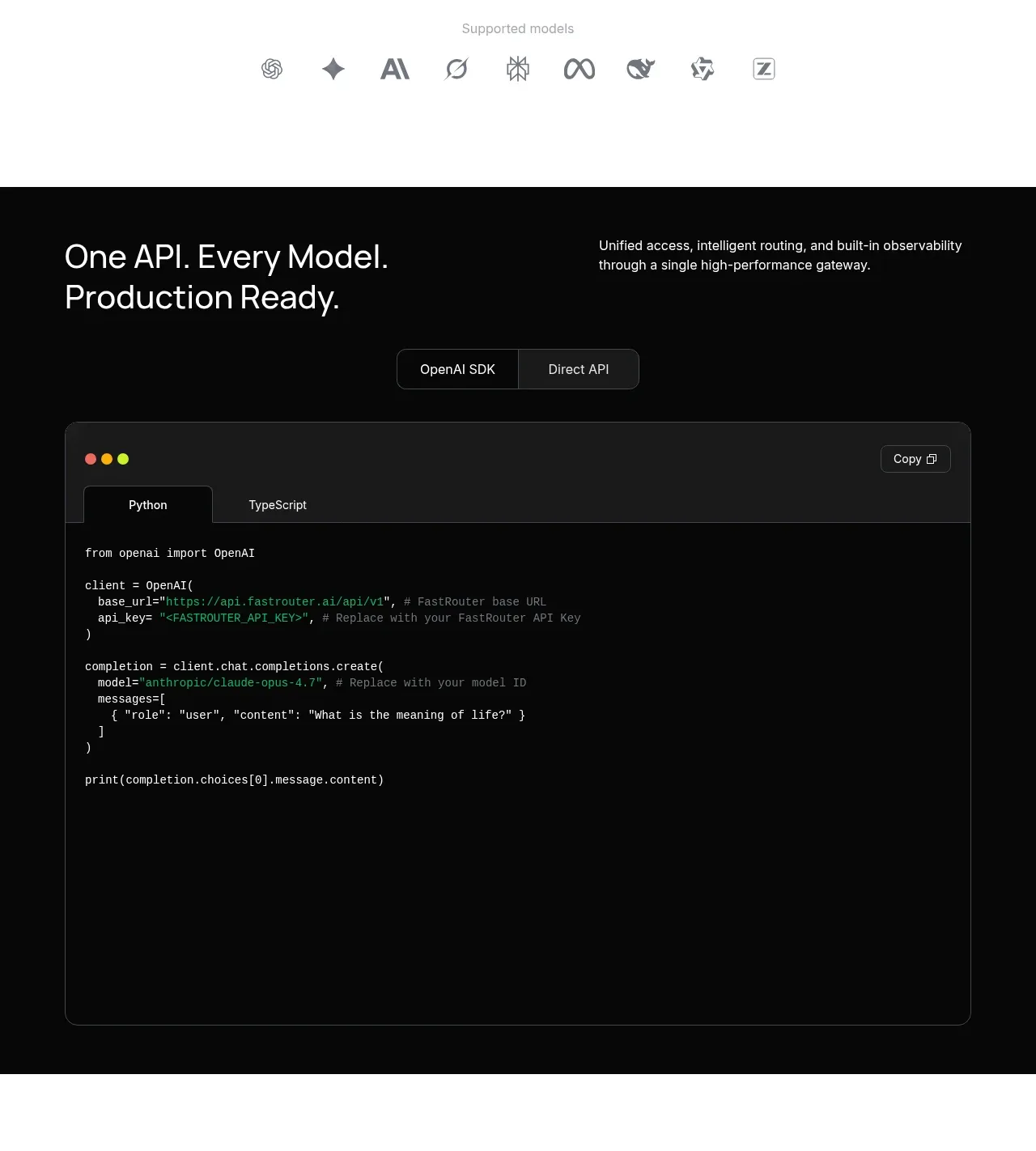
 Production-ready API code example
FastRouter.ai · Code block
Production-ready API code example
FastRouter.ai · Code block
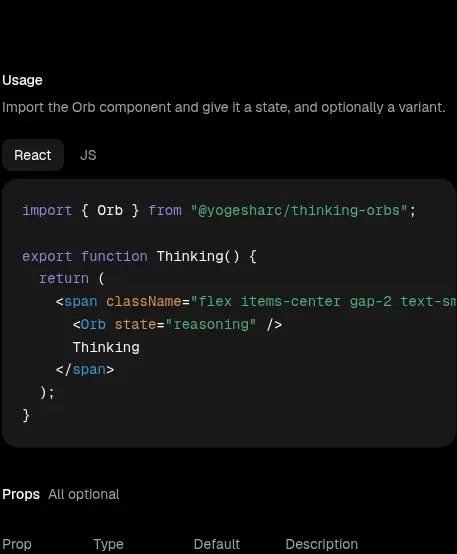
 Usage example
Thinking Orbs · Code block
Usage example
Thinking Orbs · Code block
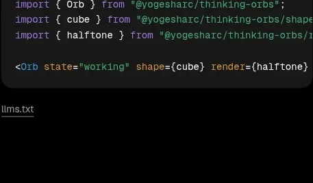 Shapes and render extensions
Thinking Orbs · Code block
Shapes and render extensions
Thinking Orbs · Code block
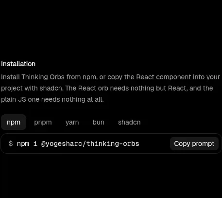 Installation instructions
Thinking Orbs · Code block
Installation instructions
Thinking Orbs · Code block