 kage
kage
buddy.works
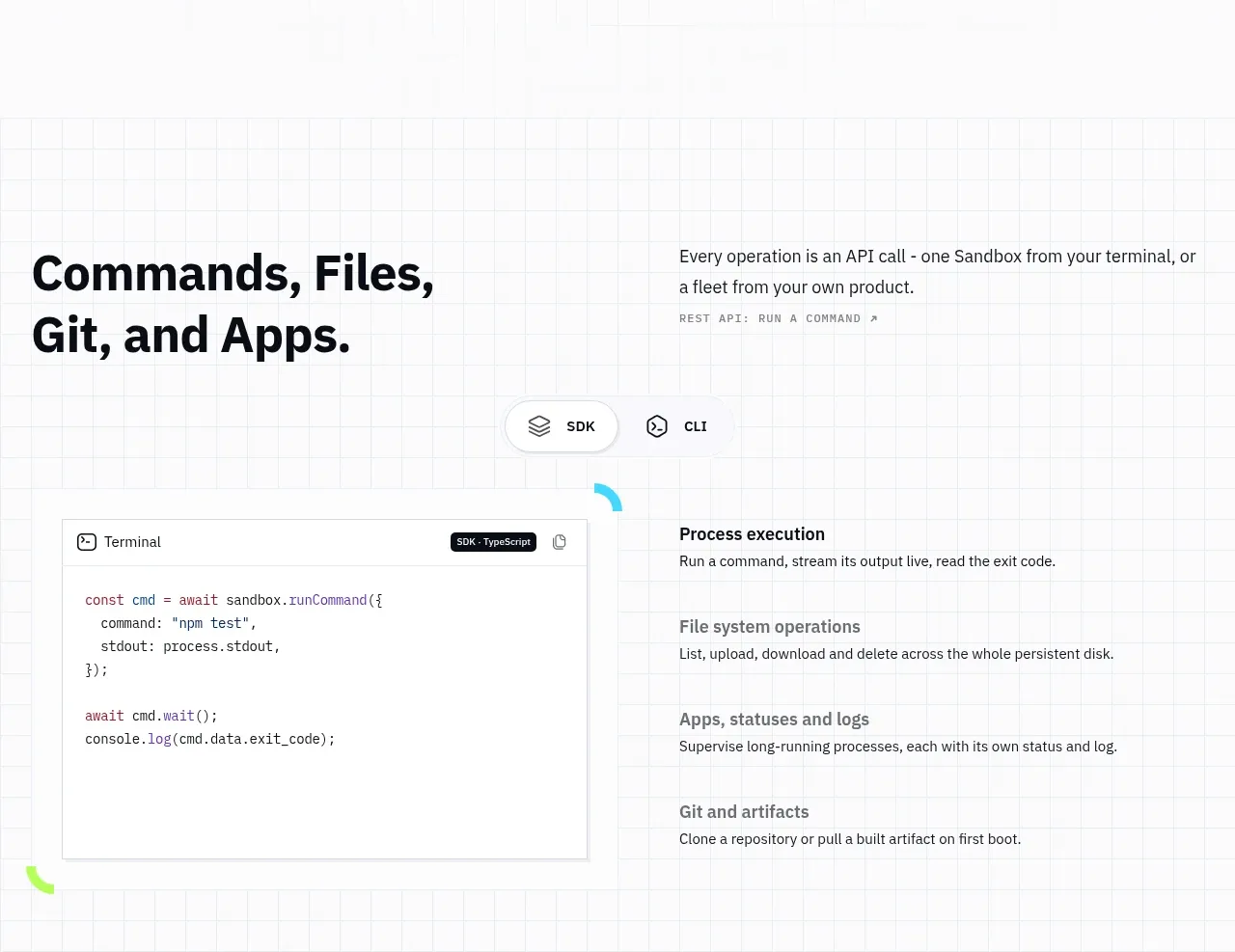
Design analysis
A code-led section combines a value proposition, SDK/CLI tabs, a terminal panel, and a concise list of supported operations.
Prompt preview
## Reference images

Study these alongside the description below: hierarchy, rhythm, spacing, colour. Build for the product you are asked about, using this design language.

- Component: https://kage-design-assets.t3.tigrisfiles.io/components/ai-sandboxes-by-buddy/f0e6e8b3-2b0a-4e1e-b3c7-06d5e5447056-1792130830-7.webp
- Full page it was cut from: https://kage-design-assets.t3.tigrisfiles.io/screenshots/ai-sandboxes-by-buddy/f0e6e8b3-2b0a-4e1e-b3c7-06d5e5447056-1792130620611-full.webp
- Component on Kage: https://kage.design/component/ai-sandboxes-by-buddy-code-block

## Before you start
Ask which APIs, SDKs, or command-line workflows the user's product actually supports and which example best communicates its value. Then create an original developer-facing section.

Build a code-and-capabilities section over a subtle grid background. Start with a two-column intro: a bold editorial heading on the left and a short explanation on the right. Below it, add a pill-style tab switcher for two or three implementation surfaces, followed by a split layout with a bordered code editor on the left and four capability rows on the right. Use a white code panel with #D7DCE1 border, 12px radius, dark monospace text, syntax accents in #35C9EE and #8BAF00, and a small copy button. Use 13–14px monospace code and 15–16px capability titles. Tabs need visible active state, keyboard focus, and content switching; stack code above capabilities on mobile.

Never: use the reference's product name, exact code, exact commands, illustrations, or imagery.
More components
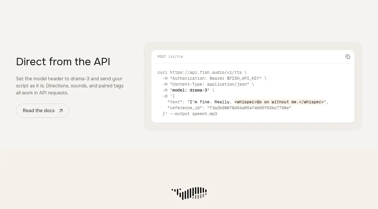
 API integration example
Fish Audio Drama 3 · Code block
API integration example
Fish Audio Drama 3 · Code block
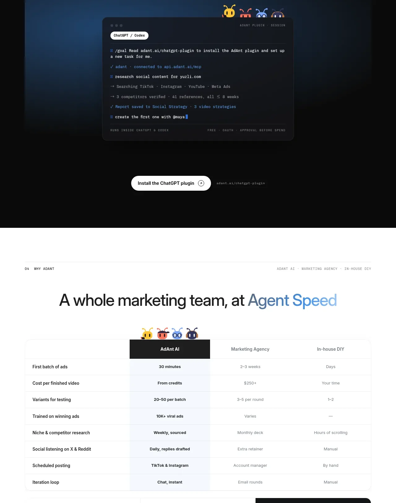
 Chat workspace plugin showcase
AdAnt 2.0 · Code block
Chat workspace plugin showcase
AdAnt 2.0 · Code block
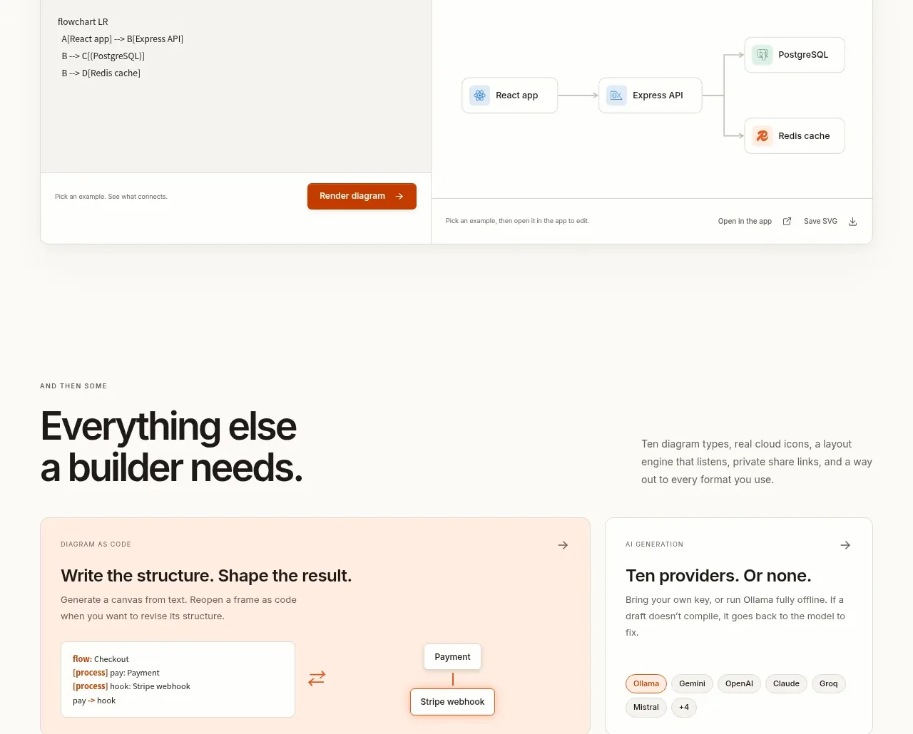
 Code-to-visual editor
OpenFlowKit 2 · Code block
Code-to-visual editor
OpenFlowKit 2 · Code block
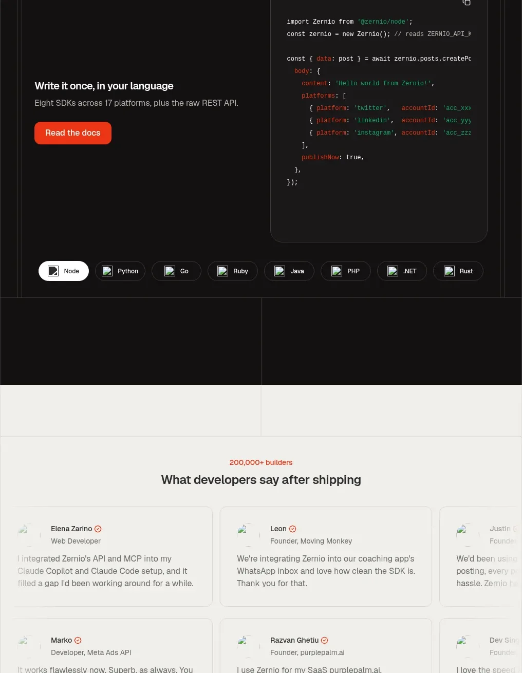
 Developer integration code showcase
Zernio · Code block
Developer integration code showcase
Zernio · Code block
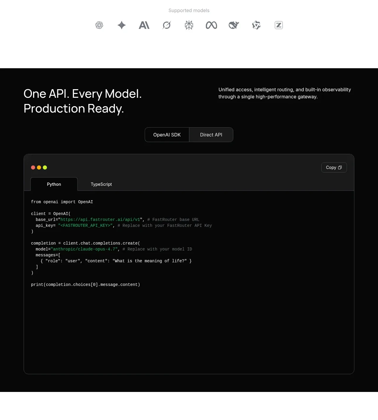
 Production-ready API code example
FastRouter.ai · Code block
Production-ready API code example
FastRouter.ai · Code block
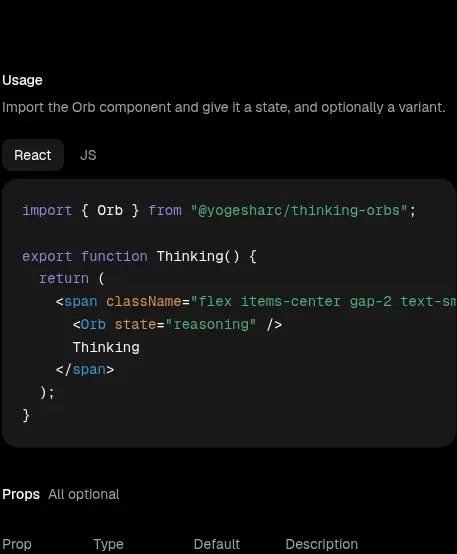
 Usage example
Thinking Orbs · Code block
Usage example
Thinking Orbs · Code block