 kage
kage
audimate.ai

Design analysis
A final centered call to action repeats the product promise, offers a single bright download action, and provides a secondary guided-demo path.
Prompt preview
## Reference images

Study these alongside the description below: hierarchy, rhythm, spacing, colour. Build for the product you are asked about, using this design language.

- Component: https://kage-design-assets.t3.tigrisfiles.io/components/audimate/f5eee044-0aa0-46f8-a989-58039412e614-1792130732-8.webp
- Full page it was cut from: https://kage-design-assets.t3.tigrisfiles.io/screenshots/audimate/f5eee044-0aa0-46f8-a989-58039412e614-1792130546049-full.webp
- Component on Kage: https://kage.design/component/audimate-cta

## Before you start
Ask what the user's product and brand are, then apply the principles below to that product rather than reproducing the reference.

Build a focused final CTA for a desktop AI product. Use a subtle dark blue-violet radial glow behind a centered accent mark, a large two-line headline, one bright pill-shaped download or start button, a muted compatibility note, and a small secondary link for requesting a guided demo. Keep the section visually quiet and high contrast, with 56–80px vertical padding. The primary button should be white with dark text and a clear hover lift; the secondary link should be understated but discoverable.

Never: use the reference's logo, product name, copy, illustrations, imagery, or exact visual identity.
More components

 Final conversion banner
CrewTower Mod for Claude Code · Call to action
Final conversion banner
CrewTower Mod for Claude Code · Call to action
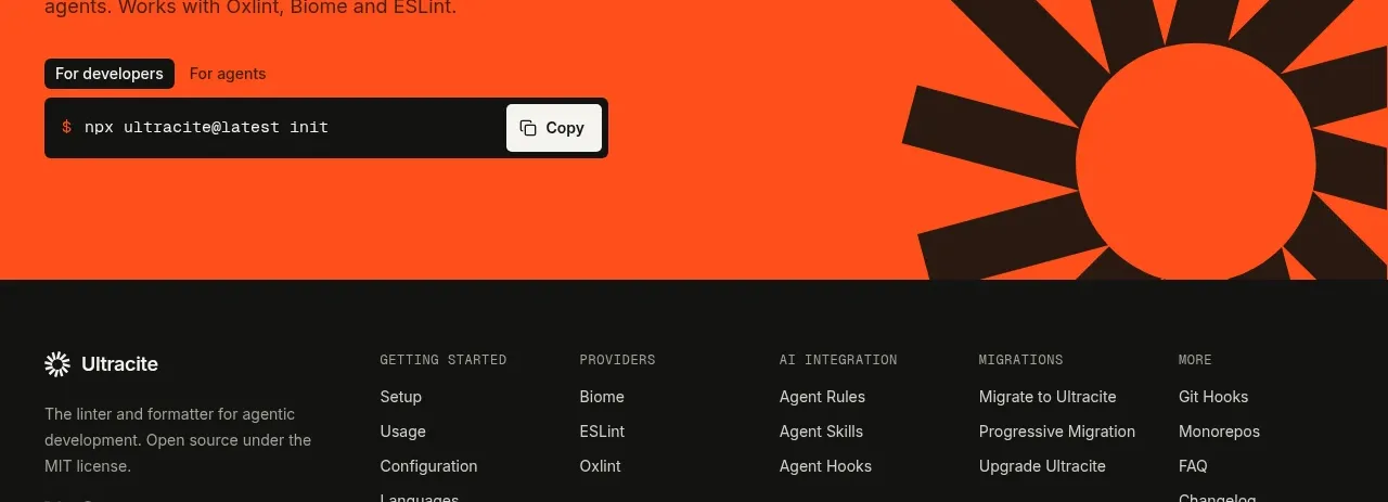
 Bright installation call to action
Ultracite v8 · Call to action
Bright installation call to action
Ultracite v8 · Call to action
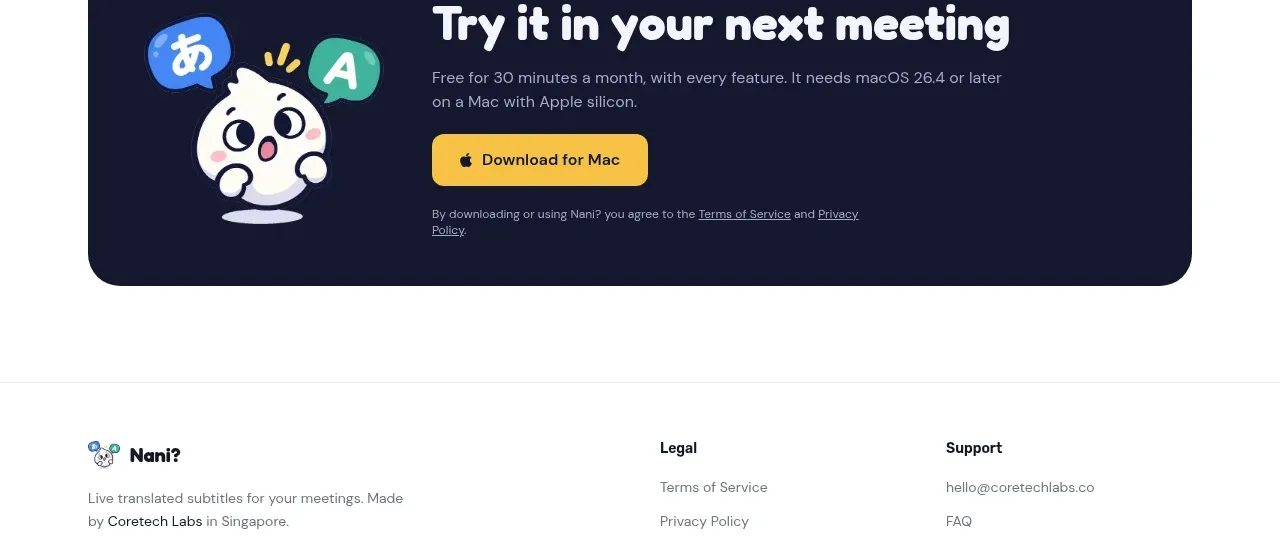
 Download call to action
NANI??? · Call to action
Download call to action
NANI??? · Call to action
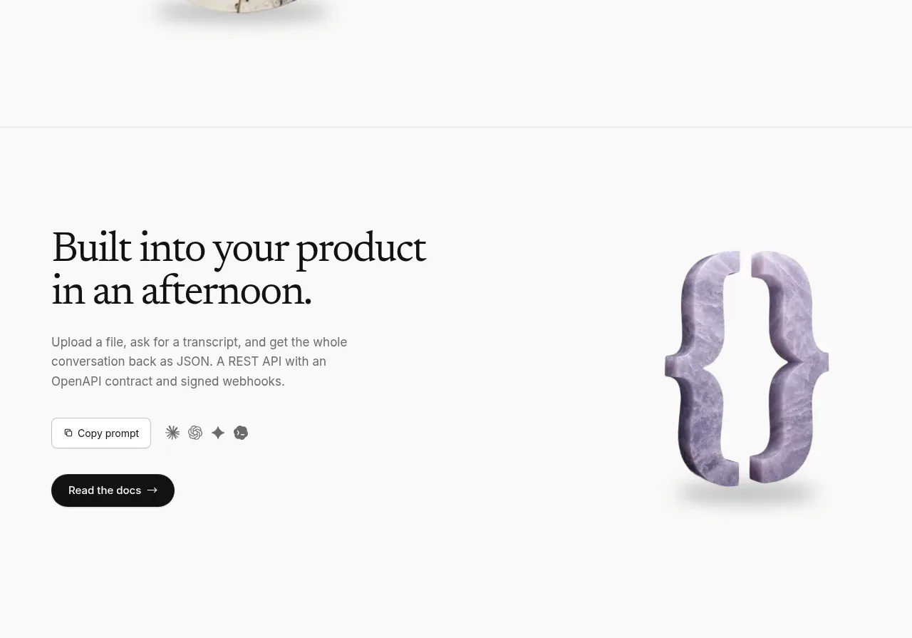
 Developer integration CTA
Maybloc · Call to action
Developer integration CTA
Maybloc · Call to action
 Marble-backed final CTA
Maybloc · Call to action
Marble-backed final CTA
Maybloc · Call to action
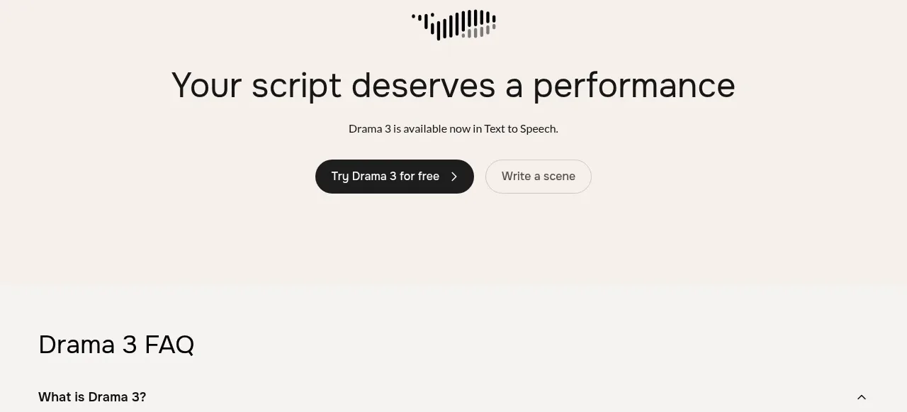
 Centered conversion call to action
Fish Audio Drama 3 · Call to action
Centered conversion call to action
Fish Audio Drama 3 · Call to action