kage
kage
audimate.ai

Design analysis
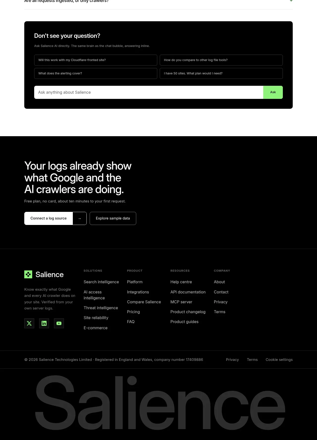
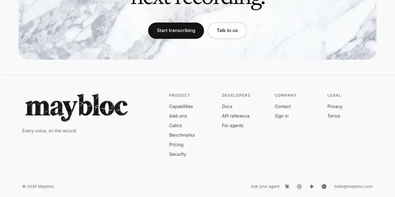
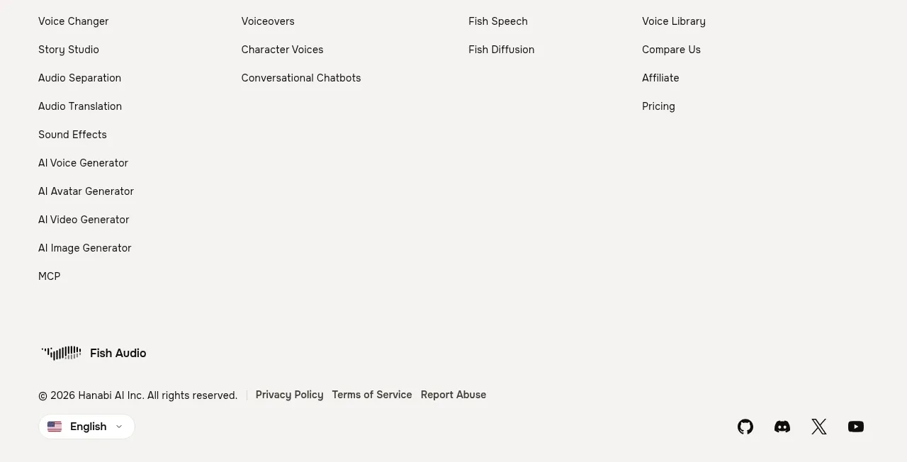
The footer closes the page with a brand area, grouped product/resource/legal links, and a separated copyright line.
Prompt preview
## Reference images

Study these alongside the description below: hierarchy, rhythm, spacing, colour. Build for the product you are asked about, using this design language.

- Component: https://kage-design-assets.t3.tigrisfiles.io/components/audimate/f5eee044-0aa0-46f8-a989-58039412e614-1792130732-9.webp
- Full page it was cut from: https://kage-design-assets.t3.tigrisfiles.io/screenshots/audimate/f5eee044-0aa0-46f8-a989-58039412e614-1792130546049-full.webp
- Component on Kage: https://kage.design/component/audimate-footer

## Before you start
Ask what the user's product and brand are, then apply the principles below to that product rather than reproducing the reference.

Build a restrained dark footer with a four-column desktop layout: brand block on the left, then grouped product, resources, and legal navigation. Use a thin top divider, ample horizontal padding, 12–13px muted links, compact vertical rhythm, and a bottom copyright row separated by another subtle rule. Keep the footer background black (#000), text in soft white and gray, and use a small brand accent color without copying any existing mark. Collapse link groups into readable stacked sections on mobile.

Never: use the reference's logo, product name, copy, illustrations, imagery, or exact visual identity.