kage
kage
maybloc.com
Design analysis
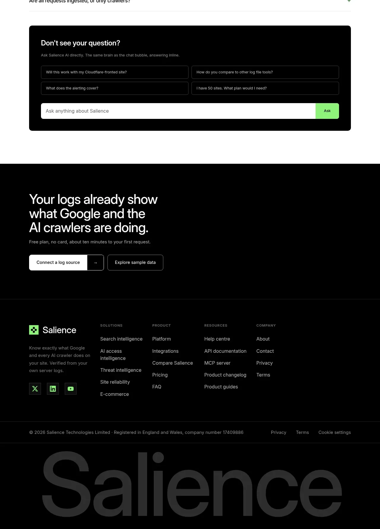
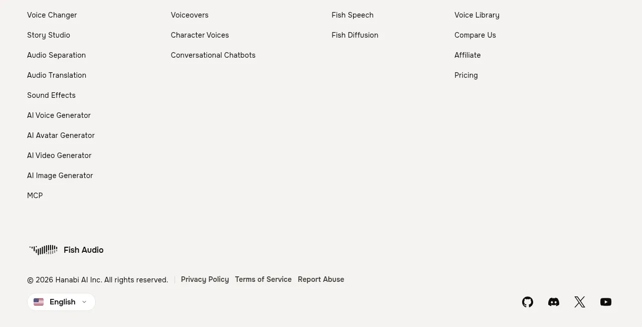
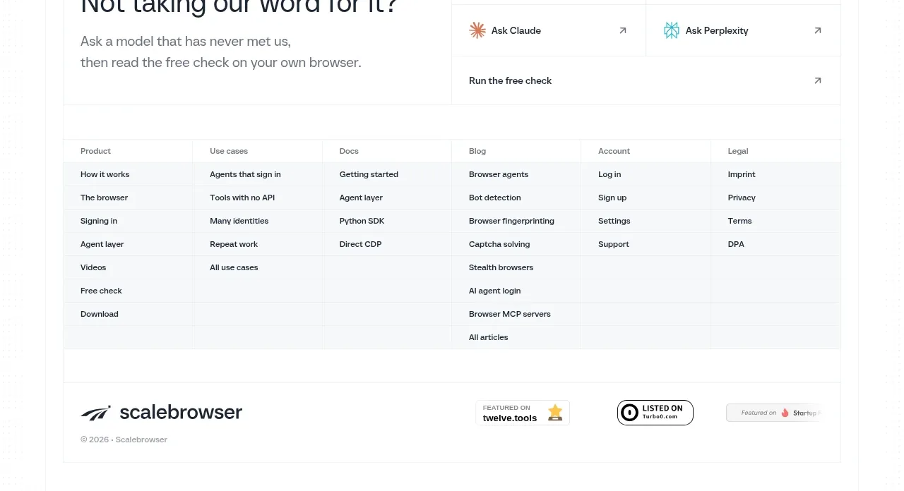
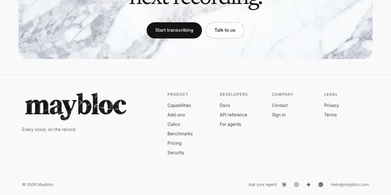
The footer balances a large wordmark area with grouped navigation columns and a thin legal/meta row at the bottom.
Prompt preview
## Reference images

Study these alongside the description below: hierarchy, rhythm, spacing, colour. Build for the product you are asked about, using this design language.

- Component: https://kage-design-assets.t3.tigrisfiles.io/components/maybloc/1877ee03-3cf3-49f7-b006-226ca2ea42de-1792217043-10.webp
- Full page it was cut from: https://kage-design-assets.t3.tigrisfiles.io/screenshots/maybloc/1877ee03-3cf3-49f7-b006-226ca2ea42de-1792216974687-full.webp
- Component on Kage: https://kage.design/component/maybloc-footer

## Before you start
Ask what the user's product is, who it serves, and what brand voice and visual identity it should use. Apply the principles below to that product rather than reproducing the reference.

Create a spacious footer on a white or near-white background with a top border. Use a large brand wordmark or brand lockup on the left and three or four compact link columns on the right, each with a small uppercase category heading and vertically spaced links. Add a thin divider near the bottom, then a legal/copyright line on the left and small utility links, contact, or social controls on the right. Use #111111 for brand and headings, #666666 for links, #e5e5e5 rules, a restrained sans-serif at 12–14px, and generous horizontal padding. Include hover and focus states, ensure the link groups collapse into stacked sections on mobile, and preserve sufficient bottom padding.

Never: use the reference's logo, product name, copy, illustrations, imagery, or exact footer labels.