kage
kage
crewtower.app

Design analysis
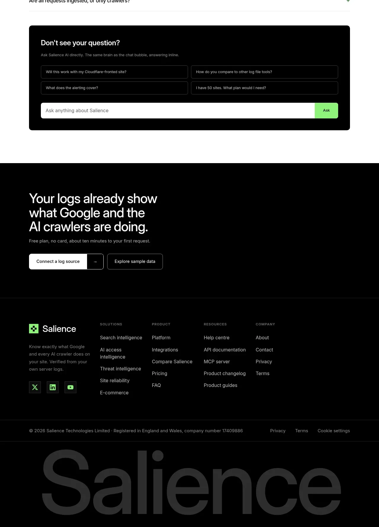
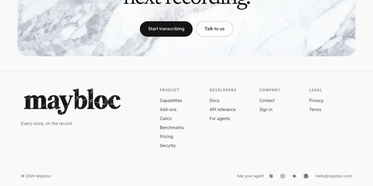
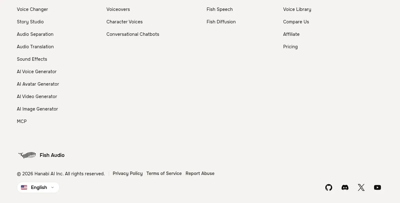
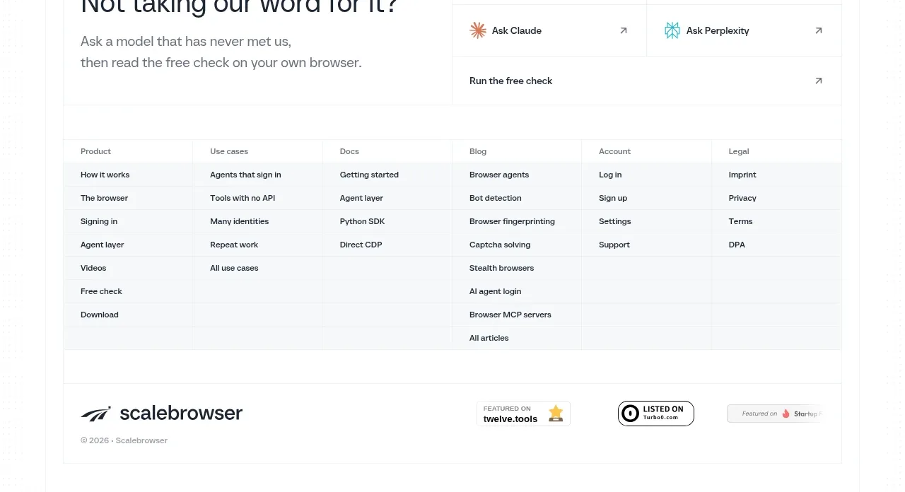
The footer is intentionally sparse: comparison links sit above a simple navigation/legal row, with small recognition badges and copyright information completing the page.
Prompt preview
## Reference images

Study these alongside the description below: hierarchy, rhythm, spacing, colour. Build for the product you are asked about, using this design language.

- Component: https://kage-design-assets.t3.tigrisfiles.io/components/crewtower-mod-for-claude-code/6a95b5f4-2bf6-41f9-aa93-70409ededf43-1792303422-8.webp
- Full page it was cut from: https://kage-design-assets.t3.tigrisfiles.io/screenshots/crewtower-mod-for-claude-code/6a95b5f4-2bf6-41f9-aa93-70409ededf43-1792303277739-full.webp
- Component on Kage: https://kage.design/component/crewtower-mod-for-claude-code-footer

## Before you start
Ask which destinations, legal pages, support channels, and trust signals the user's product needs. Organize those without copying the reference.

Create a minimal footer on an off-white background. Begin with a thin divider and a compact row of relevant comparison or resource links. Follow with a two-sided row: brand or ownership information and primary links on the left, copyright/legal details on the right. Add optional small monochrome trust badges below, but keep them secondary. Use 12–14px muted text, 20–28px horizontal gaps, 32–48px vertical padding, and #dcd9df dividers. Stack and left-align the content on mobile. Ensure every link has a visible hover and keyboard focus state.

Never use logos, product names, copy, illustrations, or imagery from the reference.