kage
kage
fish.audio
Design analysis
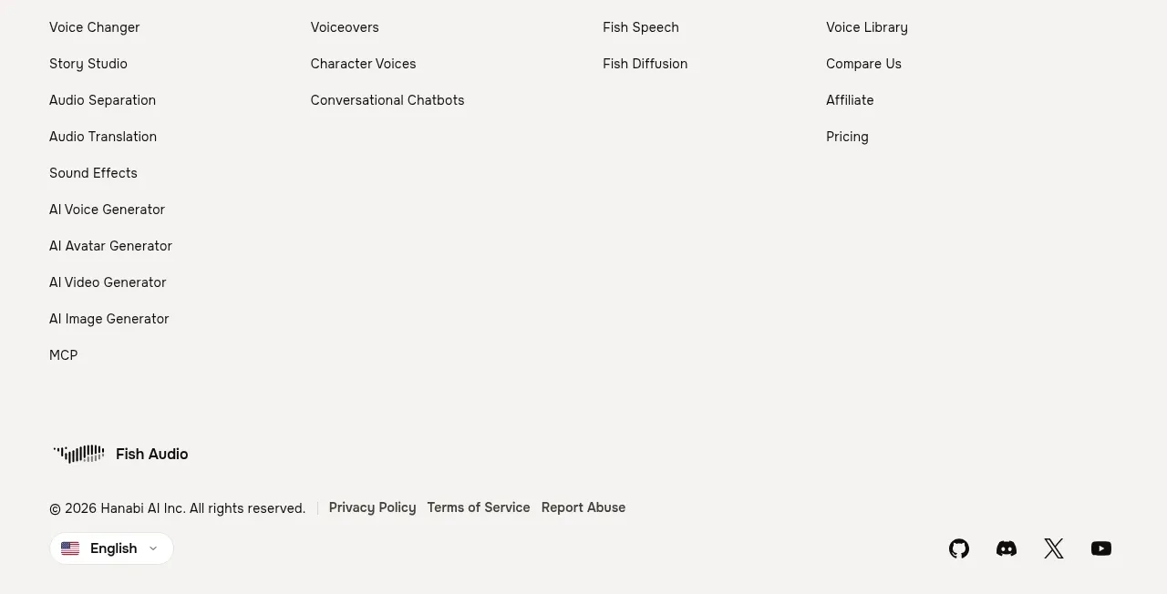
The footer organizes a large link directory into five columns, then ends with a brand/legal row containing language selection and social icons.
Prompt preview
## Reference images

Study these alongside the description below: hierarchy, rhythm, spacing, colour. Build for the product you are asked about, using this design language.

- Component: https://kage-design-assets.t3.tigrisfiles.io/components/fish-audio-drama-3/b8b3d5d8-1af1-45c3-b814-ec39ae20de20-1792217029-8.webp
- Full page it was cut from: https://kage-design-assets.t3.tigrisfiles.io/screenshots/fish-audio-drama-3/b8b3d5d8-1af1-45c3-b814-ec39ae20de20-1792216963457-full.webp
- Component on Kage: https://kage.design/component/fish-audio-drama-3-footer

## Before you start
Ask what the user's product, information architecture, and brand style are. Use the following footer system as a flexible pattern for that product.

Create a spacious footer with a five-column link directory. Group links under meaningful categories such as product, solutions, research, resources, and company, with compact but readable link rows. Beneath the directory, add a divider or generous separation followed by a bottom utility row: brand name or mark on the left, copyright and legal links nearby, a language selector, and a right-aligned group of social icons. Keep the footer aligned to the same max-width as the page content.

Use a warm off-white background `#f7f6f3`, near-black text `#1b1b1b`, muted gray links, 14–15px link text, and ample vertical whitespace. On smaller screens, stack or accordion the link groups and keep legal/language/social controls usable without horizontal overflow. Use text labels or accessible aria-labels for icon links and provide visible hover/focus states.

Never: use logos, product names, copy, illustrations, or imagery from the reference.