kage
kage
salience.com
Design analysis
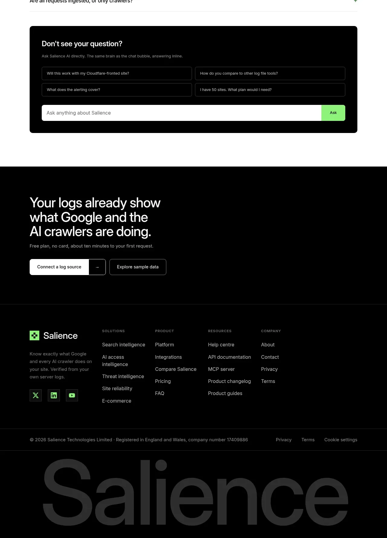
The closing area combines a strong final invitation, two calls to action, structured navigation columns, social links, legal metadata, and an oversized low-contrast brand wordmark.
Prompt preview
## Reference images

Study these alongside the description below: hierarchy, rhythm, spacing, colour. Build for the product you are asked about, using this design language.

- Component: https://kage-design-assets.t3.tigrisfiles.io/components/salience/db9244f7-ec48-4516-9a93-11a957a9eab9-1792303423-11.webp
- Full page it was cut from: https://kage-design-assets.t3.tigrisfiles.io/screenshots/salience/db9244f7-ec48-4516-9a93-11a957a9eab9-1792303314589-full.webp
- Component on Kage: https://kage.design/component/salience-footer

## Before you start
Ask what final conversion action matters most, which navigation groups the user's site needs, and what legal/social links are required. Apply those answers to an original closing area.

Create a near-black footer with a top conversion block: a large 38–50px white statement, one line of muted supporting text, and two buttons—a light primary button and outlined secondary button. Separate it from the navigation with a thin charcoal rule (#252925). Below, use a five-column footer grid: brand description and social buttons at left, then 3–4 groups of small uppercase labels with vertically stacked links. Use white #f7fff5, muted grey-green #839087, lime accent #8bea72, and charcoal borders #242824. Add a bottom legal row with copyright, privacy, terms, and cookie links. Finish with a huge cropped low-opacity wordmark-like typographic treatment using only the user's brand name, set in #202320 at roughly 150–190px; hide or reduce it on mobile. Keep all links keyboard accessible and stack columns responsively.

Never use logos, product names, copy, illustrations, or imagery from the reference.