kage
kage
autocaptioner.com
Design analysis
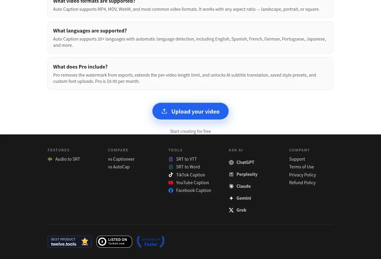
A dark footer organizes secondary links into multiple labeled columns, then closes with a divider and credibility badges near the bottom.
Prompt preview
## Reference images

Study these alongside the description below: hierarchy, rhythm, spacing, colour. Build for the product you are asked about, using this design language.

- Component: https://kage-design-assets.t3.tigrisfiles.io/components/autocaptioner-com/ff4d8c71-c21f-4141-9075-b069f1384c25-1792109433-7.webp
- Full page it was cut from: https://kage-design-assets.t3.tigrisfiles.io/screenshots/autocaptioner-com/ff4d8c71-c21f-4141-9075-b069f1384c25-1792109412255-full.webp
- Component on Kage: https://kage.design/component/autocaptioner-footer

## Before you start
Ask what the user's product, audience, and brand are, then apply the following principles to that product rather than copying this reference.

Create a dark footer beginning with a centered max-width content container. Use a near-black background around #171717, muted uppercase column labels in #8b8b8b, and light-gray links around #c8c8c8. Arrange four or five columns for product/features, comparisons, tools, AI or integrations, and company/support links; keep line-height comfortable and link hover states clear. Add a horizontal divider below the link groups, then reserve a bottom row for generic trust or certification badges and a small legal/copyright area. Use responsive stacking on mobile while preserving strong grouping and adequate contrast. Keep the footer visually quieter than the primary CTA.

Never use logos, product names, copy, illustrations, or imagery from the reference.