kage
kage
autocaptioner.com
Design analysis
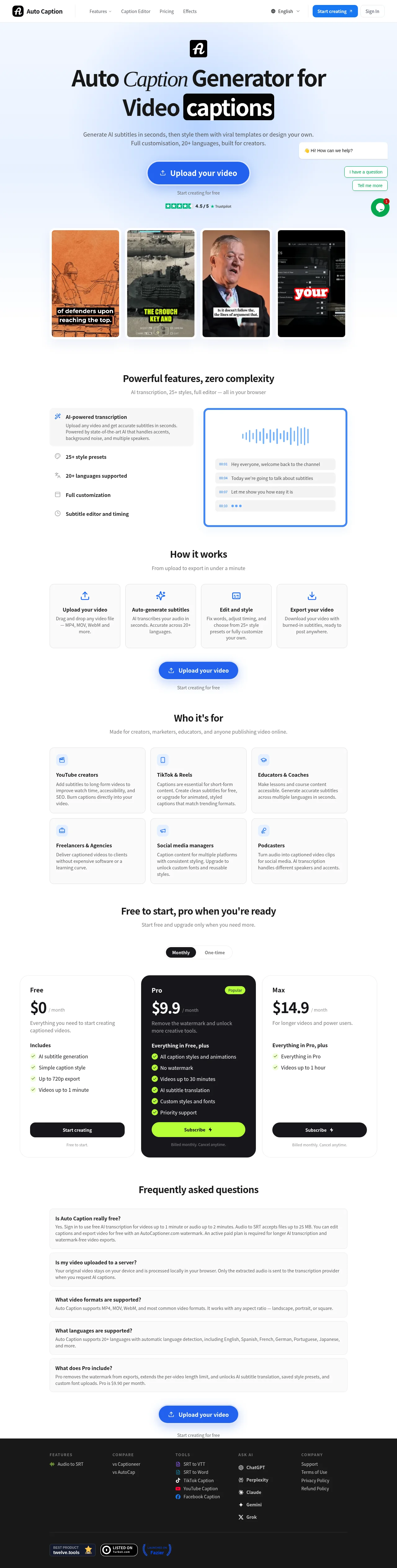
A light, conversion-focused landing page for a browser-based video captioning tool. The hero sets a bold sans headline with one serif-italic word and the key word inside a black rounded chip — the product's own burned-in-caption output turned into a brand device — above a blue pill CTA, a Trustpilot row and four vertical thumbnails that double as a caption-style catalogue. Below the hero the rhythm alternates: a split feature showcase with a blue-bordered transcript demo panel, a four-step process row, a 3×2 audience grid on gray fills, pricing where an elevated near-black Pro card with lime accents breaks the white field, gray FAQ accordion rows, a repeated centred CTA, and a dark five-column footer with badge chips.
Prompt preview
## Reference images

Study these alongside the description below: hierarchy, rhythm, spacing, colour. Build for the product you are asked about, using this design language.

- Full page: https://kage-design-assets.t3.tigrisfiles.io/screenshots/autocaptioner-com/ff4d8c71-c21f-4141-9075-b069f1384c25-1792109412255-full.webp
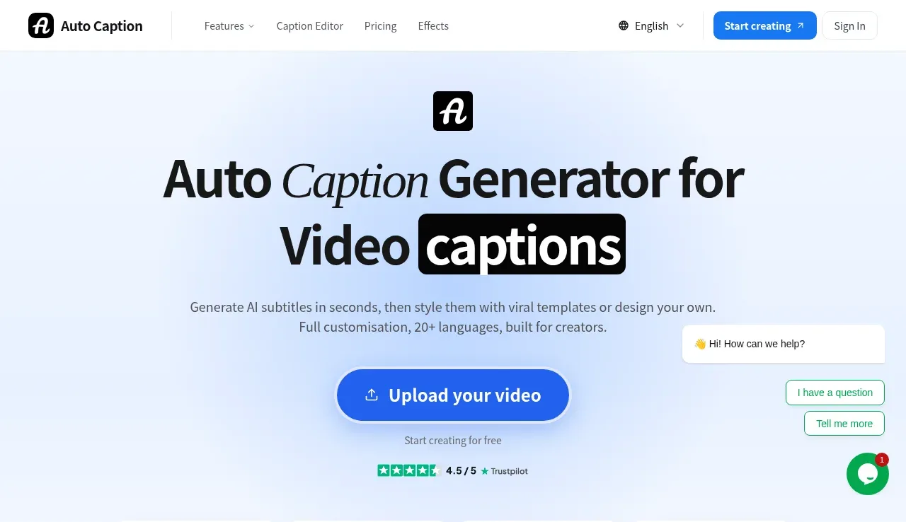
- Above the fold: https://kage-design-assets.t3.tigrisfiles.io/screenshots/autocaptioner-com/ff4d8c71-c21f-4141-9075-b069f1384c25-1792109407944.webp
- Design on Kage: https://kage.design/designs/autocaptioner-landing-page

## Before you start
Ask the user what product or page they are building, who it is for, and what brand assets they already have (name, logo, colours, type). Wait for their answers before writing any code. Everything below is applied to *their* product, not to the reference site.

## Page structure
1. **Sticky top nav** — white bar; logo mark + product name left; centre links (one dropdown with caret plus two or three anchors); right side a language selector, one filled pill button and a quiet text link.
2. **Hero** — centred on a soft blue-to-white gradient wash; small rounded app icon; a two-line display headline where one word is serif italic and one key word sits inside a black rounded "caption chip"; two-sentence subheading; one large pill CTA with an upload icon; a microcopy line under it; a star-rating trust row; a small floating support/chat card pinned at the right edge.
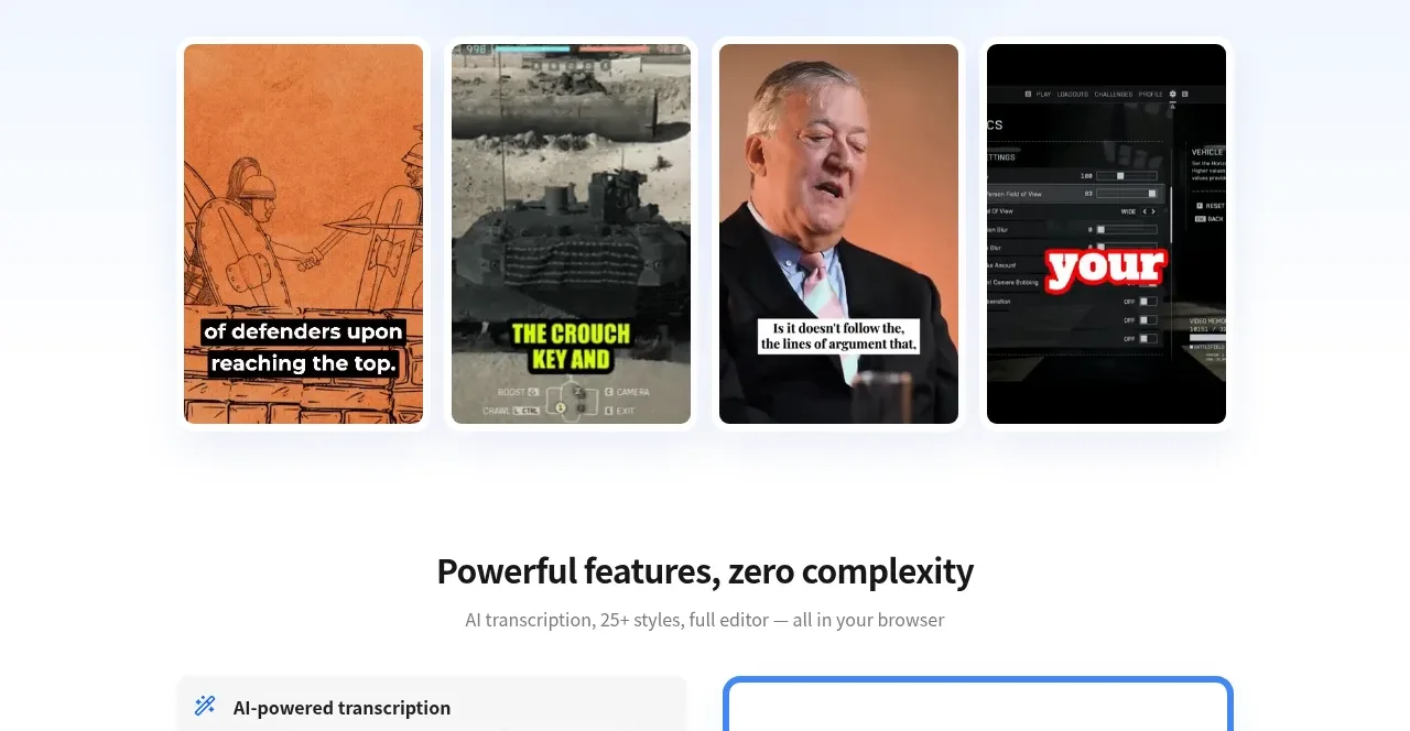
3. **Proof gallery** — a row of four 9:16 vertical thumbnails, each showing the product's output rendered in a different visual style, captions burned into the image.
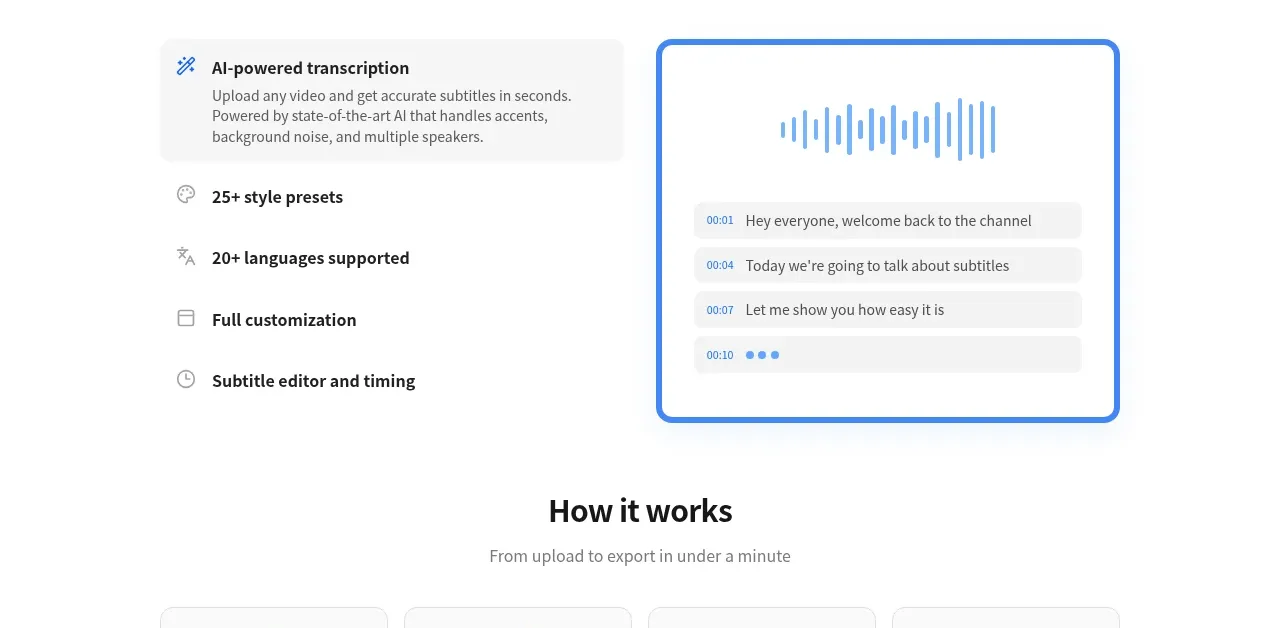
4. **Feature showcase** — centred H2 + one-line subtext; two-column split: left a selectable feature list where the active item expands into a light-gray card with a paragraph, right a large demo panel with a 2px primary-colour border showing a waveform and timestamped transcript lines.
5. **How it works** — centred H2 + subtext; four equal white bordered cards in one row, each with a primary-colour line icon, bold title and 2–3 line description; below them the primary CTA is repeated with microcopy.
6. **Audience grid** — centred H2 + subtext; a 3×2 grid of light-gray borderless cards, each with a small icon, bold audience name and 2–3 line description.
7. **Pricing** — centred H2 + subtext; a two-option billing toggle with the active option in a black pill; three tier cards where the middle tier is an elevated near-black card with a lime "Popular" badge and lime button, and the outer tiers are white with black buttons; feature lists use green check icons; microcopy under every button.
8. **FAQ** — centred H2; five full-width light-gray rounded rows, each a semibold question with its answer set beneath it.
9. **Closing CTA** — the same primary pill CTA + microcopy repeated, centred in generous whitespace.
10. **Footer** — near-black band with five link columns under small uppercase gray headers (feature pages, comparisons, tools, AI assistants, company); below the columns a row of third-party badge chips.

## Design language
- **Hierarchy:** centred, symmetrical sections; each section is one bold H2 (~36–40px) plus a single gray subline (~16px); body 14–16px at ~1.5 line height; never more than one accent treatment per section.
- **Signature motif:** turn the product's own output into a brand device — the reference sets a headline word inside a black rounded rectangle with white bold text, exactly like a burned-in video caption. Find the equivalent "output chip" for the user's product and use it once in the hero, not everywhere.
- **Colour:** white page base; a soft gradient wash only in the hero (light blue ~#eef4ff fading to white); one vivid primary for all CTAs (~#2563eb); near-black ~#0a0a0a for text, the highlighted pricing card and the footer; one high-energy accent (~lime #a3e635) used *only* inside the dark highlight card (badge, button, check icons) so it reads as special; neutral light gray ~#f5f5f7 for quiet cards and FAQ rows; 1px borders at ~#e5e7eb.
- **Type:** one geometric sans (Inter/Manrope-like) for everything, paired with a single serif italic used for exactly one emphasised word in the H1; scale roughly 64 / 40 / 20 / 16 / 14; 700 for headings, 600 for card titles, 400–500 for body; 11–12px letter-spaced uppercase labels for footer column headers.
- **Shape:** fully pill-shaped buttons (radius 999px); cards at 12–16px radius; the demo panel and highlight pricing card at 20–24px; shadows restrained — only the elevated pricing card and the floating chat card cast a soft shadow.
- **Rhythm down the page:** hero (airy, gradient) → proof strip (tight, visual) → split showcase (text left, demo right) → four-card row (even density) → six-card grid (denser, gray fills) → pricing (high contrast, dark centre) → FAQ (quiet gray rows) → closing CTA (airy again) → footer (dark, small type). Alternate white bands with gray-filled components so no two adjacent sections look alike.
- **CTA system:** one repeated primary pill (action verb + icon) appears in the hero, mid-page after the process section and at the bottom; every instance is followed by a 13px gray microcopy line.
- **Motion:** keep it quiet — 150–200ms ease transitions; slight lift or border darken on card hover; FAQ rows expanding smoothly; the feature list swapping the demo panel's content without moving the page.

## Never
- Do not use the Auto Caption name, logo, wordmark, or any of its copy, FAQ text, sample thumbnails or photography.
- Do not recreate its Trustpilot widget, third-party award badges, or the chat-assistant greeting.
- Never present the result as Auto Caption or imply any affiliation with it.
Components from this page
All components
 Top navigation
autocaptioner.com · Navigation
Top navigation
autocaptioner.com · Navigation
 Caption generation hero
autocaptioner.com · Hero
Caption generation hero
autocaptioner.com · Hero
 Feature overview with product preview
autocaptioner.com · Feature grid
Feature overview with product preview
autocaptioner.com · Feature grid
 Four-step workflow
autocaptioner.com · Feature grid
Four-step workflow
autocaptioner.com · Feature grid
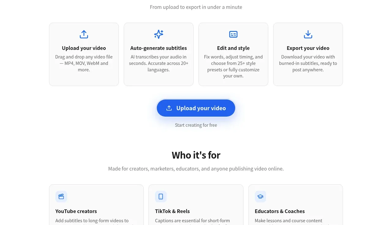 Audience use cases
autocaptioner.com · Feature grid
Audience use cases
autocaptioner.com · Feature grid
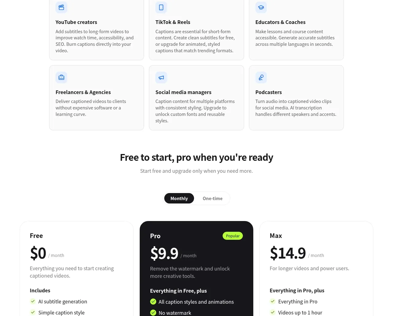 Three-tier pricing
autocaptioner.com · Pricing table
Three-tier pricing
autocaptioner.com · Pricing table
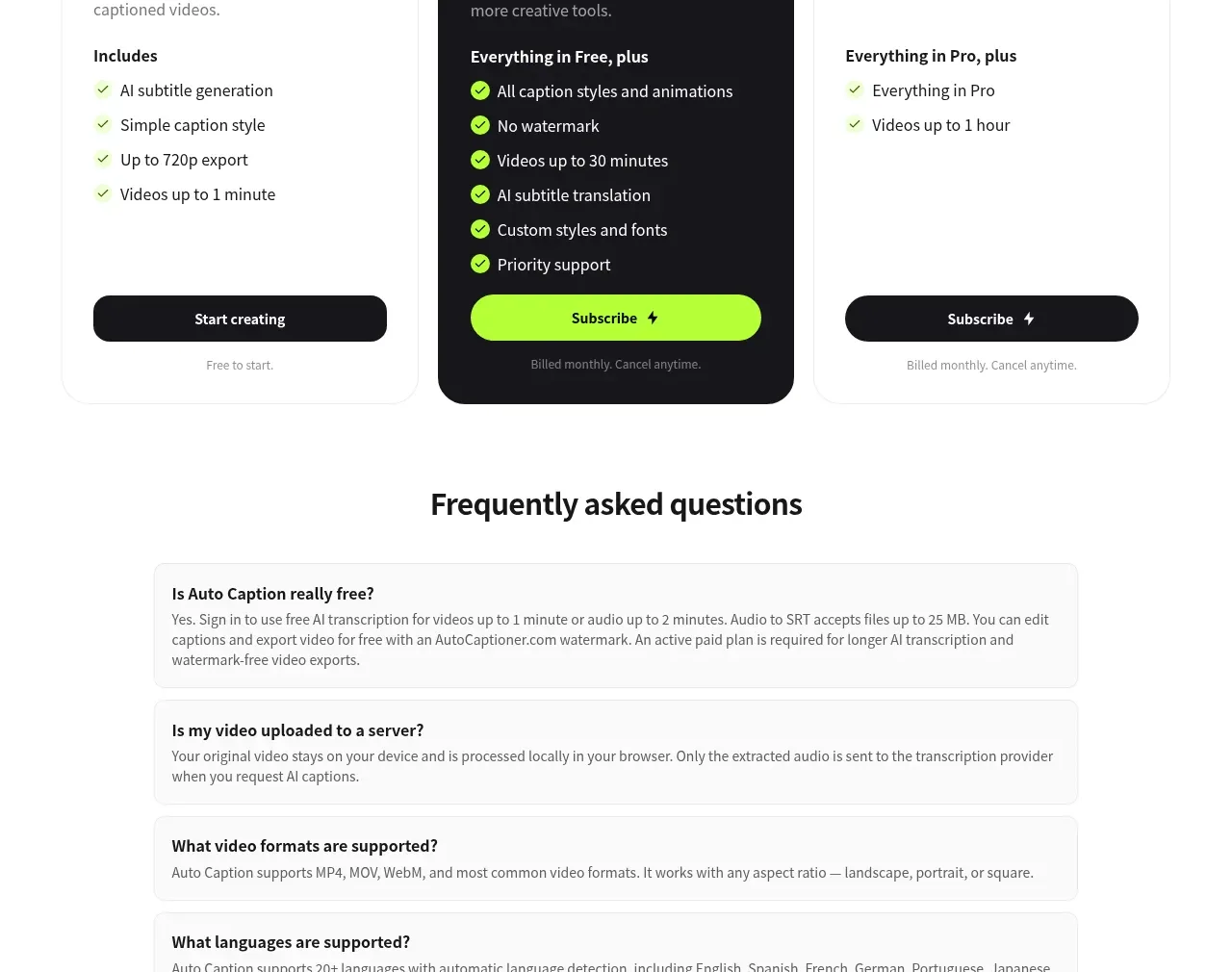 Frequently asked questions
autocaptioner.com · FAQ
Frequently asked questions
autocaptioner.com · FAQ
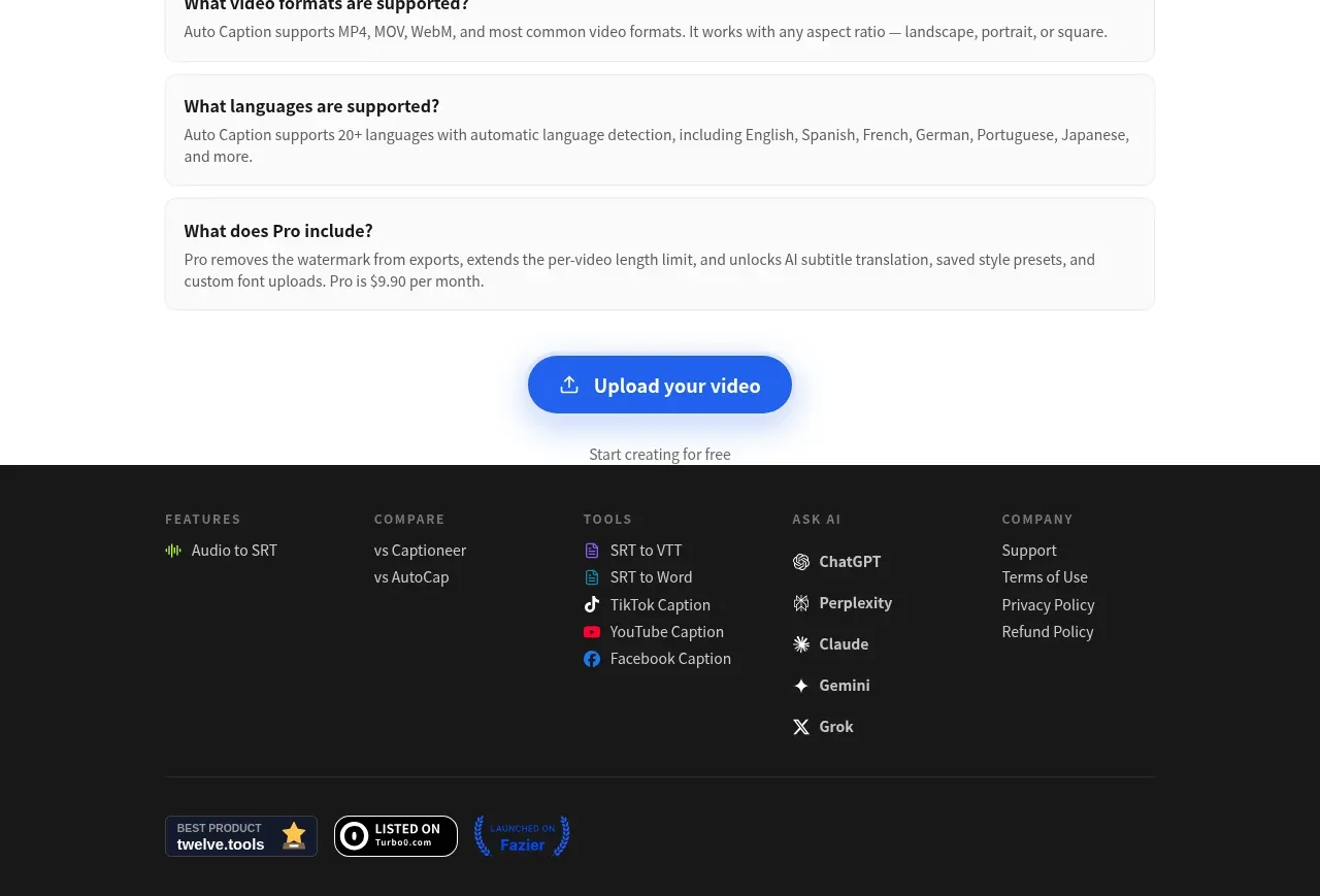 Dark multi-column footer
autocaptioner.com · Footer
Dark multi-column footer
autocaptioner.com · Footer