 kage
kage
autocaptioner.com
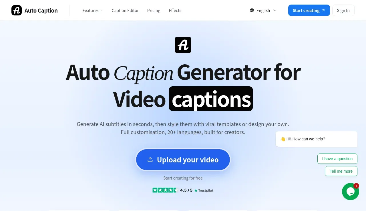
Design analysis
A pale blue hero centers a small product mark, oversized two-line headline, supporting copy, a prominent upload button, trust rating, and a row of example captioned videos.
Prompt preview
## Reference images

Study these alongside the description below: hierarchy, rhythm, spacing, colour. Build for the product you are asked about, using this design language.

- Component: https://kage-design-assets.t3.tigrisfiles.io/components/autocaptioner-com/ff4d8c71-c21f-4141-9075-b069f1384c25-1792109432-1.webp
- Full page it was cut from: https://kage-design-assets.t3.tigrisfiles.io/screenshots/autocaptioner-com/ff4d8c71-c21f-4141-9075-b069f1384c25-1792109412255-full.webp
- Component on Kage: https://kage.design/component/autocaptioner-hero

## Before you start
Ask what the user's product, audience, and brand are, then apply the following principles to that product rather than copying this reference.

Create a centered hero directly below the navigation. Use a very pale blue background near #eef5ff, generous top and bottom whitespace, and a narrow readable content measure. Place a small brand/product symbol above an oversized two-line headline, using a 48–56px bold sans-serif with one emphasized phrase in a dark rounded capsule. Add two short lines of supporting copy in #53606d, then a large blue pill-shaped primary upload/action button with a subtle glow and a small secondary reassurance line below it. Include a compact trust-rating row. Beneath the CTA, show four evenly spaced portrait media cards with rounded 8px corners, thin borders, and caption overlays; use generic placeholder media rather than specific source imagery. Maintain a calm visual hierarchy and make the CTA keyboard accessible.

Never use logos, product names, copy, illustrations, or imagery from the reference.
More components
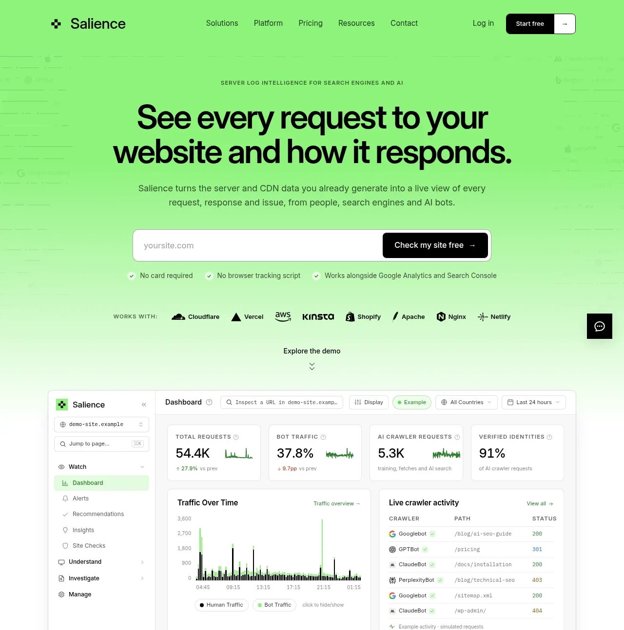
 Product promise and site checker hero
Salience · Hero
Product promise and site checker hero
Salience · Hero
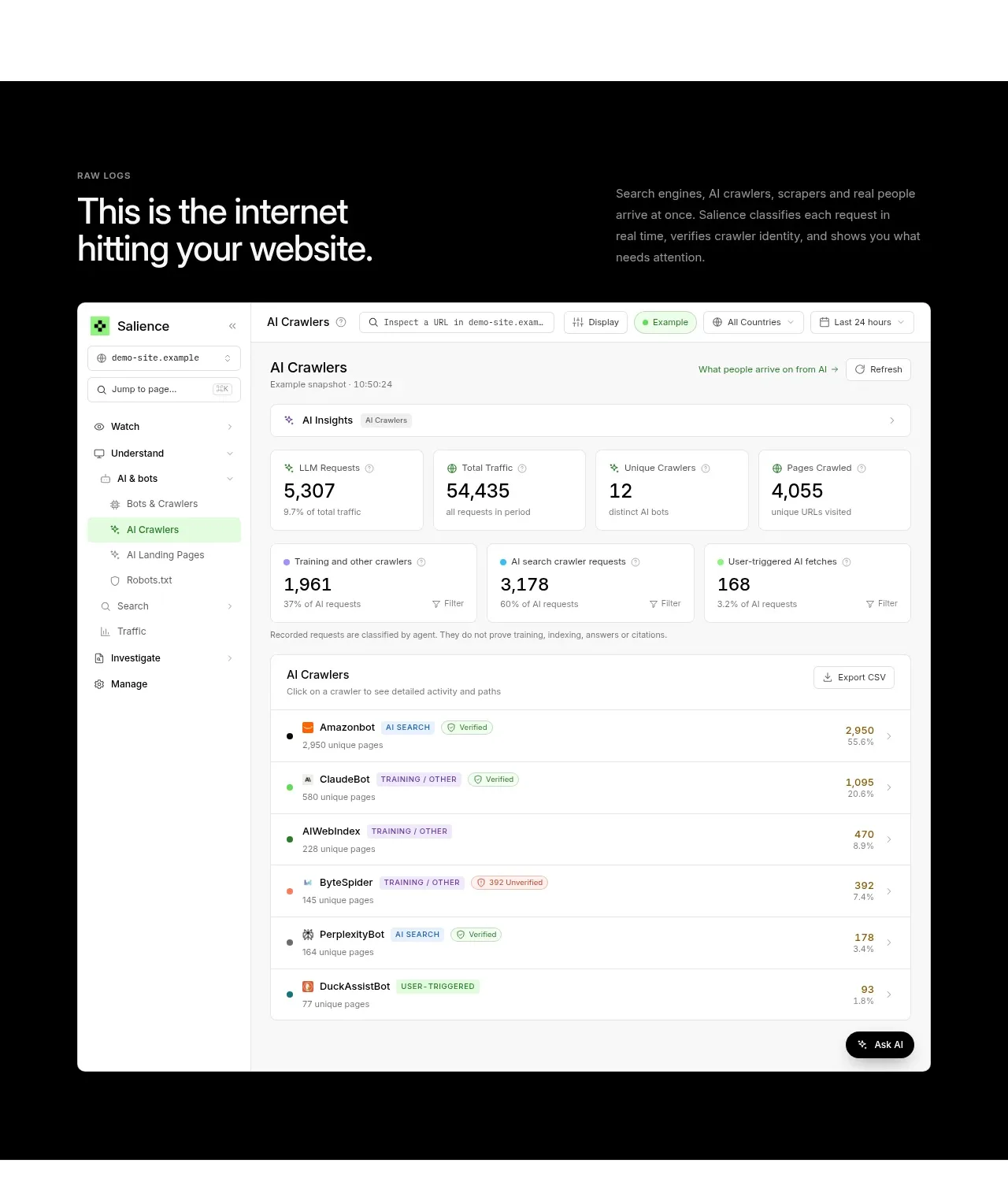 Raw activity dashboard showcase
Salience · Hero
Raw activity dashboard showcase
Salience · Hero
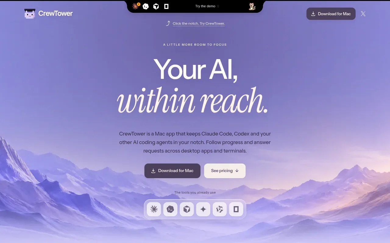
 Focus-oriented hero
CrewTower Mod for Claude Code · Hero
Focus-oriented hero
CrewTower Mod for Claude Code · Hero
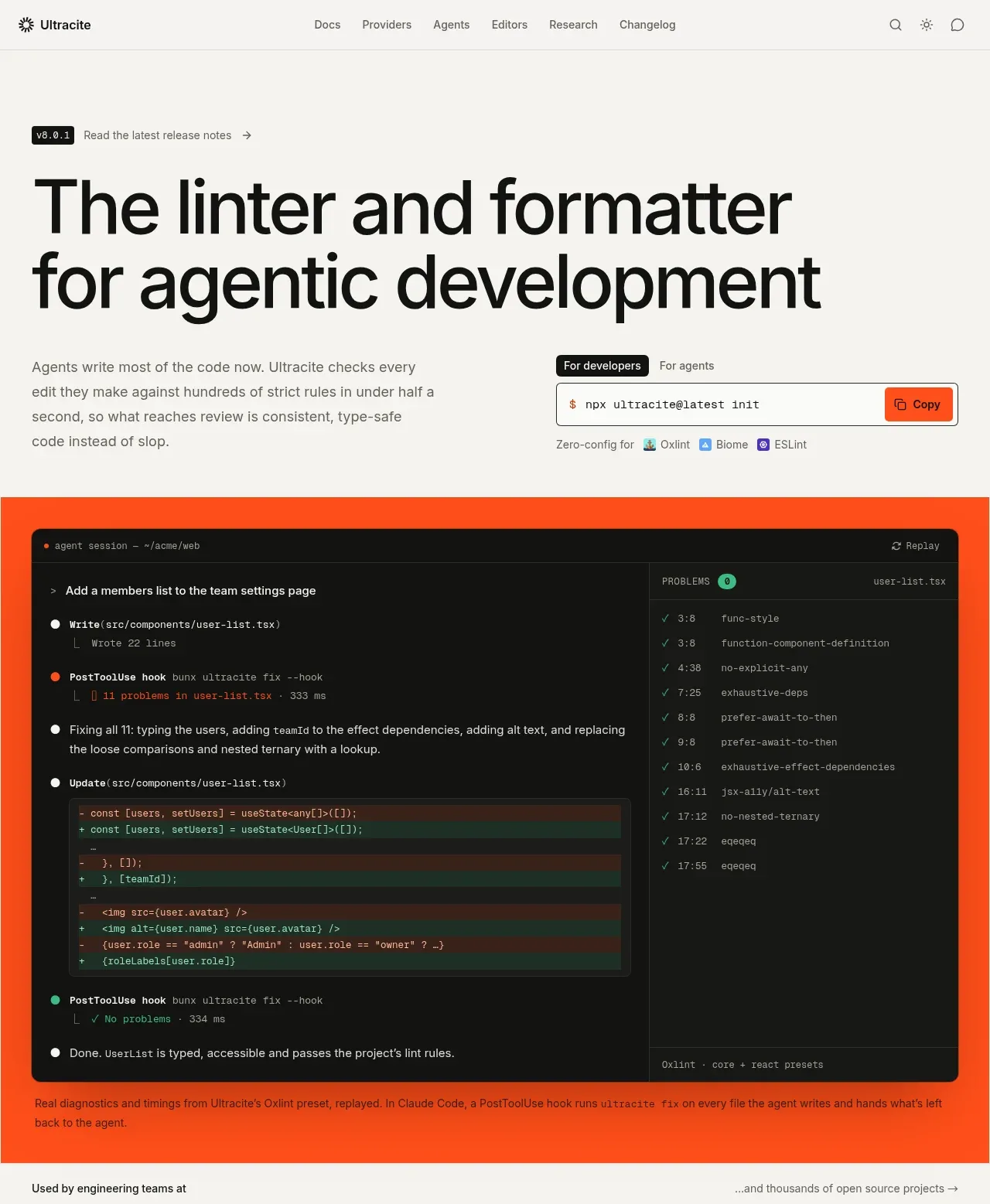
 Agentic development hero with live terminal preview
Ultracite v8 · Hero
Agentic development hero with live terminal preview
Ultracite v8 · Hero
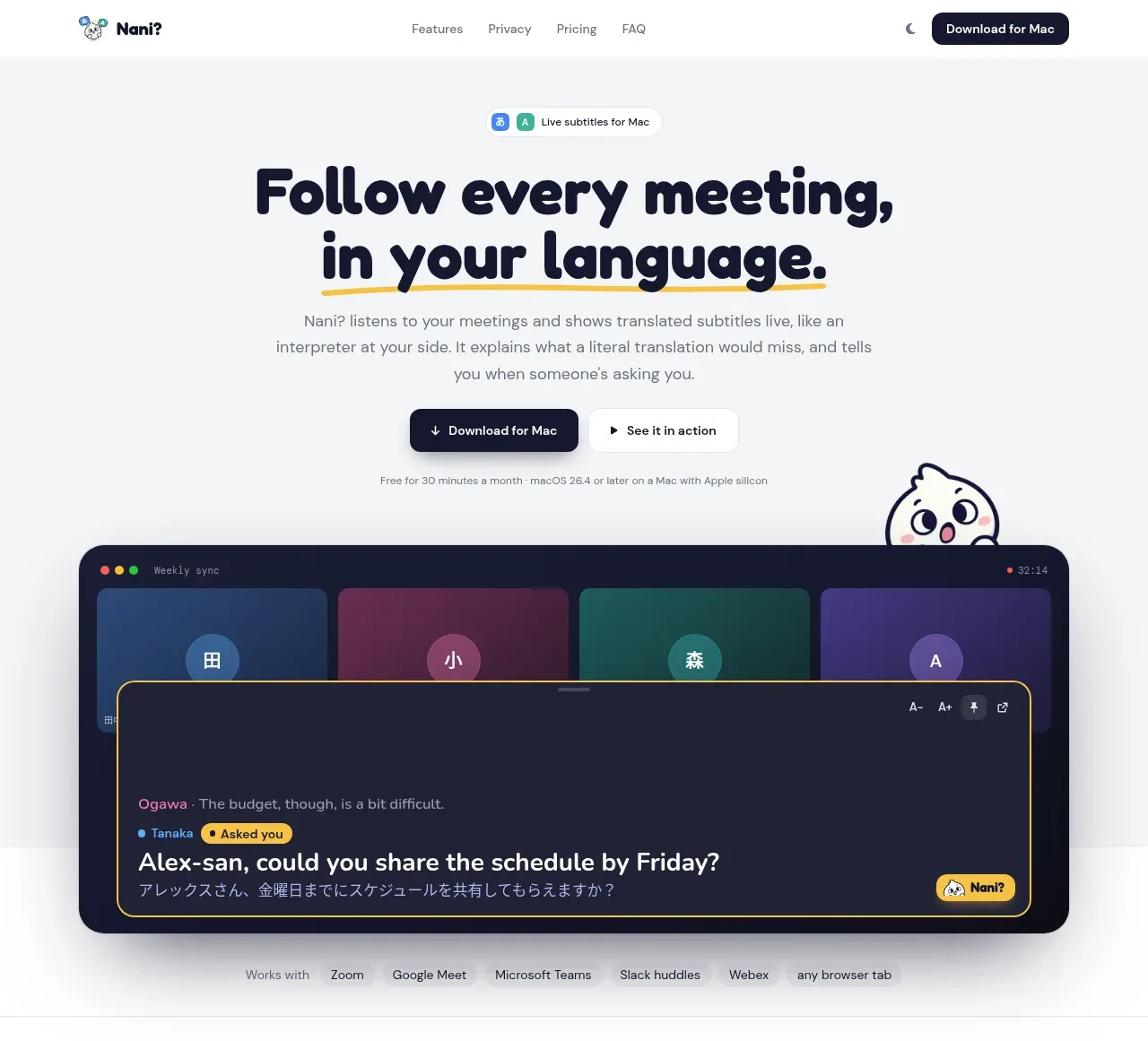
 Translation meeting hero
NANI??? · Hero
Translation meeting hero
NANI??? · Hero
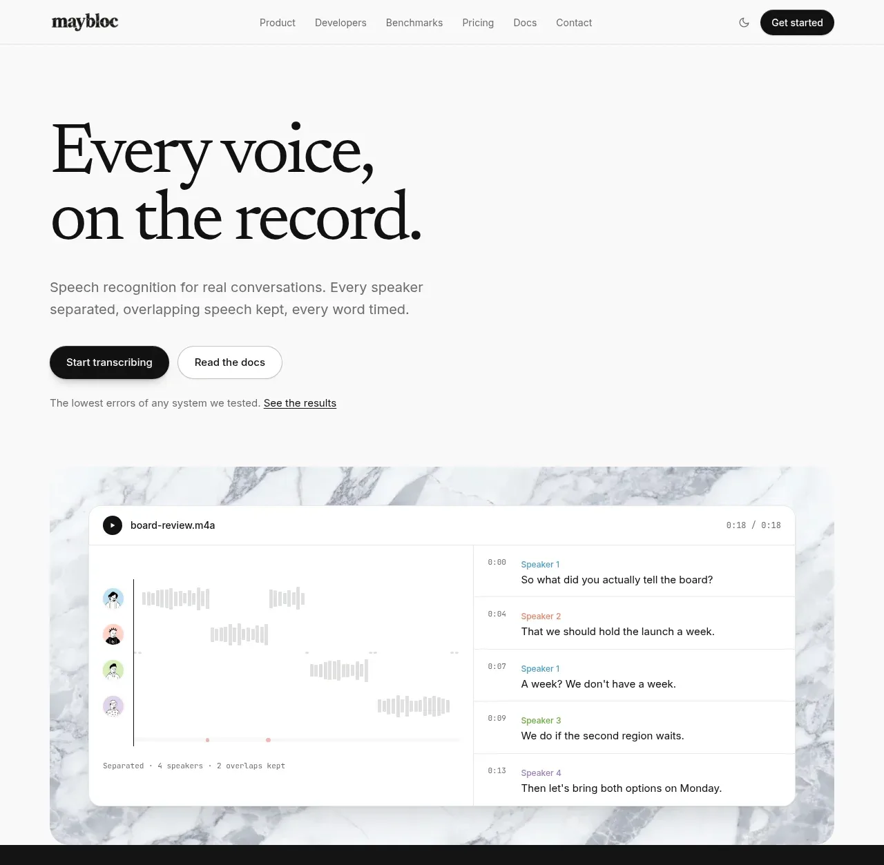
 Editorial speech transcription hero
Maybloc · Hero
Editorial speech transcription hero
Maybloc · Hero