kage
kage
axari.ai
Design analysis
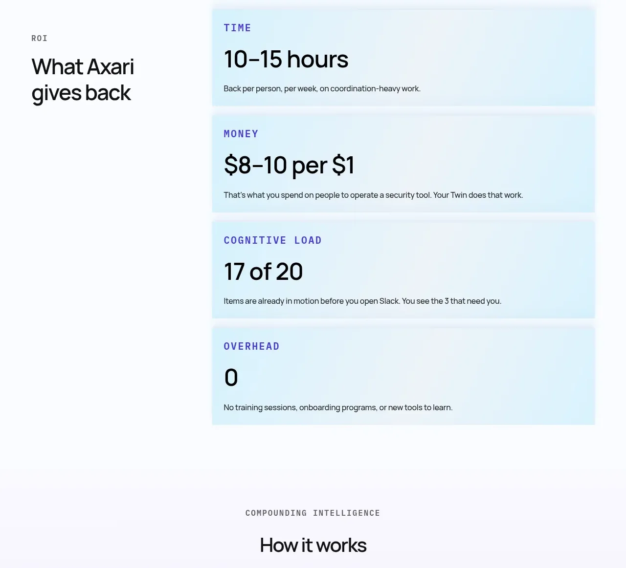
A two-column impact section uses a strong left-side statement and stacked tinted metric cards to make time, money, workload, and overhead tangible.
Prompt preview
## Reference images

Study these alongside the description below: hierarchy, rhythm, spacing, colour. Build for the product you are asked about, using this design language.

- Component: https://kage-design-assets.t3.tigrisfiles.io/components/axari/3e8824e7-9cff-44d5-8739-31a0e173005a-1789538688-6.webp
- Full page it was cut from: https://kage-design-assets.t3.tigrisfiles.io/screenshots/axari/3e8824e7-9cff-44d5-8739-31a0e173005a-1789538612563-full.webp
- Component on Kage: https://kage.design/component/axari-stats

## Before you start
Ask what measurable outcomes the user's product can substantiate and which audience cares about them most. Use only defensible metrics.

Build a spacious metrics section on an off-white background `#fbfbfd`. Put a small section index or eyebrow and a large two-line heading in a narrow left column. In the wider right column, stack four pale blue metric cards (`#e1f5fb`) with a small uppercase label in blue-violet, an oversized numeric value, and one sentence of context. Use 28–44px metric numbers, 12–14px labels, 16–24px internal padding, subtle borders/shadows, and consistent card heights. Keep the left column sticky or visually anchored on desktop, stack on mobile, and animate numbers only when motion is accessible and meaningful.

Never: copy logos, product names, copy, illustrations, or imagery from the reference.