kage
kage

Design analysis
Landing page for an AI "digital twin" product for security teams, built on a white base with rounded, pale blue-to-lavender gradient panels framing the hero and workforce sections. The signature move is a monospace uppercase labelling system — eyebrows, "DONE WHEN" card footers, ROI categories, timeline nodes — paired with a soft medium-weight grotesk for headlines, and purple reserved strictly for accents (the hero's final word, icon chips, timeline dots, stat numerals, primary nav link). Proof escalates in artifact density down the page: a Slack-style chat mockup, a pull quote over an integrations marquee, a full-bleed lineup of five identical AI personas with a boxed headline and checklist capability cards, a tinted stack of oversized ROI numerals, a Day/Week/Month timeline with product screenshots, and three trust columns, before two near-black bands (founder quote, footer) close the page. Photographic persona portraits carry floating white spec chips, and hairline-bordered white cards float over every gradient so the colour does the sectioning work.
Prompt preview
## Reference images

Study these alongside the description below: hierarchy, rhythm, spacing, colour. Build for the product you are asked about, using this design language.

- Full page: https://kage-design-assets.t3.tigrisfiles.io/screenshots/axari/3e8824e7-9cff-44d5-8739-31a0e173005a-1789538612563-full.webp
- Above the fold: https://kage-design-assets.t3.tigrisfiles.io/screenshots/axari/3e8824e7-9cff-44d5-8739-31a0e173005a-1789538606920.webp
- Design on Kage: https://kage.design/designs/axari-landing-page

# Build a landing page in the style of this reference

## Before you start
Ask the user these questions and wait for the answers before writing any code:
- What product are you building and what does it do in one sentence?
- Who is it for (role and industry of the buyer)?
- What brand assets exist: name, logo, primary accent colour, and any preferred fonts? If no fonts exist, propose a grotesk sans + monospace pairing.
- Do they have real product screenshots, customer quotes, or integration names to feature, or should those be plausible placeholders they will swap later?
Apply everything below to *their* product and brand, never to the reference product.

## Page structure
Build one long scrollable page, top to bottom:
1. **Top nav** — slim white bar: logo left; 2–3 centred text links; right side one accent-coloured text link (primary action) and one neutral text link (secondary). No buttons in the bar.
2. **Hero panel** — a full-width rounded container filled with a soft blue-to-lavender gradient, inset from the viewport edges. Inside: a monospace uppercase eyebrow naming the category; a very large one-line "equation" headline (use arithmetic symbols like + and =, with one accent-coloured word); two pill CTAs side by side (solid dark pill + white pill). Below the CTAs, two portrait cards side by side — the human persona and the AI persona — each with a small floating white chip card listing three responsibilities under a monospace header (e.g. "YOU · 9 AM–6 PM" vs the AI equivalent running 24/7).
3. **Proof mockup** — monospace eyebrow ("what that looks like" style), then one large app mockup card: dark sidebar with workspace name, channel list and DM entries; chat thread with bot messages interleaved with human replies, timestamps, avatars, and two inline action buttons. Build it as a generic chat/collaboration UI in the user's brand, not a specific real product's interface.
4. **Quote + integrations** — a monospace uppercase pull quote with a small attribution line, then a single-row logo marquee of the tools the product works with (user's own integrations).
5. **Workforce section** — full-bleed gradient background. A headline sits inside a plain white box overlapping a band of stylised persona imagery (a lineup of AI "workers" in the user's own visual identity). Below, three white capability cards floating on the gradient: purple rounded icon chip, bold title, 3–4 checklist rows each led by a small tool glyph, and a footer kicker in monospace reading "DONE WHEN" followed by the concrete completion criterion. Round arrow buttons under the row indicate a carousel.
6. **Trusted-by band** — monospace label "trusted by security teams from these companies" style, then a row of 5–6 customer wordmarks.
7. **ROI section** — left column: monospace label plus a short two-line heading ("What [product] gives back"). Right column: a vertical stack of four lightly tinted rows, each with a monospace category label (TIME, MONEY, ...), a huge numeral result ("10–15 hours"), and a one-line plain explanation underneath.
8. **How it works** — centred monospace eyebrow plus heading, then a horizontal three-node timeline with small accent dots on a hairline line: DAY 01 / WEEK 01 / MONTH 01 in monospace, each node a card with a title, one-two sentence copy, and a product screenshot. Arrow buttons for carousel.
9. **Trust columns** — monospace eyebrow, a large two-line headline making a pointed contrast claim, then three columns each headed by a monospace category (CONTROL-style) with 4–5 icon-plus-text list rows.
10. **Founder quote band** — full-width near-black block with an oversized accent-coloured quotation mark, a large two-line quote, and a monospace attribution.
11. **Footer** — dark: logo, "follow us" social icons right, a single row of small underlined links (contact email, privacy, security, terms, support, cookies), and a copyright line.

## Design language
- **Sectioning by colour, not rules:** white page base; major sections live inside large rounded panels filled with a pale blue→lavender gradient (≈ #d7e8fb → #e6defb); two near-black bands (≈ #131316) bracket the end of the page. White cards with hairline #e5e7eb borders float on top of every tinted area.
- **Accent discipline:** one purple accent (≈ #6d4aff) used only for the headline's key word, icon chips, timeline dots, stat numerals, and the primary nav link. Never for backgrounds or body text.
- **The monospace system is the signature:** all eyebrows, card footers ("DONE WHEN"), ROI categories, timeline node labels, quote attributions and the nav-adjacent category labels are 11–12px monospace, uppercase, letter-spaced ~0.08em, in gray #6b7280 or accent purple. Headlines and body use a single medium-weight grotesk (Inter/Söhne-like), 500–600 weight, tight tracking, near-black #101018.
- **Type scale rhythm:** hero headline ~72–88px and roughly one line; section headlines 32–48px; stat numerals 56–72px in the mono face; body 14–16px with generous line height. Density alternates: airy hero → dense mockup → airy quote → dense cards → tall stat rows → dense timeline.
- **Shape and shadow:** 16–24px radius on cards, 24–32px on gradient section panels, fully rounded pills for buttons and floating chips. Shadows are soft and low (small blur, ~4–8% opacity) — elevation signals "floating chip", not importance.
- **Imagery treatment:** photographic or rendered persona portraits are cropped into rounded cards with small white spec cards overlapping their corners; product screenshots are shown at real UI fidelity inside plain cards; small tool glyphs appear inline inside checklist rows.
- **Interaction:** carousels use small round white arrow buttons with hairline borders; nav primary link is coloured text, not a button; hover states elevate cards slightly. Keep motion minimal and functional.

## Never
- Do not copy the reference's name, logo, wordmark, tagline, headline copy, or the "AI twin / Indefatigable" phrasing; invent equivalent copy for the user's product.
- Do not recreate the Slack interface or use Slack's brand colours for the chat mockup — build a generic chat UI in the user's brand.
- Do not reuse the visor-wearing figures, the "five identical AI workers" photography concept verbatim, or any of the reference's people photos.
- Do not use real customer logos, employee names, quotes, or third-party product logos (Slack, Wiz, GitHub, Gmail, etc.) — substitute the user's own customers and integrations or clearly generic placeholders.
- Never present the result as the reference product or imply endorsement by it.
Components from this page
All components
 Minimal top navigation
Axari · Navigation
Minimal top navigation
Axari · Navigation
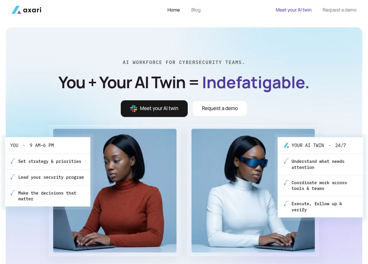 AI workforce hero
Axari · Hero
AI workforce hero
Axari · Hero
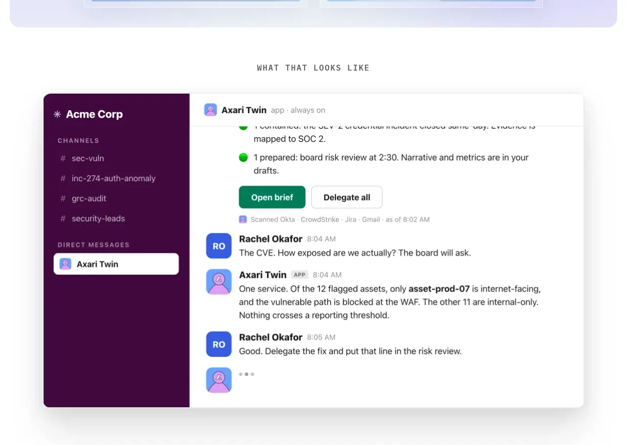 Product conversation proof
Axari · Card
Product conversation proof
Axari · Card
 Customer quote and social proof
Axari · Testimonials
Customer quote and social proof
Axari · Testimonials
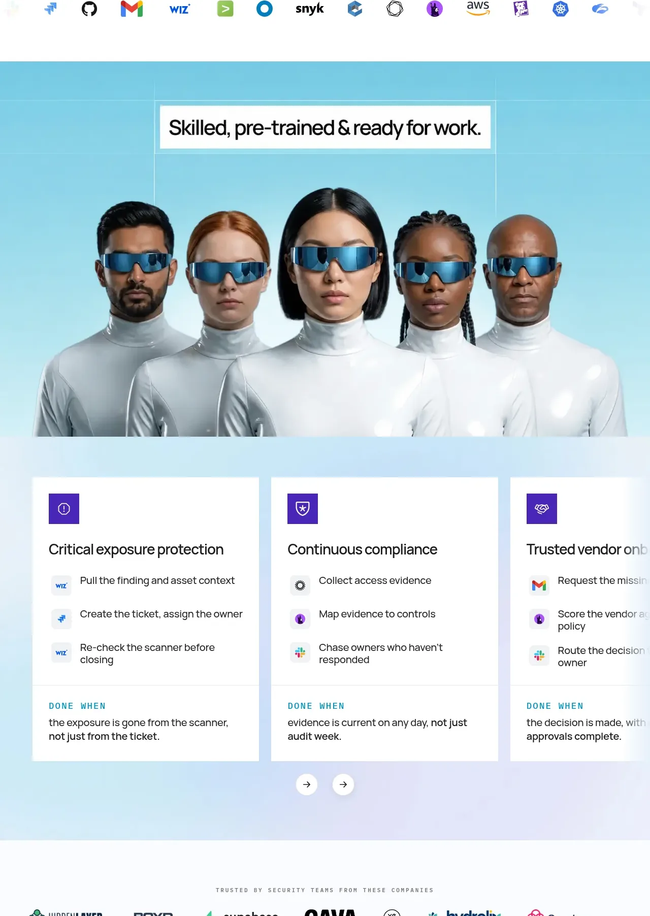 Pre-trained workforce capabilities
Axari · Feature grid
Pre-trained workforce capabilities
Axari · Feature grid
 Trusted-by company row
Axari · Logo cloud
Trusted-by company row
Axari · Logo cloud
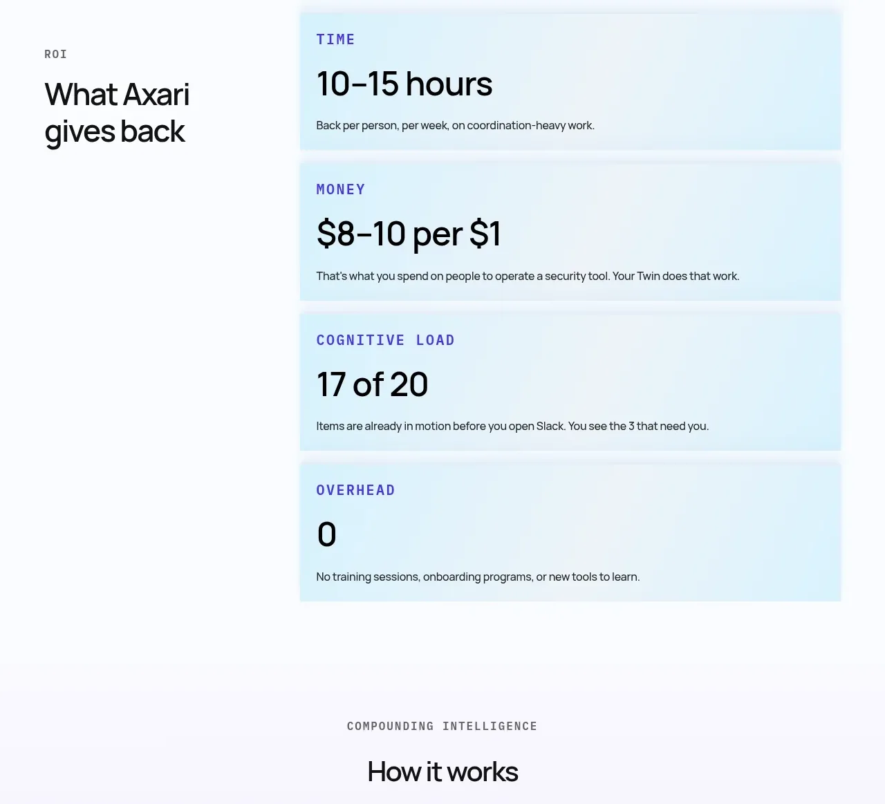 Operational impact metrics
Axari · Stats
Operational impact metrics
Axari · Stats
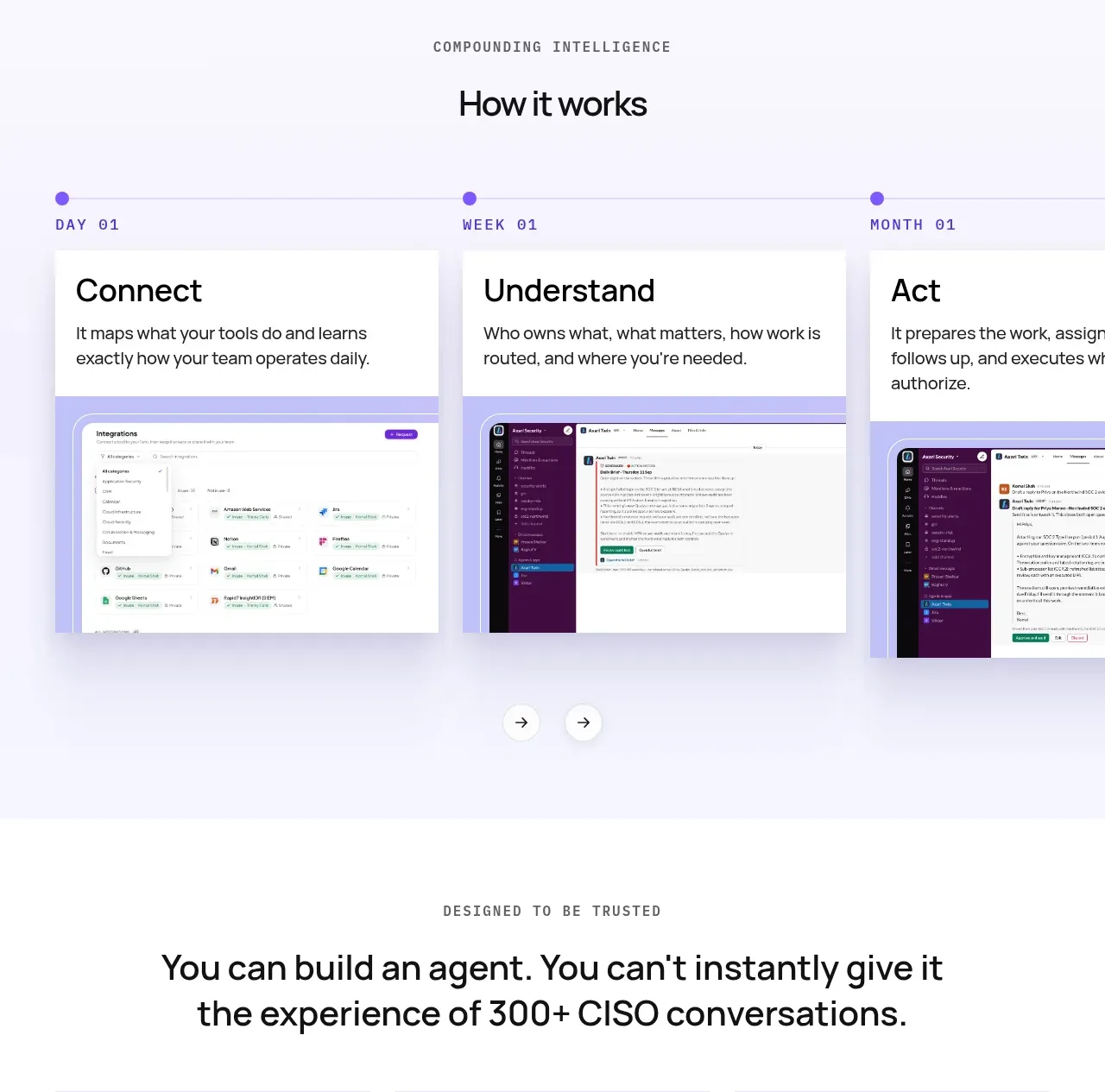 How the workflow works
Axari · Tabs & steps
How the workflow works
Axari · Tabs & steps
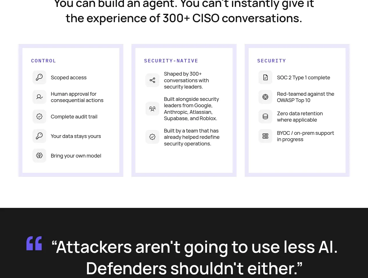 Trust and security principles
Axari · Feature grid
Trust and security principles
Axari · Feature grid
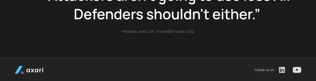 Closing founder quote
Axari · Testimonials
Closing founder quote
Axari · Testimonials
 Dark utility footer
Axari · Footer
Dark utility footer
Axari · Footer