 kage
kage
partners.axiom.co
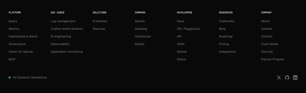
Design analysis
A short centered CTA repeats the core promise, adds a low-risk reassurance, and presents two clear conversion paths before the footer.
Prompt preview
## Reference images

Study these alongside the description below: hierarchy, rhythm, spacing, colour. Build for the product you are asked about, using this design language.

- Component: https://kage-design-assets.t3.tigrisfiles.io/components/axiom/c8c1ccab-fdeb-4f51-a10a-de94b7cc1af3-1789711533-11.webp
- Full page it was cut from: https://kage-design-assets.t3.tigrisfiles.io/screenshots/axiom/c8c1ccab-fdeb-4f51-a10a-de94b7cc1af3-1789711409328-full.webp
- Component on Kage: https://kage.design/component/axiom-cta

## Before you start
Ask what the user's strongest closing promise is and which two conversion paths should be offered. Apply these principles with original content.

Create a centered, spacious CTA band on a near-black background. Use a large 30–38px off-white headline, one muted reassurance line beneath, and two buttons: a warm orange primary action and a dark outlined or filled secondary action. Keep the content within a 620px max-width, use 16–24px gaps, 6px radius, and a subtle top/bottom divider if needed. The CTA should feel calm and confident rather than sales-heavy. Stack buttons on narrow screens and maintain strong focus states.

Never: copy logos, product names, copy, illustrations, or imagery from the reference.
More components
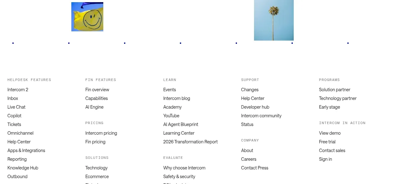
 Final customer experience call to action
intercom.com · Call to action
Final customer experience call to action
intercom.com · Call to action
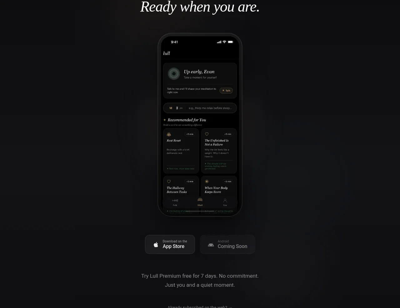
 App download conversion
Lull · Call to action
App download conversion
Lull · Call to action

 Centered final call to action
ApplySeed · Call to action
Centered final call to action
ApplySeed · Call to action
F
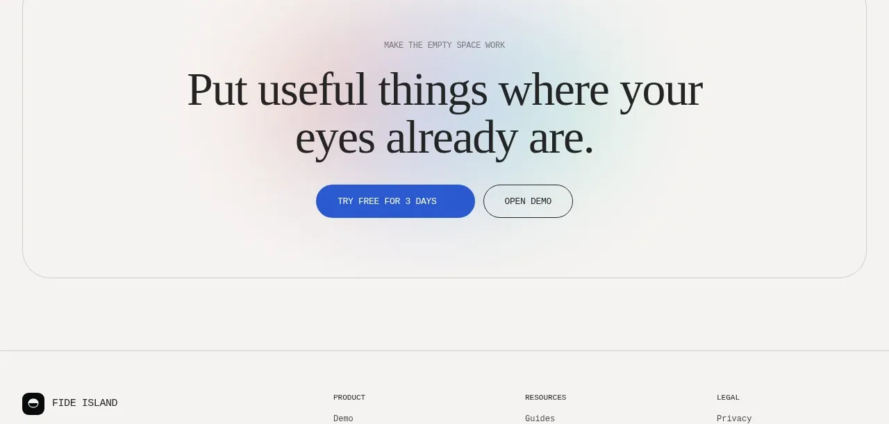
Final conversion call to action
Fide Island · Call to action

 Inline conversion banner
QAgent · Call to action
Inline conversion banner
QAgent · Call to action
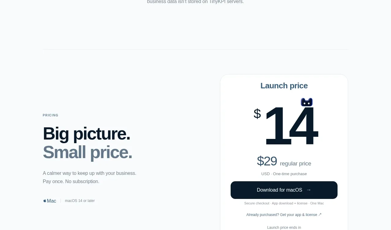
 Privacy promise
TinyKPI · Call to action
Privacy promise
TinyKPI · Call to action