kage
kage
partners.axiom.co

Design analysis
A near-black, engineer-first landing page where the product UI does the persuading: oversized white statement headlines on pure black, then long embedded screenshots of query editors, data tables, a pricing slider and a terminal. The single orange accent (#f97316-ish) is rationed to CTAs, links, badges and chart highlights, while monospace type carries eyebrows, attributions and all data. Rhythm alternates between full-width text-led statements, three-card visual grids, and two-column feature rows, with density concentrated inside the mockups rather than the marketing copy.
Prompt preview
## Reference images

Study these alongside the description below: hierarchy, rhythm, spacing, colour. Build for the product you are asked about, using this design language.

- Full page: https://kage-design-assets.t3.tigrisfiles.io/screenshots/axiom/c8c1ccab-fdeb-4f51-a10a-de94b7cc1af3-1789711409328-full.webp
- Above the fold: https://kage-design-assets.t3.tigrisfiles.io/screenshots/axiom/c8c1ccab-fdeb-4f51-a10a-de94b7cc1af3-1789711405948.webp
- Design on Kage: https://kage.design/designs/axiom-landing-page

## Before you start
Ask the user what product they are building, who it is for, and what brand assets they already have (name, logo, colours, typefaces). Wait for the answers. Everything below is a design language to apply to *their* product — do not build the reference product.

## Page structure
1. **Top nav** — slim fixed bar on near-black: logo left, six plain text links centred (Platform, Solutions, Use cases, Pricing, Docs, Resources pattern), right side a muted "Sign in" link plus a small solid-accent pill CTA with an arrow glyph.
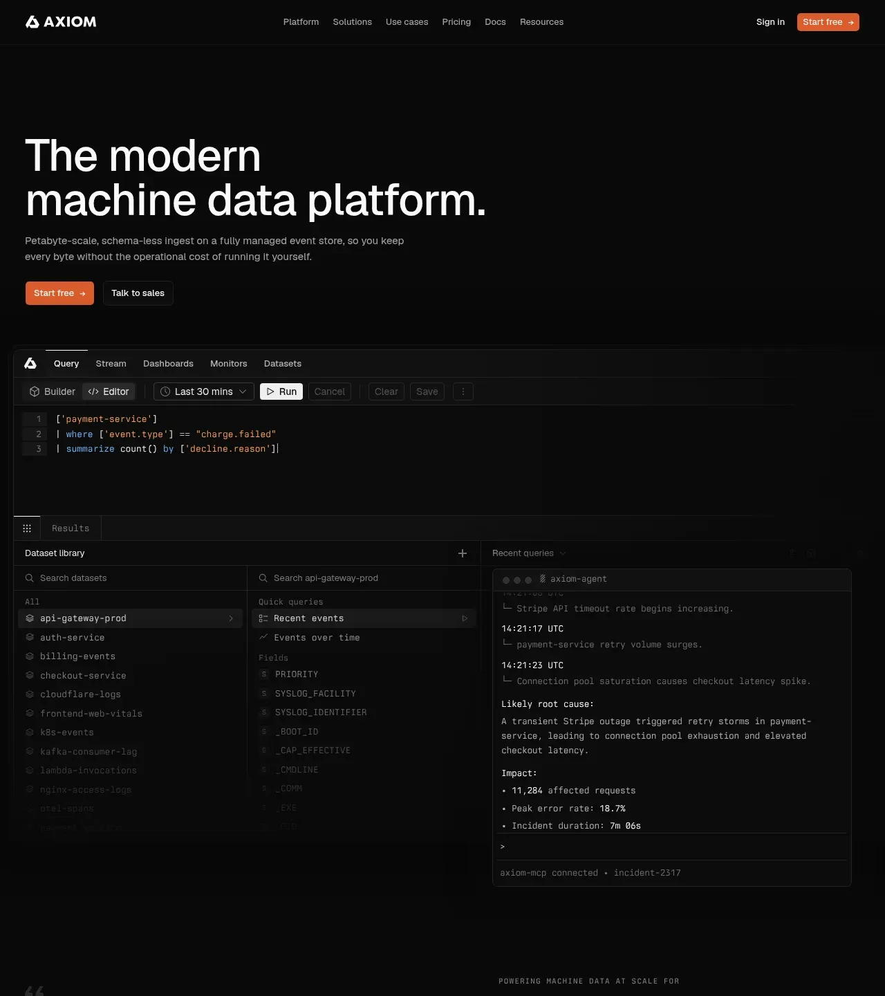
2. **Hero** — full-bleed black. An oversized two-line sans headline stating the category in plain words, a 2-line grey sub-paragraph, then two buttons side by side: solid accent "Start free →" and a 1px-border ghost "Talk to sales".
3. **Full-width product screenshot** — a dark app frame showing tabs (Query / Stream / Dashboards / Monitors / Datasets), a query editor with syntax-highlighted monospace code, a left sidebar listing datasets, a results table, and a side panel with an AI incident-analysis card. Immediately proves the product with real-looking UI.
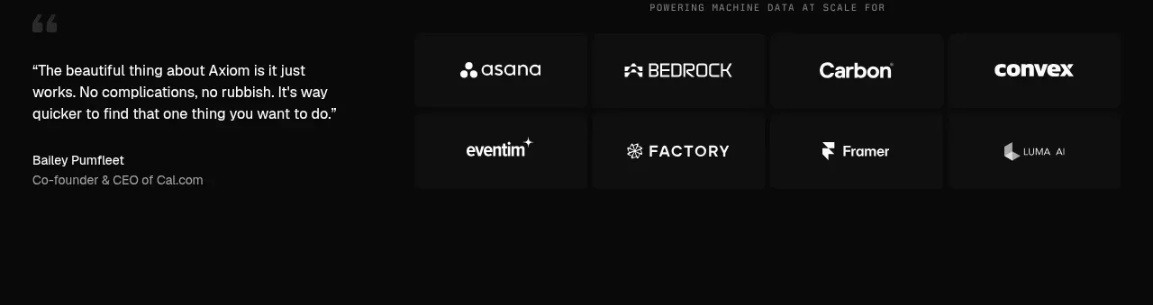
4. **Proof band** — monospace uppercase eyebrow ("Powering machine data at scale for"), a large pull quote with orange quotation mark on the left (name + role + company beneath), and a 4×2 grid of customer logos in bordered cells on the right.
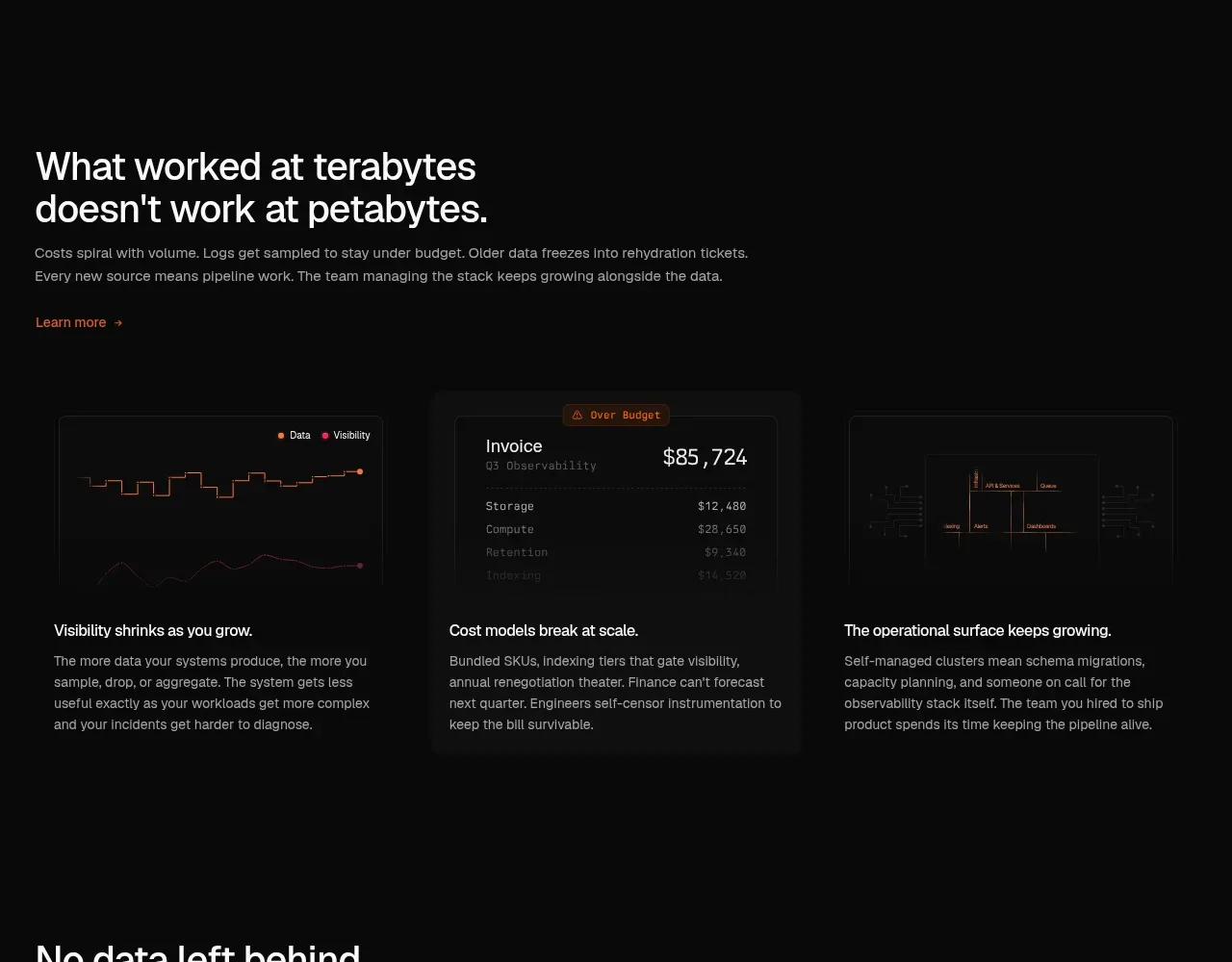
5. **Problem section** — big statement headline ("What worked at terabytes doesn't work at petabytes."), short paragraph, orange "Learn more →" text link; below, three equal cards each with a mini data-visual on top (a sparkline chart, an invoice card flagged "Over Budget", a network/ops diagram) and a one-line title + 3-line body beneath.
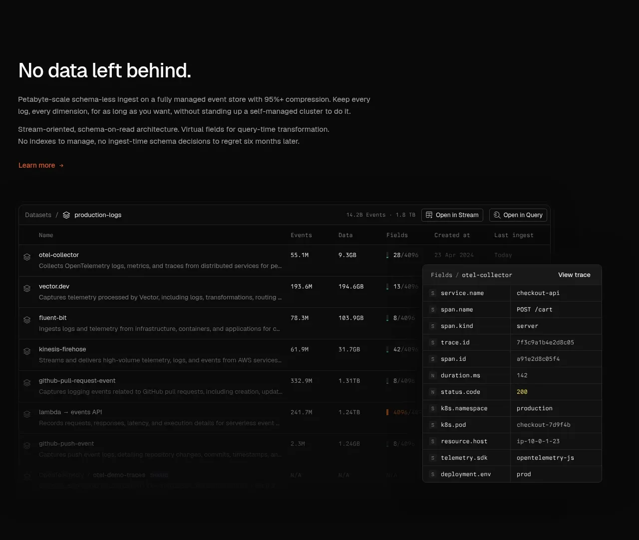
6. **Feature: data completeness** — statement headline + 3 short lines of copy + link, then a full-width table mockup of datasets (rows with icons, event counts, dates, compression percentages) with a right-hand detail drawer listing typed fields.
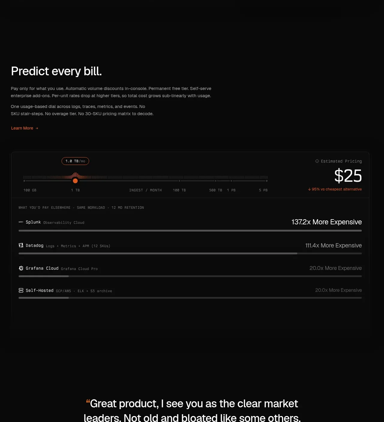
7. **Pricing section** — statement headline ("Predict every bill."), copy about usage-based pricing; an interactive slider over a tick-marked ruler (GB → PB) with the big estimated price figure top-right and a "vs cheapest alternative" note; beneath, comparison rows where each competitor gets a horizontal bar and a right-aligned monospace multiplier ("137.2x More Expensive").
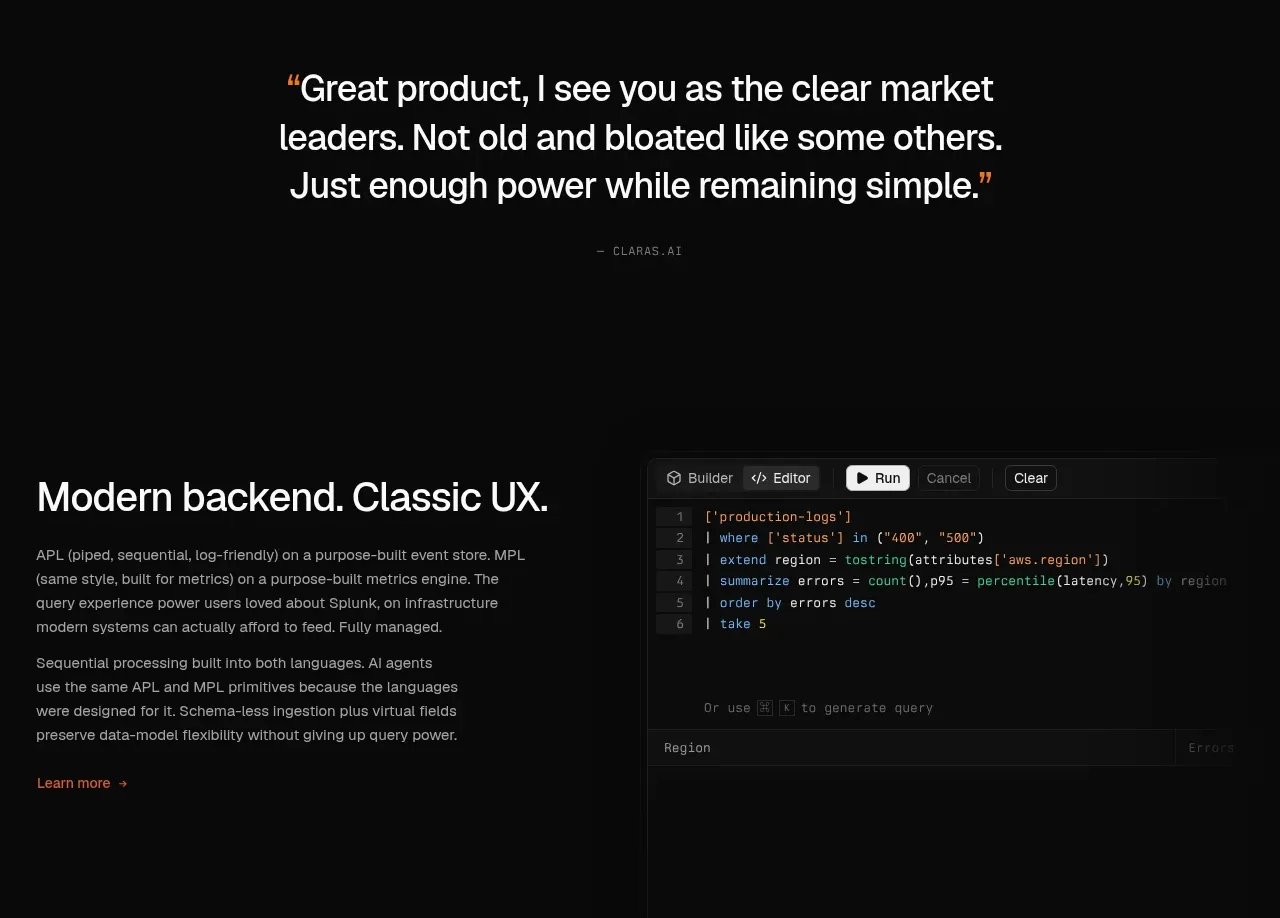
8. **Second pull quote** — centred, large, with orange quotation marks and a monospace attribution; generous whitespace around it.
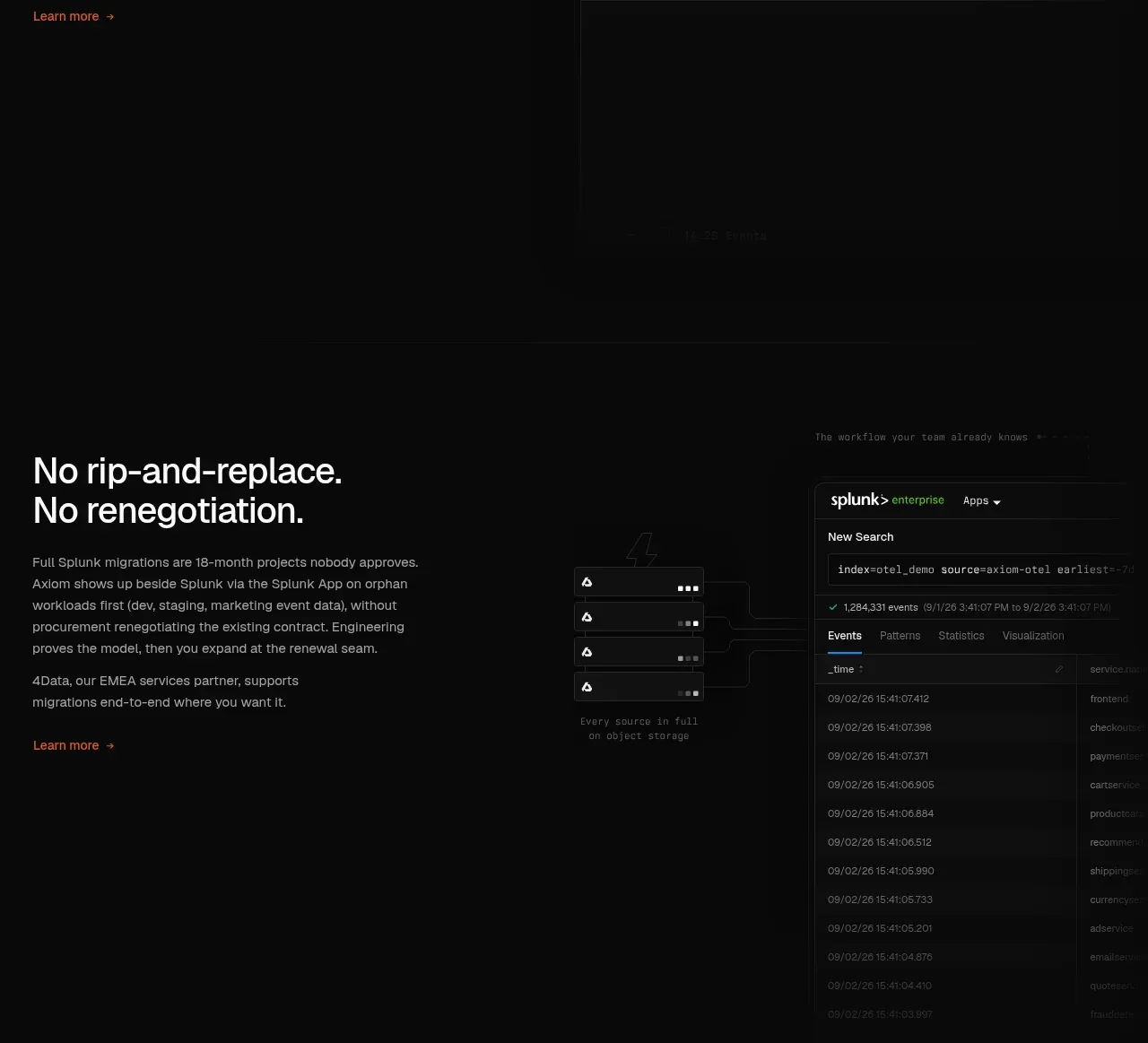
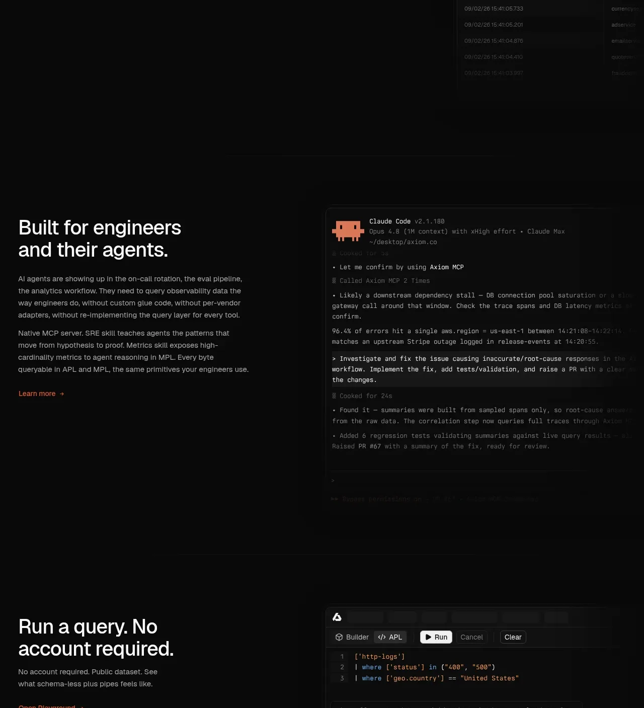
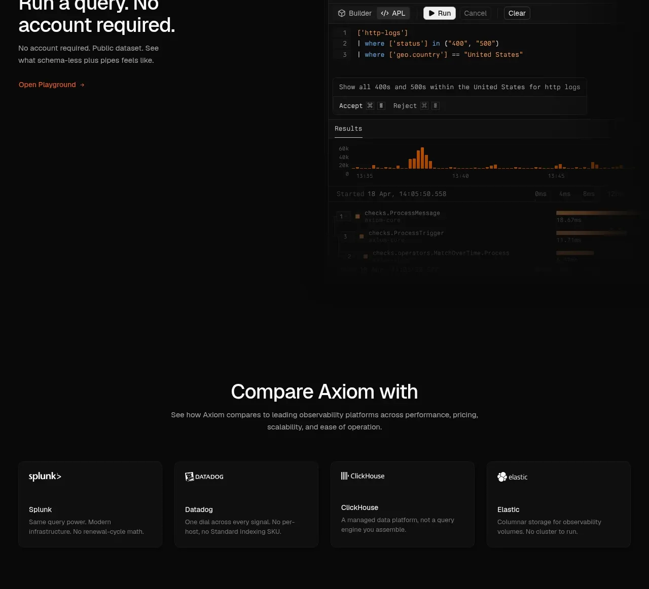
9. **Three alternating two-column feature rows** — each pairs a text column (headline, 1–2 short paragraphs, orange "Learn more →") with a full-bleed-ish product visual: query-language code editor, a third-party-tool integration view, and a terminal session where an AI agent investigates and ships a fix. All text columns sit on the left, visuals right, keeping a consistent reading pattern.
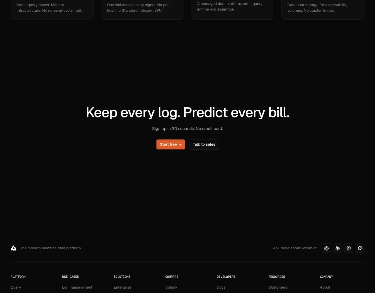
10. **Self-serve playground row** — "Run a query. No account required." with a mockup of a builder/editor toggle, a natural-language prompt bar with Accept/Reject, and a results histogram.
11. **Comparison card row** — centred heading plus four bordered cards in a row, each with a competitor mark, name and a one-sentence positioning line.
12. **Final CTA** — huge centred two-clause headline ("Keep every log. Predict every bill."), one grey line ("Sign up in 30 seconds. No credit card."), and the same dual CTA pair as the hero.
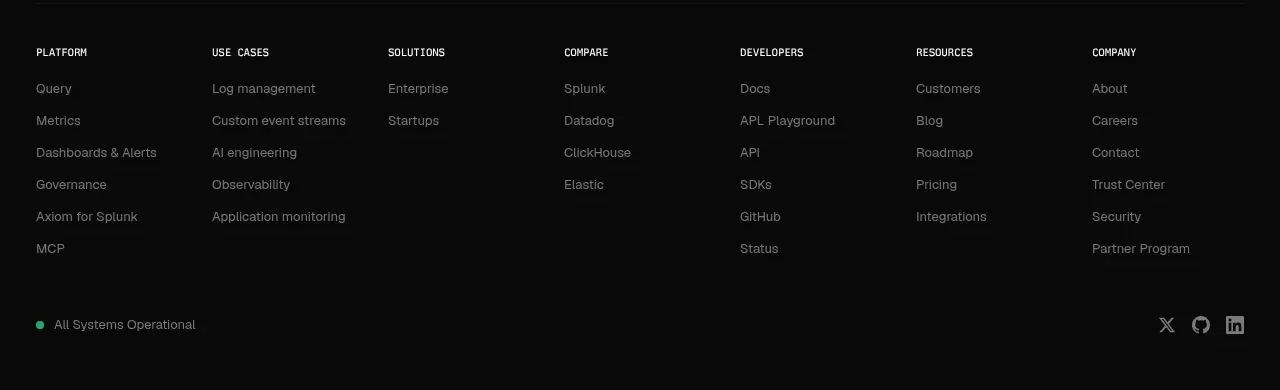
13. **Footer** — seven-column link grid (Platform, Use cases, Solutions, Compare, Developers, Resources, Company), a green "All Systems Operational" status pill, social icons, and the tagline bottom-left.

## Design language
- **Canvas:** near-black page (#0a0a0a–#111) with slightly lighter panels (#161616–#1b1b1b), separated by 1px #262626 borders, radius 6–10px. No glows, no drop shadows — depth comes from borders and tone steps only.
- **Accent discipline:** ~95% of the page is grayscale. One saturated accent (orange ≈ #f97316) appears only on primary CTAs, text links, badges, chart highlights, slider handle, and quote marks. If the user's brand has an accent, apply it with the same scarcity.
- **Type pairing:** a neutral grotesque sans for headlines and body; a monospace for eyebrows (uppercase, letter-spaced, ~11–12px), code, metrics, attributions, status text, and all numbers inside mockups. Scale: hero ~64–72px/–2% tracking, section statements ~40–48px, card titles ~18–20px, body 15–16px in #9ca3af, mono labels 11–12px.
- **Headline voice:** short declarative sentences ending in a period, stating the benefit concretely ("No data left behind."). Body copy stays 2–3 lines per block; persuasion is delegated to screenshots, not prose.
- **Rhythm:** alternate section shapes down the page — full-width text statement → full-width screenshot → quote/logo band → statement + 3-card grid → statement + table → interactive pricing → centred quote → repeating two-column rows → card row → centred CTA. Section padding is generous (~120–160px); density lives *inside* the mockups, never in the marketing copy.
- **Mockups:** render the user's product UI as real frames — tab bars, sidebars, tables with plausible timestamps/counts/durations, syntax-highlighted code, terminal sessions with dimmed history and bright results. Every mockup gets a 1px border and slightly lighter background so it reads as an object on the page.
- **Buttons and links:** primary = small solid-accent pill (radius ~6px, 13–14px text) with a → glyph; secondary = 1px ghost pill; tertiary = accent-coloured text link with →. Reuse the exact same pair in hero and final CTA for bookending.
- **Comparison visuals:** normalise competitors as horizontal bars against your own price, multiplier labels right-aligned in monospace; keep neutral greys for competitor bars and reserve the accent for your own price figure.
- **Motion:** minimal and functional — hover brightening on links/cards, an interactive slider in the pricing section, no parallax or decorative animation.

## Never
- No reference logos, wordmarks, product names, customer logos, quotes, copy, code snippets, illustrations or icon sets from the reference site.
- Do not recreate their incident cards, dataset names or pricing numbers verbatim — generate plausible, product-appropriate data for the user's product.
- Never present the result as the reference product or imply their endorsement.
Components from this page
All components
A
Global navigation
Axiom · Navigation
A
Machine data platform hero
Axiom · Hero
A
Customer proof and logo grid
Axiom · Logo cloud
A
Scaling problem cards
Axiom · Feature grid
A
Schema-less data exploration
Axiom · Feature grid
A
Usage-based pricing comparison
Axiom · Chart
A
Centered customer quote
Axiom · Testimonials
A
Backend and classic UX
Axiom · Feature grid
A
Migration without replacement risk
Axiom · Feature grid
A
Built for engineers and agents
Axiom · Feature grid
A
Try the product playground
Axiom · Feature grid
A
Final signup call to action
Axiom · Call to action