 kage
kage
backdropagent.com
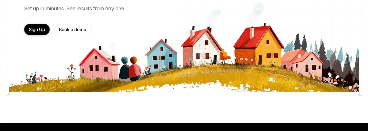
Design analysis
A final conversion band uses a bold promise, compact supporting copy, two actions, and a wide colorful scene that anchors the transition into the footer.
Prompt preview
## Reference images

Study these alongside the description below: hierarchy, rhythm, spacing, colour. Build for the product you are asked about, using this design language.

- Component: https://kage-design-assets.t3.tigrisfiles.io/components/backdrop/a4be162f-a1b8-4e5c-8da7-09cb7d37c0e3-1792130681-8.webp
- Full page it was cut from: https://kage-design-assets.t3.tigrisfiles.io/screenshots/backdrop/a4be162f-a1b8-4e5c-8da7-09cb7d37c0e3-1792130585649-full.webp
- Component on Kage: https://kage.design/component/backdrop-cta

## Before you start
Ask what first action the user's product wants visitors to take and what visual metaphor fits its brand. Then create an original conversion band.

Build a wide final CTA with a bold left-aligned heading, one short line of supporting copy, and two compact actions. Place a contained illustrative or product visual across the lower portion so the section feels memorable without becoming a second hero. Use generous white space, near-black heading text, muted gray copy, a dark filled pill plus light outlined pill, and a bright brand-specific visual surface. Keep the visual clipped inside the section with a soft radius and make the CTA buttons remain visible above it. On mobile, stack the actions and use a shorter visual crop.

### Never
- Never use the reference CTA wording, houses, characters, colors, or illustration.
- Never repeat the hero exactly.
- Never make the image necessary to understand the action.
More components

 Final conversion banner
CrewTower Mod for Claude Code · Call to action
Final conversion banner
CrewTower Mod for Claude Code · Call to action
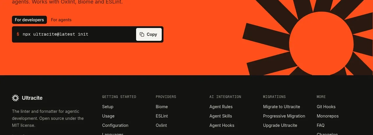
 Bright installation call to action
Ultracite v8 · Call to action
Bright installation call to action
Ultracite v8 · Call to action
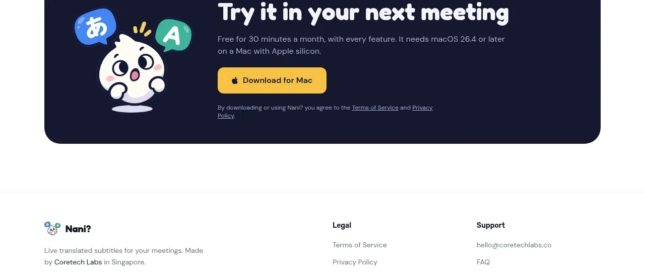
 Download call to action
NANI??? · Call to action
Download call to action
NANI??? · Call to action

 Marble-backed final CTA
Maybloc · Call to action
Marble-backed final CTA
Maybloc · Call to action
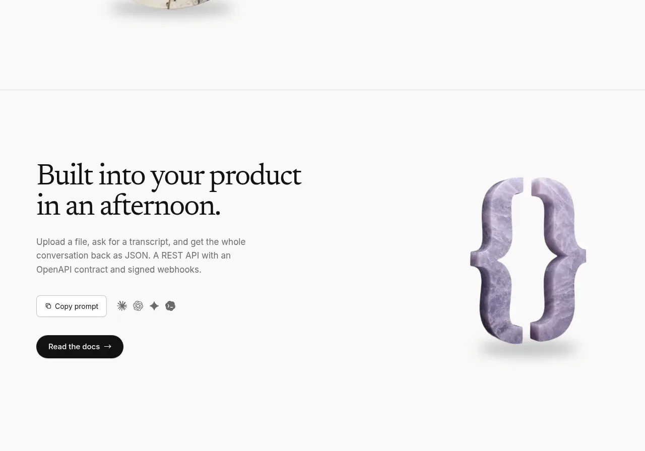 Developer integration CTA
Maybloc · Call to action
Developer integration CTA
Maybloc · Call to action
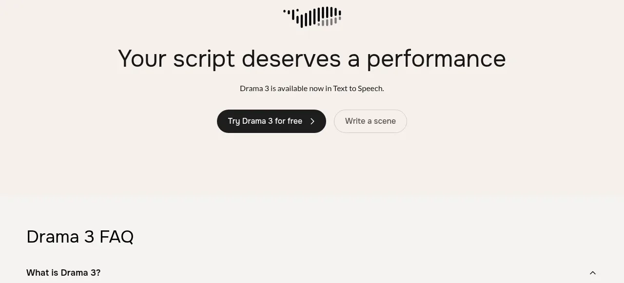
 Centered conversion call to action
Fish Audio Drama 3 · Call to action
Centered conversion call to action
Fish Audio Drama 3 · Call to action