kage
kage
basedash.com

Design analysis
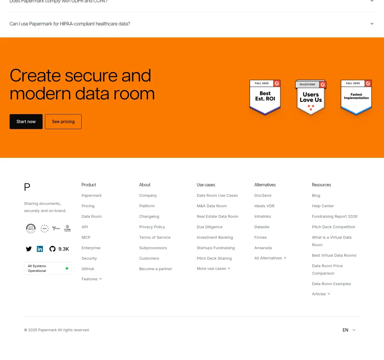
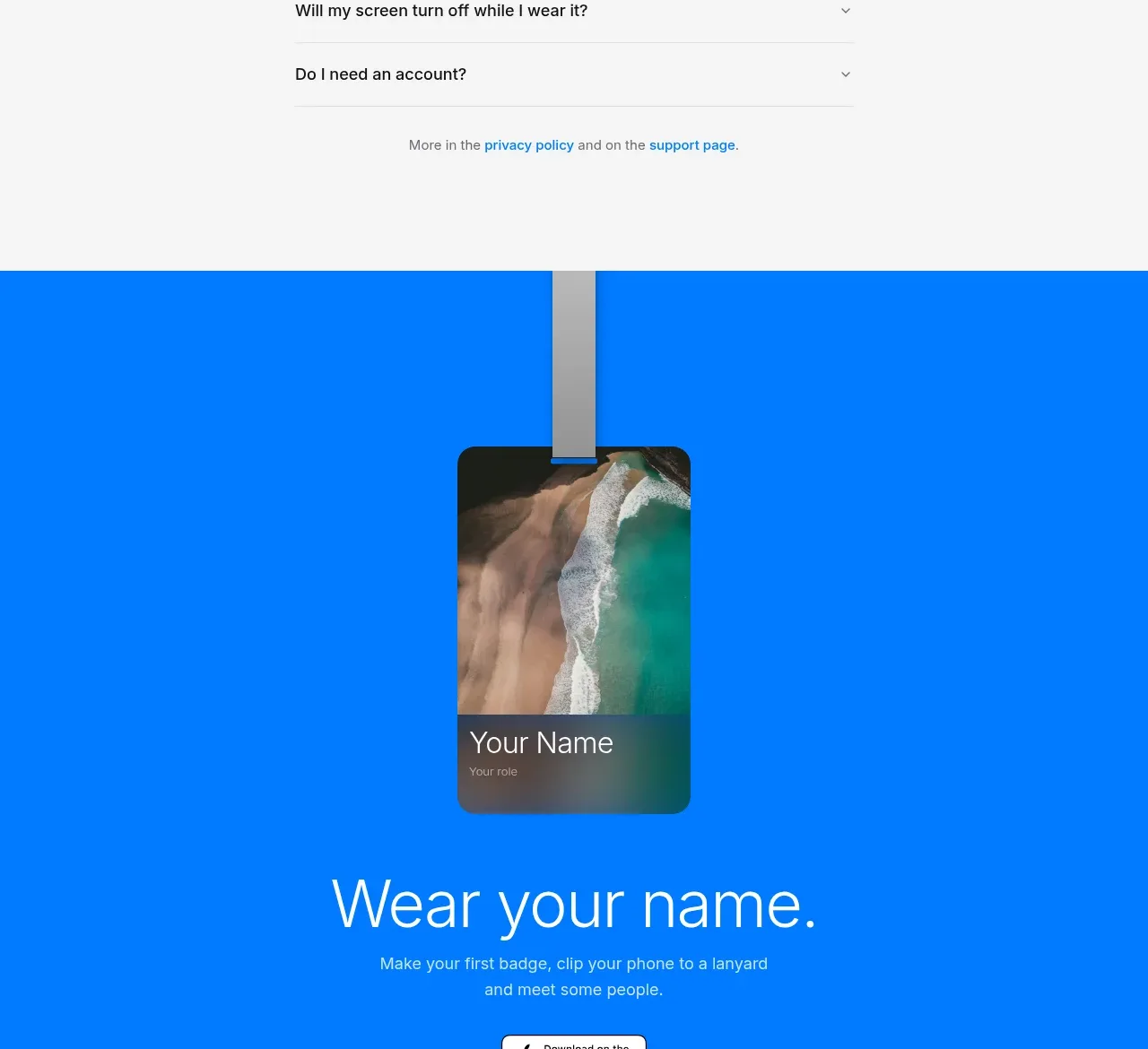
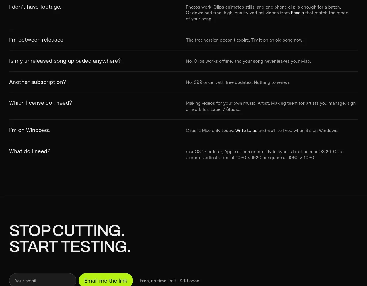
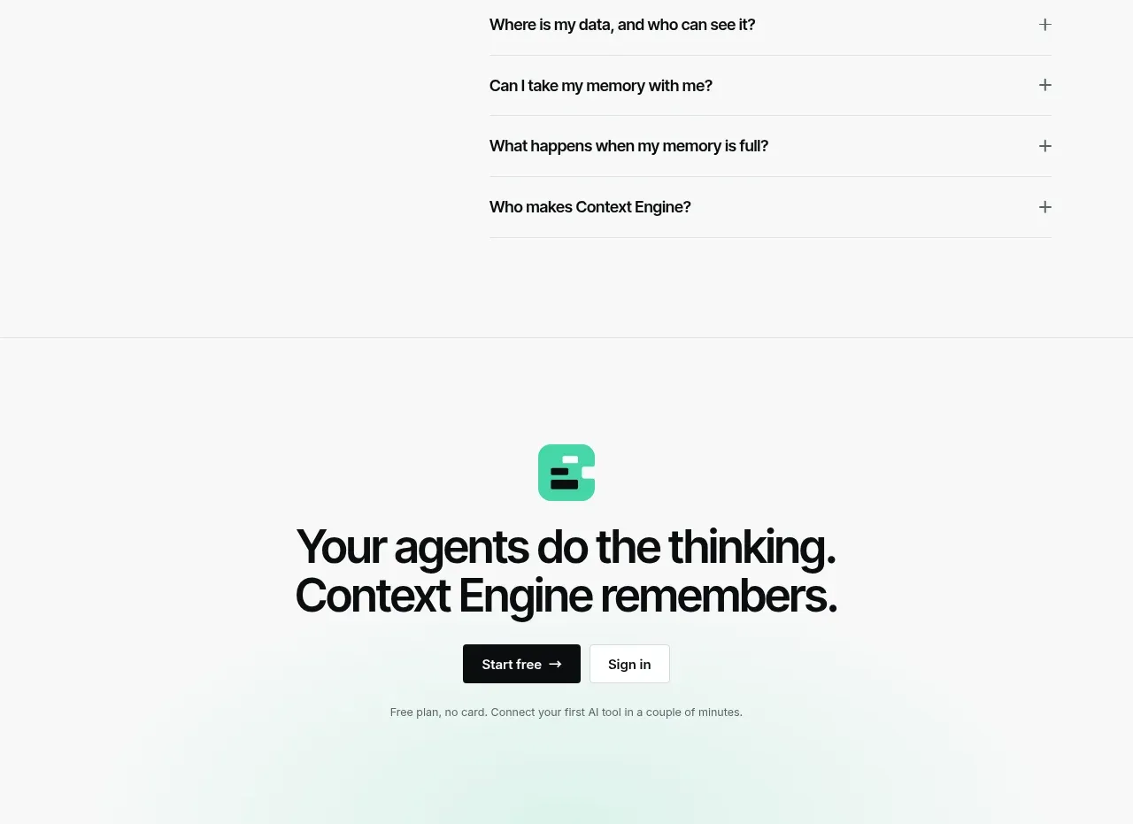
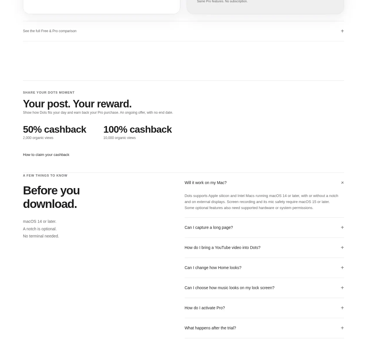
A calm, centered FAQ section that uses generous whitespace, restrained typography, and thin dividers to make a dense set of questions feel easy to scan. Expandable rows keep answers hidden until needed while preserving a clear path toward conversion.
Prompt preview
## Reference images

Study these alongside the description below: hierarchy, rhythm, spacing, colour. Build for the product you are asked about, using this design language.

- Component: https://kage-design-assets.t3.tigrisfiles.io/components/basedash-in-espanol-francais-portugues/b3381e01-f9b6-42c9-8798-975c026618b1-1789106703-8.webp
- Full page it was cut from: https://kage-design-assets.t3.tigrisfiles.io/screenshots/basedash-in-espanol-francais-portugues/b3381e01-f9b6-42c9-8798-975c026618b1-1789106655341-full.webp
- Component on Kage: https://kage.design/component/basedash-in-espanol-francais-portugues-faq

## Before you start
Ask me what my product is, who it is for, and what visual brand it uses. Then apply the principles below to create an original FAQ section for my product—not a copy of the reference.

## Build this section
Create a refined FAQ section for a modern software or service website. The section should feel editorial, calm, and highly legible, with a centered heading and a vertically stacked accordion beneath it.

### Layout and alignment
- Use a warm off-white page background, approximately `#FAF8F5`.
- Place the FAQ inside a centered container with a maximum width of roughly `760–900px`; use horizontal padding of `24px` on small screens and `40–64px` on larger screens.
- Center-align the introductory content: a compact eyebrow is optional, followed by a large heading and one short supporting sentence.
- Keep the accordion narrower than the overall page content so each question remains easy to read.
- Stack rows vertically with consistent full-width dividers. Align question text to the left and the expand/collapse control to the right.
- Give the section generous vertical breathing room: approximately `96–144px` above and below on desktop, reduced to `64–88px` on mobile.
- On mobile, preserve the same hierarchy, allow questions to wrap naturally, and avoid forcing the accordion into columns.

### Typography hierarchy
- Use the product’s brand typeface if available; otherwise choose a clean contemporary sans-serif with a neutral, polished feel.
- Use a prominent but not oversized heading, approximately `48–64px` on desktop, `34–42px` on mobile, with a tight line-height around `1.05–1.15` and medium or regular weight.
- Set the supporting copy around `17–20px`, with a line-height near `1.5` and a softer contrast than the heading.
- Set FAQ questions around `17–20px`, medium weight, with comfortable line-height for multi-line wrapping.
- Set expanded answers around `15–17px`, normal weight, with a line-height near `1.6` and a muted text colour.

### Colour, borders, and shape
- Use near-black for primary text, approximately `#171615` or a brand-appropriate equivalent.
- Use muted warm grey for secondary text, approximately `#716D69`.
- Use subtle warm-grey dividers, approximately `#DDD9D4`; keep them 1px and low contrast.
- Keep the background mostly flat and quiet. Do not introduce decorative gradients unless they are clearly part of the user’s existing brand.
- Use little or no container border or shadow. The structure should come from spacing and dividers rather than cards.
- If the design uses a control background, make it understated with a light neutral such as `#F1EEEA`.
- Use restrained corner radii, approximately `6–10px`, only for buttons or focus surfaces—not for every FAQ row.

### Accordion interaction
- Each row must be keyboard accessible and implemented as a real button or disclosure control, not a clickable generic `div`.
- Show a simple plus icon when collapsed and switch it to a minus icon or rotate it when expanded. Keep the icon small, crisp, and aligned with the question’s first line.
- Add a subtle transition for answer height, opacity, or icon rotation, around `180–240ms`, using an ease-out curve.
- Make the entire question row clickable, with generous vertical padding of approximately `24–30px`.
- On hover, slightly darken the question text or divider without adding a loud background effect.
- Provide a clear visible keyboard focus ring using the product’s accent colour with sufficient contrast.
- Decide whether multiple answers may remain open based on the product’s content needs; default to allowing multiple open if comparison is useful, or one open at a time if the page should feel especially compact.
- Ensure the expanded answer has clear separation from the question and does not cause layout jitter.

### Responsive and accessibility requirements
- Maintain readable line lengths and at least `44px` of interactive height for touch targets.
- Use semantic heading levels, a labelled FAQ region, and `aria-expanded` plus `aria-controls` for each disclosure.
- Respect `prefers-reduced-motion` by disabling or shortening accordion transitions.
- Ensure colour contrast meets WCAG AA and that the section remains usable at 200% zoom.

## Never
- Never use the reference’s logo, product name, brand name, or exact copy.
- Never reproduce the reference’s wording, question list, typography brand, or distinctive visual identity exactly.
- Never use illustrations, screenshots, video stills, or imagery from the reference.
- Never make the FAQ dependent on hover, autoplay, or animation to communicate information.
- Never add unnecessary cards, gradients, shadows, or decorative elements that compete with the questions.
- Never assume the user’s product, audience, language, or brand; ask first and adapt the content and styling accordingly.