kage
kage
beehiiv.com

Design analysis
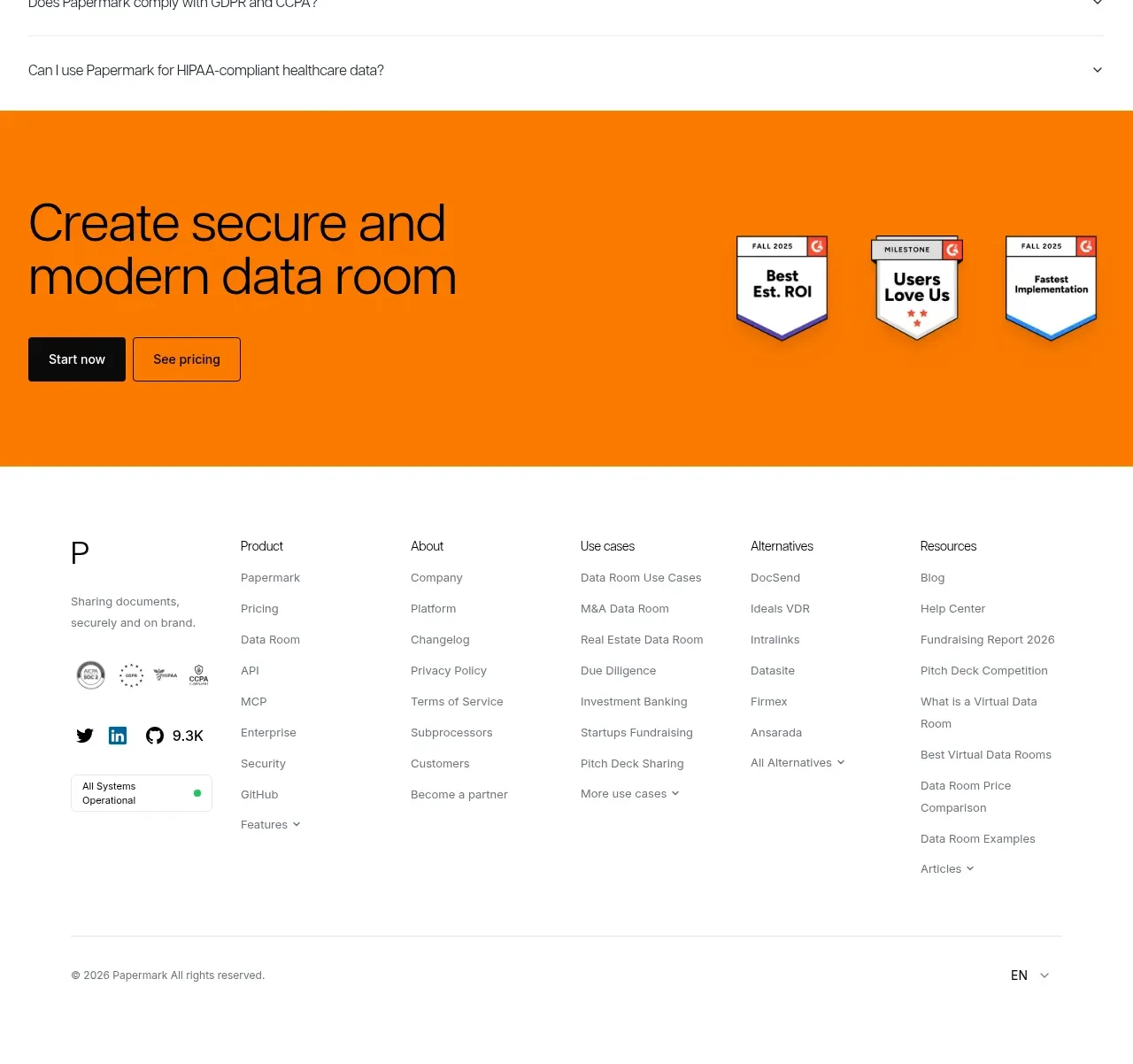
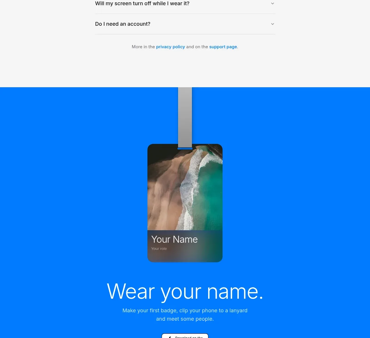
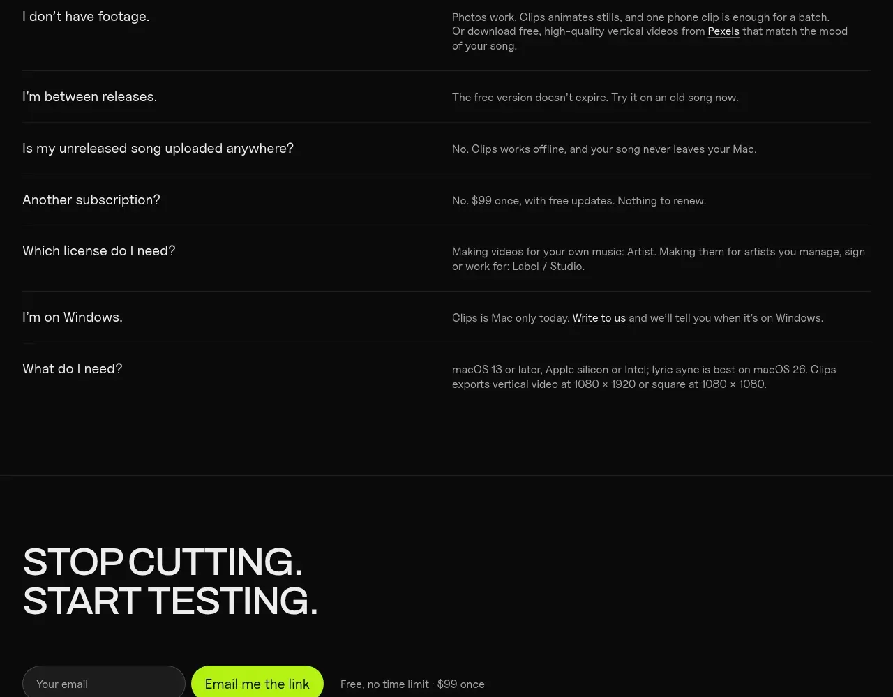
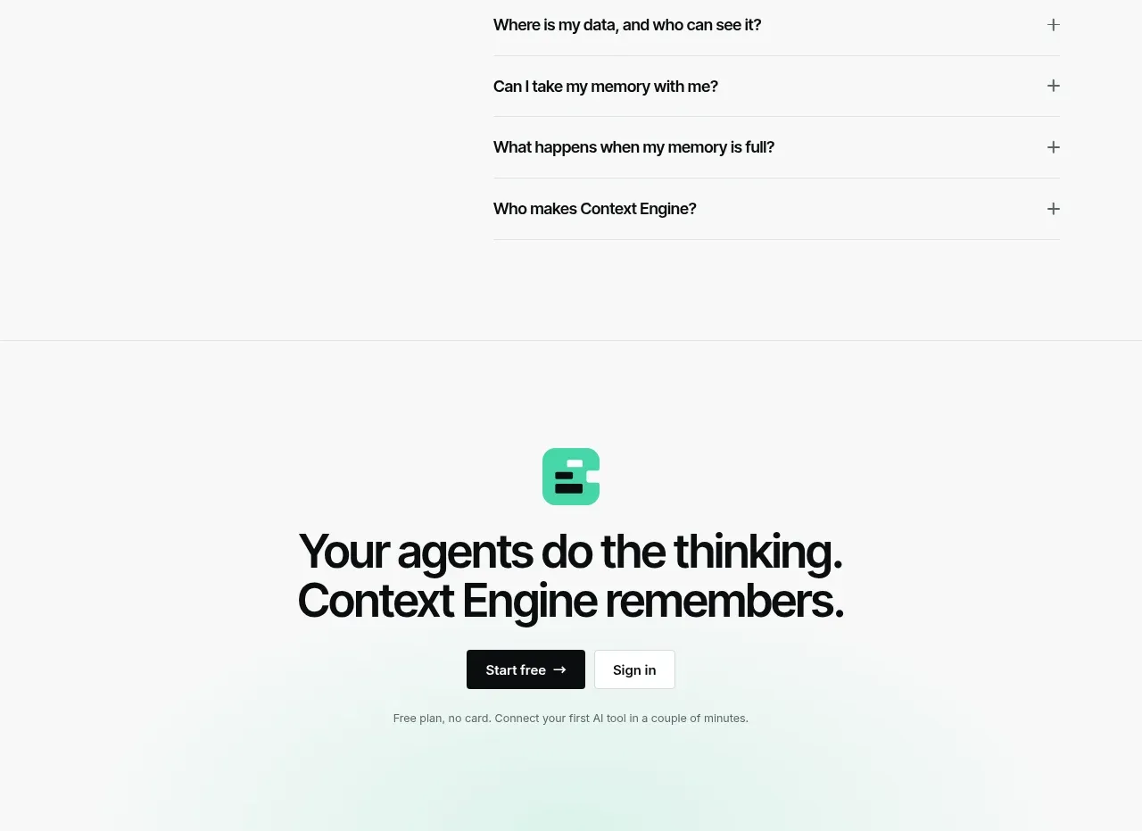
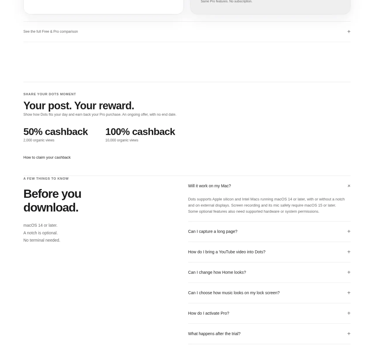
A high-contrast FAQ section pairs an oversized left prompt with a calm, structured accordion on the right. Strong typography, generous negative space, and thin dividers make a long list feel easy to scan while keeping the interaction understated.
Prompt preview
## Reference images

Study these alongside the description below: hierarchy, rhythm, spacing, colour. Build for the product you are asked about, using this design language.

- Component: https://kage-design-assets.t3.tigrisfiles.io/components/beehiiv-com/23eb8ac3-d7aa-449f-95ad-92bcd925810d-1789067455-9.webp
- Full page it was cut from: https://kage-design-assets.t3.tigrisfiles.io/screenshots/beehiiv-com/23eb8ac3-d7aa-449f-95ad-92bcd925810d-1789067406-full.webp
- Component on Kage: https://kage.design/component/beehiiv-faq

## Before you start
Ask the user what their product is, who it serves, and what brand personality, colours, and typography they want. Then apply the principles below to create an original FAQ section for that product rather than reproducing the reference.

## Design the section
Build a responsive FAQ component with a two-column split layout:

- Use a nearly black navy background around `#07051A` or a comparable dark brand colour.
- Constrain the section to a centered max-width of roughly `1180–1280px`, with generous vertical padding of about `120–180px` on desktop.
- On desktop, make the left column about 30–35% wide and the FAQ list about 65–70% wide. Align both columns to the top of the content area.
- On smaller screens, stack the heading above the accordion, preserving a clear gap of roughly `48–72px`.
- Keep the layout spacious and editorial: do not fill the section with cards, decorative imagery, or unnecessary controls.

## Typography
- Render the section heading as a short, emphatic question or invitation in uppercase.
- Use a heavy grotesk or geometric sans-serif with tight line-height, approximately `56–72px` on desktop and `40–52px` on mobile.
- Let the heading wrap into two or three compact lines; use a maximum width so it feels intentionally composed.
- Style FAQ questions in a semibold sans-serif at approximately `18–20px`, with `1.35–1.5` line-height.
- Use a warm white such as `#F7F7F2` for primary text and a muted lavender-grey such as `#A6A3B8` for secondary or expanded-answer text.

## Accordion structure and alignment
- Place the accordion as a single vertical list with no surrounding card container.
- Separate each item with a thin, low-contrast horizontal rule around `#555268` or `rgba(220,218,245,.35)`.
- Include generous row padding, approximately `26–32px` vertically and `16px` horizontally, so each question is easy to scan and tap.
- Keep question text left-aligned and vertically centered with a chevron or plus/minus control aligned to the far right.
- Allow long questions to wrap naturally without pushing the control out of alignment.
- Include several realistic questions relevant to the user's product, but do not reuse wording from the reference.

## Interaction
- Make each entire row keyboard-accessible and clickable, using an actual button or accessible disclosure pattern.
- On hover, slightly brighten the question text and divider; avoid loud colour changes.
- Animate the chevron rotation and answer panel expansion with a short, smooth transition around `180–240ms`.
- Keep one or multiple answers open according to the product's UX needs, but make the behaviour consistent.
- Show a visible focus ring with a brand-appropriate accent colour, such as `#8D8BFF`, without relying on colour alone.
- Ensure the accordion has clear accessible names, correct expanded states, and adequate contrast.

## Responsive and visual details
- Reduce heading size and horizontal padding on mobile while keeping row tap targets at least `44px` high.
- Preserve divider alignment and avoid horizontal overflow.
- Use a restrained accent only for focus, active state, or answer links; a vivid periwinkle such as `#5555E8` can work against the dark background.
- Keep corners mostly square or use a very subtle `4–8px` radius only where the brand needs softness. The reference's structure depends on open space and rules, not floating rounded cards.

## Never
- Never copy the reference's logo, product name, brand identity, exact FAQ copy, or page-specific claims.
- Never use the reference's illustrations, imagery, icons, or branded integration marks.
- Never reproduce the exact typeface, dimensions, wording, or visual treatment; reinterpret the layout for the user's product and brand.
- Never make the accordion inaccessible, hover-only, or dependent on colour alone.