 kage
kage
blancbrowser.com
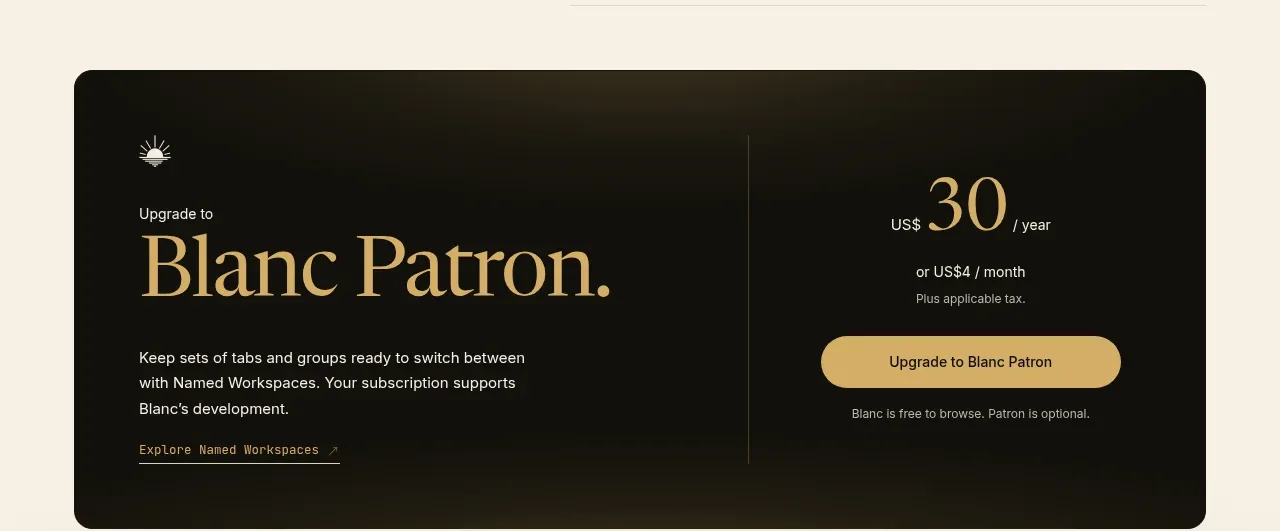
Design analysis
A high-contrast dark rounded panel promotes an optional premium tier, balancing a large gold-toned headline and supporting copy against price and a bright pill CTA.
Prompt preview
## Reference images

Study these alongside the description below: hierarchy, rhythm, spacing, colour. Build for the product you are asked about, using this design language.

- Component: https://kage-design-assets.t3.tigrisfiles.io/components/blanc/6c0ef6d1-d2ca-4e94-b731-e699c7d4dc0f-1789711447-5.webp
- Full page it was cut from: https://kage-design-assets.t3.tigrisfiles.io/screenshots/blanc/6c0ef6d1-d2ca-4e94-b731-e699c7d4dc0f-1789711355373-full.webp
- Component on Kage: https://kage.design/component/blanc-cta

## Before you start
Ask what the user's product, audience, and brand are, then apply the principles below to create an original premium CTA.

Create a wide two-column upgrade panel with a near-black brown background (#14130f), 28–32px rounded corners, and generous 44–56px internal padding. On the left, place a small eyebrow, a large elegant serif headline in warm gold (#d8b875), concise light text, and a small underlined detail link. On the right, show a compact price hierarchy with a large gold amount, muted billing context, and a prominent rounded gold button (#dfb866) with dark text. Divide the columns with a subtle vertical rule (#514a3a). Keep the tone premium but restrained; avoid gradients and excessive decoration. On mobile, stack the columns and replace the divider with a horizontal rule. Include hover and focus states for the button.

Never: copy the reference's logos, product names, copy, illustrations, or imagery.
More components
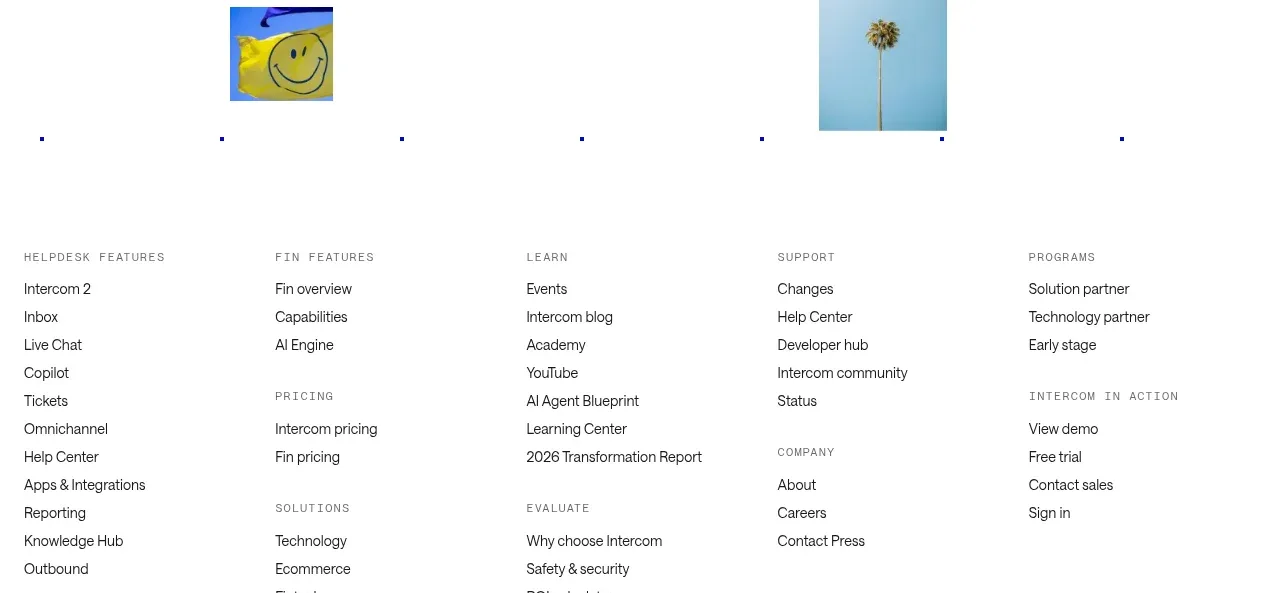
 Final customer experience call to action
intercom.com · Call to action
Final customer experience call to action
intercom.com · Call to action
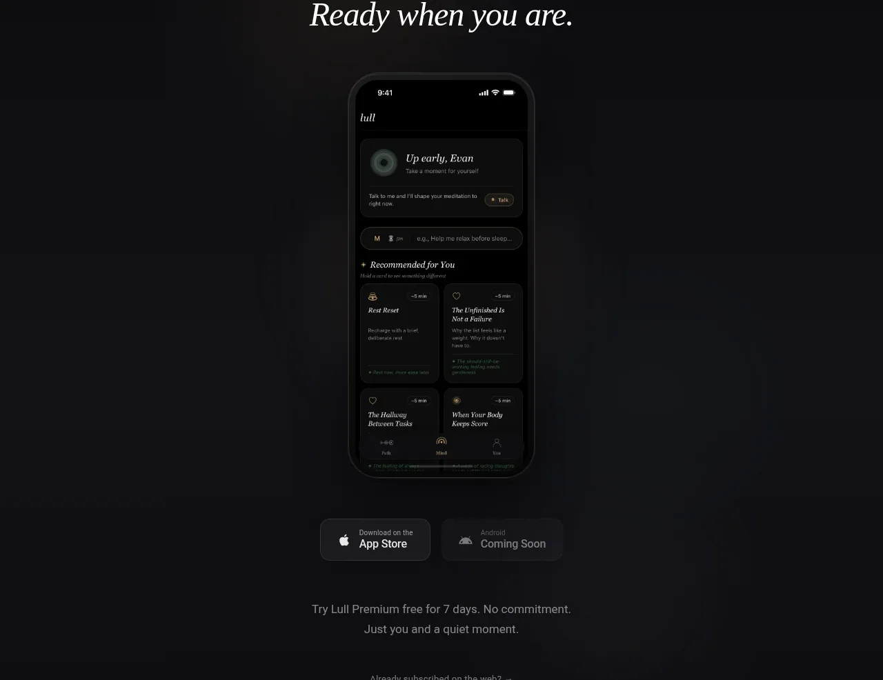
 App download conversion
Lull · Call to action
App download conversion
Lull · Call to action

 Centered final call to action
ApplySeed · Call to action
Centered final call to action
ApplySeed · Call to action
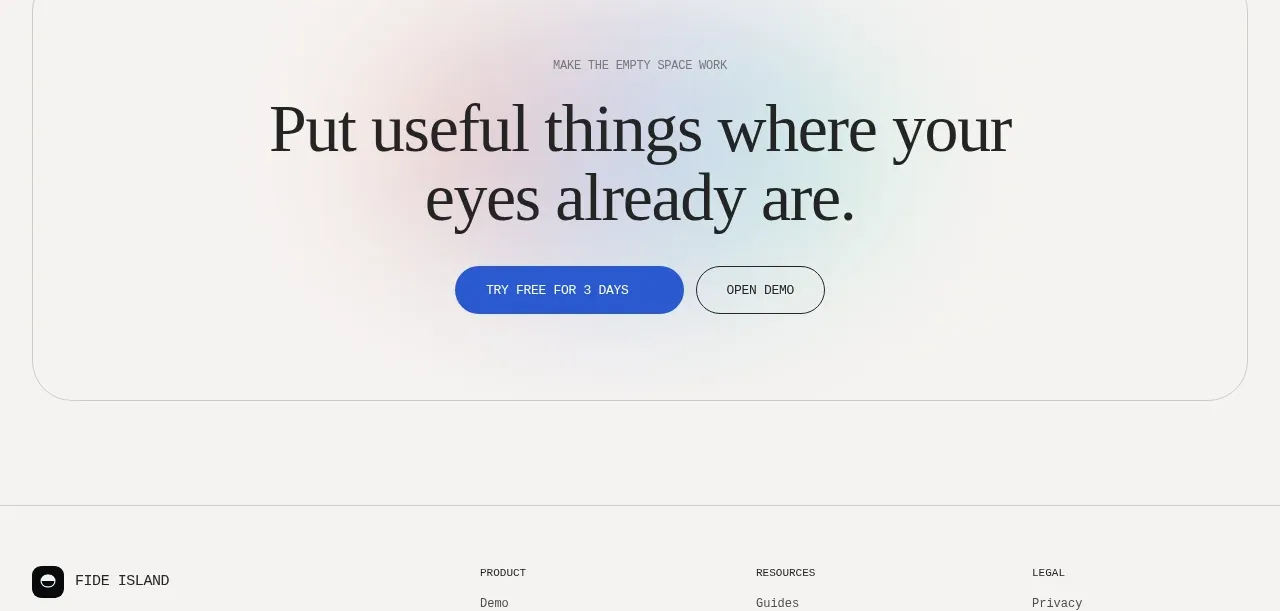
F
Final conversion call to action
Fide Island · Call to action

 Inline conversion banner
QAgent · Call to action
Inline conversion banner
QAgent · Call to action
A
Final signup call to action
Axiom · Call to action