kage
kage
blancbrowser.com
Design analysis
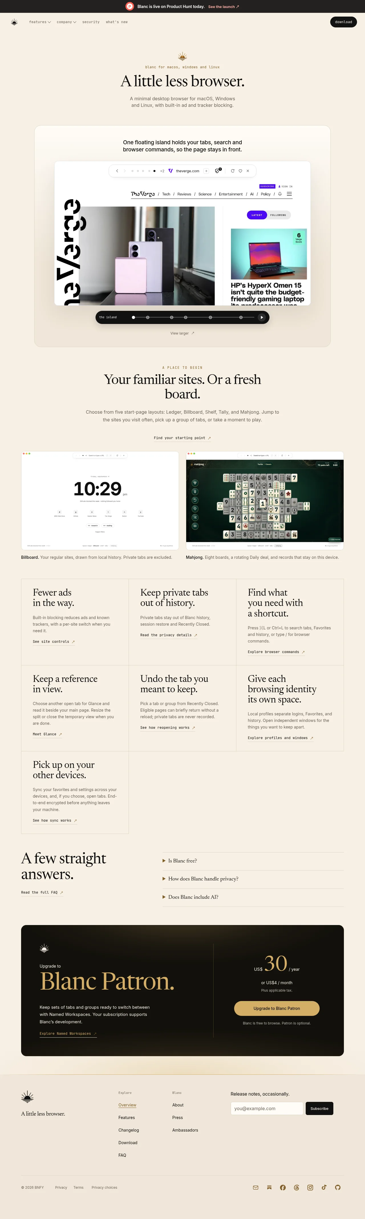
A cream editorial landing page that argues "less is more" through its own typography: a large serif voice for headlines, monospace for eyebrows, nav and links, and a quiet sans for body copy. Rhythm is built from tone changes rather than decoration — an airy centered hero, a lighter-card island demo set piece, a captioned screenshot pair, a seven-cell feature grid ruled with shared hairlines, a split FAQ accordion, then a near-black Patron banner where the page's only gold accent is spent. Dark bookends (announcement bar, upgrade banner) and thin ink rules give the page structure without a single drop shadow.
Prompt preview
## Reference images

Study these alongside the description below: hierarchy, rhythm, spacing, colour. Build for the product you are asked about, using this design language.

- Full page: https://kage-design-assets.t3.tigrisfiles.io/screenshots/blanc/6c0ef6d1-d2ca-4e94-b731-e699c7d4dc0f-1789711355373-full.webp
- Above the fold: https://kage-design-assets.t3.tigrisfiles.io/screenshots/blanc/6c0ef6d1-d2ca-4e94-b731-e699c7d4dc0f-1789711352579.webp
- Design on Kage: https://kage.design/designs/blanc-landing-page

# Editorial cream landing page — serif display + monospace labels

## Before you start
Ask the user these questions and wait for the answers before writing any code:
- What product are you building, and what is the one-sentence promise it makes?
- Who is it for, and which platforms or devices matter (for an eyebrow line like "for macOS, Windows and Linux")?
- What brand assets do you already have: name, logo mark, colours, and fonts (do you have a serif, a monospace, a sans)?
- What are the 2–3 signature product behaviours worth demonstrating on the page, and do you have real screenshots?
Apply everything below to *their* product and brand, never to the reference.

## Page structure
Build a single centered page, max-width ~1160–1240px, in this order:
1. **Announcement bar** — optional slim full-width dark strip above the nav: small icon, one-line message, inline text link with a trailing ↗. One accent colour allowed here only.
2. **Header** — cream background: small dark logo mark left, inline menu (two dropdown labels + two plain links) set in monospace, black pill CTA right.
3. **Hero** — centered stack with generous whitespace: small mark, uppercase letterspaced monospace eyebrow naming platforms, very large serif headline (~64–76px), two-line sans subhead in muted ink. No imagery in the hero itself.
4. **Product demo panel** — a large rounded card one tone lighter than the page: centered one-sentence intro (serif or sans, ~20px), then a real product screenshot showing the signature UI, then a black pill "scrubber" below it carrying the feature name, a row of small icon stops and a play affordance, plus a small monospace "View larger ↗" link. This is the page's first set piece.
5. **Showcase section** — centered: monospace uppercase eyebrow, serif H2, short sans paragraph, monospace link. Below, two screenshots side by side (2-col grid), each captioned underneath with the pattern "**Bold word.** One explanatory sentence.".
6. **Feature grid** — 3 columns ruled by shared 1px hairlines (border-collapse look). Seven cells: serif H3 on two lines, short sans body, monospace underlined link with ↗. Let the last row leave cells empty rather than padding the grid.
7. **FAQ** — two-column split: left is a serif headline ("A few straight answers.") plus a monospace link; right is a compact accordion list with small ▶ markers, hairline dividers between rows, one line per question.
8. **Upgrade / paid tier banner** — full-width dark rounded card: left column with small mark, tiny "Upgrade to" label, huge serif plan name in gold, one sans paragraph, monospace link; a vertical hairline divides it from a right column with a big serif price ("US$ 30 / year"), an alternate price line, a tax note, a gold pill button, and a one-line reassurance sentence.
9. **Footer** — cream: logo mark + tagline left; two link columns with small monospace column labels; right a "Release notes, occasionally." newsletter with an email input and black pill button; bottom hairline row with copyright, legal links, and social icons right-aligned.

## Design language
- **Hierarchy rule:** every content section repeats the same spine — (optional monospace uppercase eyebrow) → serif headline → short sans body → exactly one monospace action link with a trailing ↗. Never more than one competing element per section.
- **Type system:** pair three voices — an editorial serif for all display and card headings (tight leading, ~1.05), a monospace for nav, eyebrows, links, prices' labels and column headers (12–13px, uppercase + letterspacing for eyebrows), and a humanist sans for body copy (15–16px, ~1.6 line height, muted ink). Scale: hero clamp(44px, 6vw, 76px), H2 ~40px, H3 ~24px.
- **Colour:** warm cream field `#EDE4D6` with card panels one step lighter `#F6F0E5`; ink `#1C1916` for text and dark panels; muted ink `#6E675C` at body weight; gold accent `#C9A15F` reserved *only* for the paid-tier banner; one warm accent (e.g. `#E85A2F`) allowed only in the announcement bar. Dark surfaces are `#16130F` with a faint warm gradient, not flat black.
- **Rhythm:** alternate quiet and dense. Hero and FAQ are airy; the demo panel and screenshot pair are contained set pieces; the feature grid is compact with short text blocks; the banner is heavy and dark; the footer is utilitarian. Change tone between sections via background steps and inversion, not via new layout systems.
- **Borders, radius, shadow:** 1px hairlines at ~12% ink for grid rules, FAQ dividers and banner's vertical split; radius 20–28px on large cards, 999px pills on buttons and the scrubber; no drop shadows — separation comes from tone steps and hairlines, at most a very soft shadow under the product screenshot.
- **Buttons and links:** primary button is an ink pill with cream text; on dark surfaces use a gold pill with ink text; all text links are monospace, underlined, ending in ↗. Accordion rows use a small solid ▶ marker.
- **Media:** screenshots sit inside rounded, hairline-bordered frames; captions follow "**Term.** Sentence." so each image teaches one named feature.
- **Motion:** functional and minimal — hover brightens/underlines links, accordion expands, the demo scrubber/play affordance hints at interaction. No parallax, no scroll-jacking, no decorative animation.

## Never
- No "Blanc", "Blanc Patron", "A little less browser", the sun/burst logo mark, the Product Hunt bar copy, The Verge screenshot, or the Mahjong imagery from the reference.
- Do not copy the reference's feature names, FAQ questions or captions; write equivalent content for the user's product.
- Do not clone the exact cream-and-gold palette if the user has brand colours — derive tones from their brand and keep the same roles (field, ink, single premium accent).
- Never present the result as the reference product or reuse its tagline anywhere on the page.
Components from this page
All components
 Announcement bar and site navigation
Blanc · Navigation
Announcement bar and site navigation
Blanc · Navigation
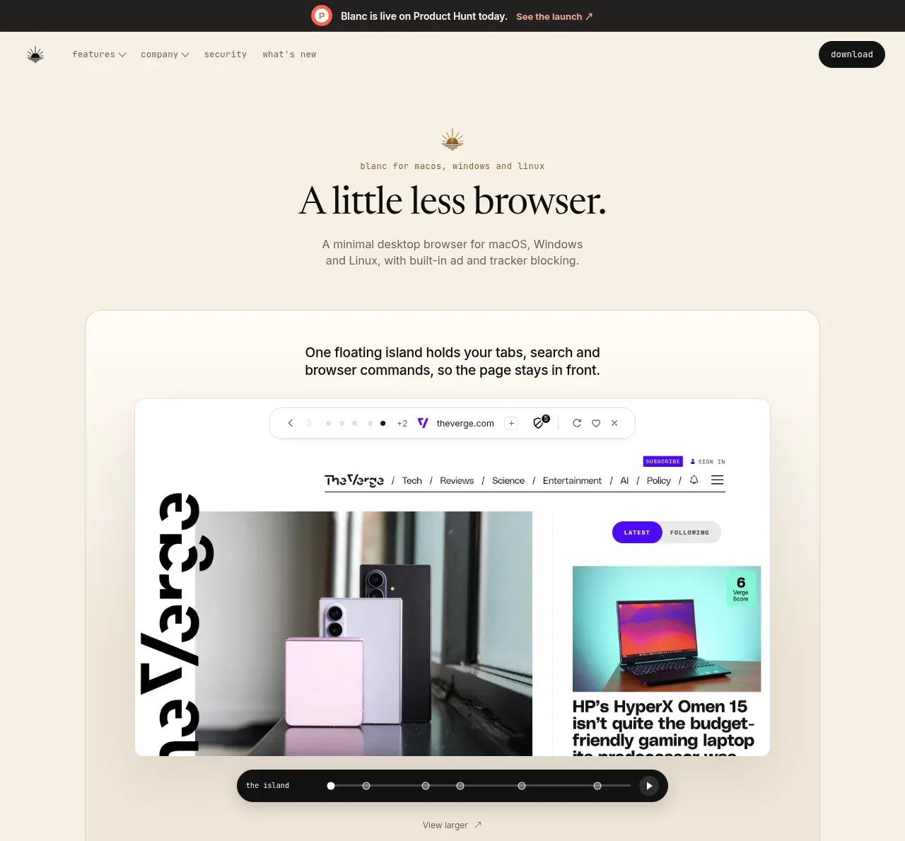 Minimal browser hero with product preview
Blanc · Hero
Minimal browser hero with product preview
Blanc · Hero
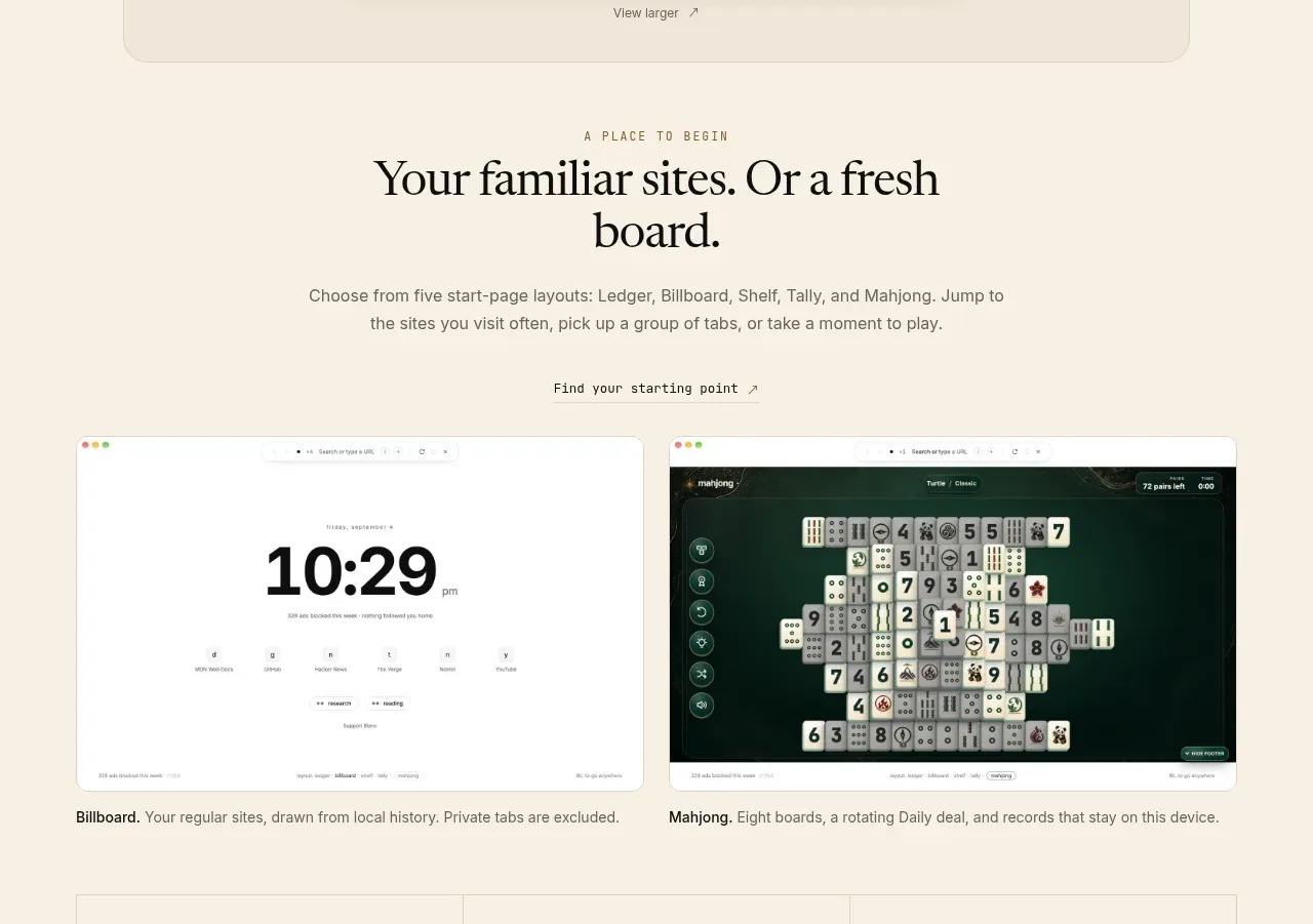 Start-page layout showcase
Blanc · Hero
Start-page layout showcase
Blanc · Hero
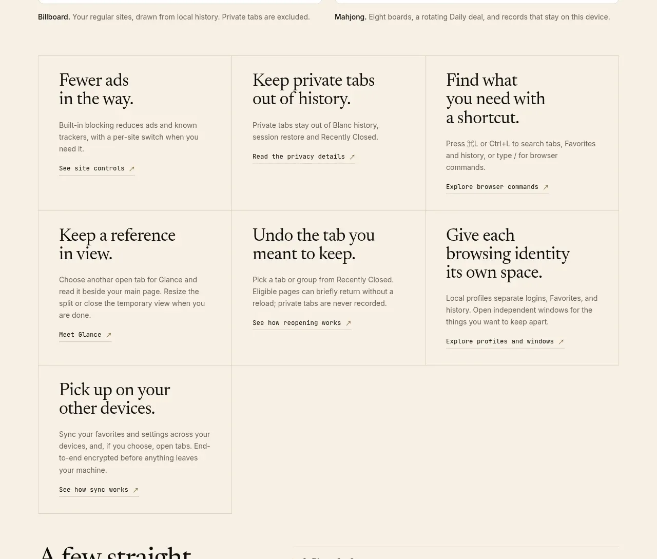 Product capabilities grid
Blanc · Feature grid
Product capabilities grid
Blanc · Feature grid
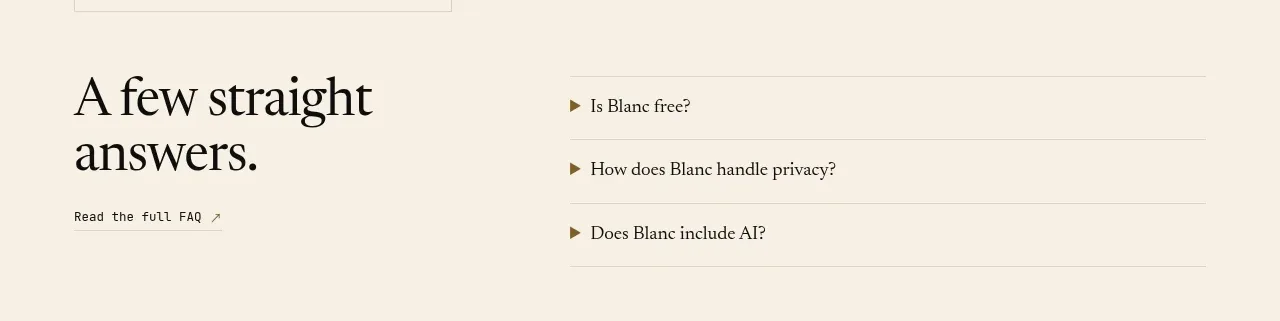 Compact FAQ section
Blanc · FAQ
Compact FAQ section
Blanc · FAQ
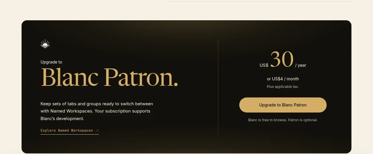 Dark premium upgrade call to action
Blanc · Call to action
Dark premium upgrade call to action
Blanc · Call to action
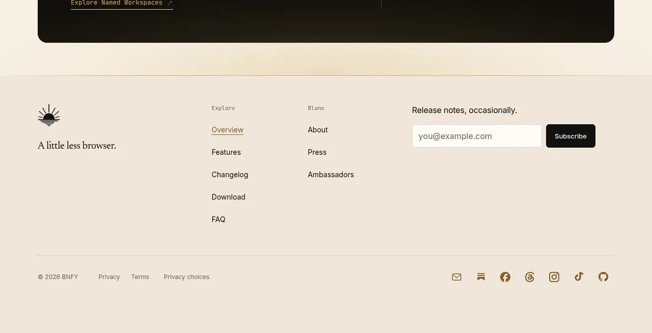 Multi-column site footer
Blanc · Footer
Multi-column site footer
Blanc · Footer