kage
kage
blancbrowser.com
Design analysis
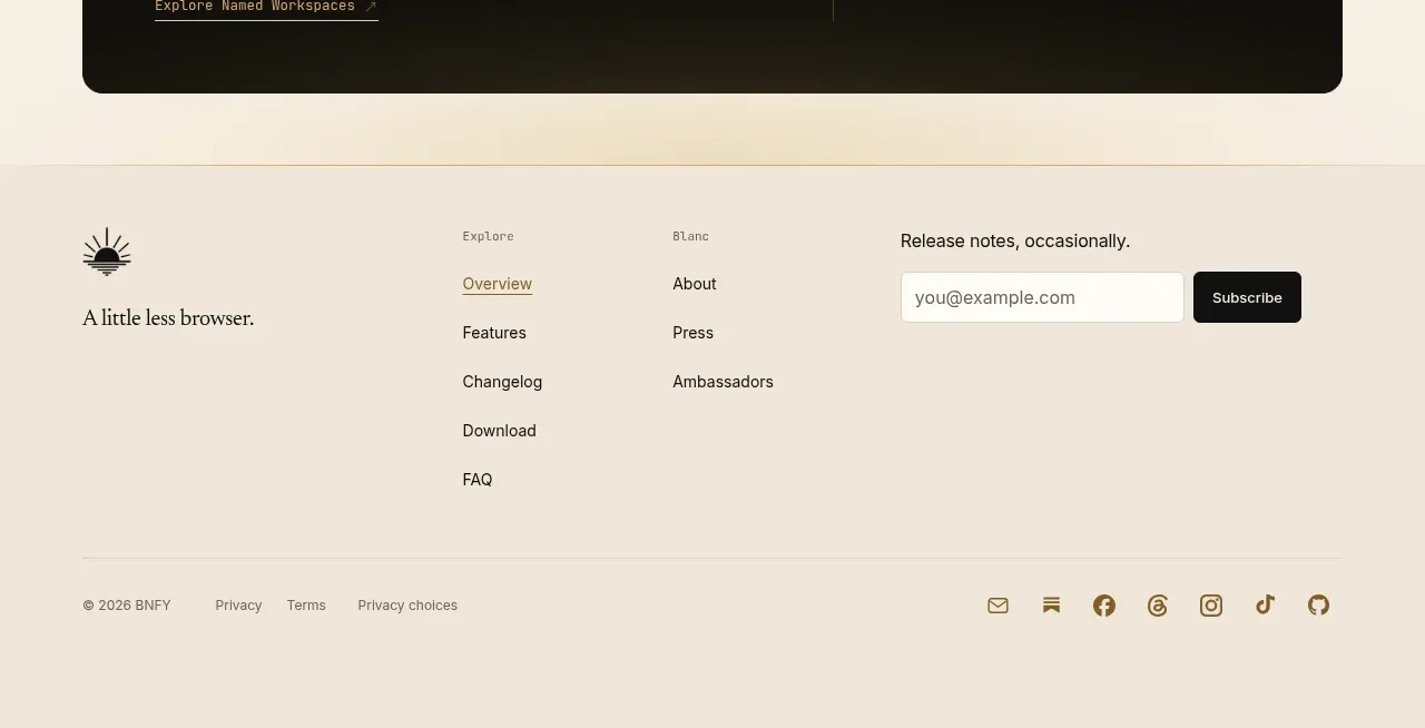
The footer uses a pale warm panel with a brand lockup, grouped navigation links, an email subscription form, a divider, legal links, and social icons.
Prompt preview
## Reference images

Study these alongside the description below: hierarchy, rhythm, spacing, colour. Build for the product you are asked about, using this design language.

- Component: https://kage-design-assets.t3.tigrisfiles.io/components/blanc/6c0ef6d1-d2ca-4e94-b731-e699c7d4dc0f-1789711447-6.webp
- Full page it was cut from: https://kage-design-assets.t3.tigrisfiles.io/screenshots/blanc/6c0ef6d1-d2ca-4e94-b731-e699c7d4dc0f-1789711355373-full.webp
- Component on Kage: https://kage.design/component/blanc-footer

## Before you start
Ask what the user's product, audience, and brand are, then apply the principles below to create an original footer.

Build a spacious footer on a slightly differentiated warm beige background (#eee5d6). Use a centered max-width container with a top grid: brand mark and short descriptor on the left, two compact link columns in the middle, and an email subscription block on the right. Use small uppercase or muted labels, 14–15px link text, and clear 10–14px vertical spacing. The subscription field should be a light bordered input paired with a compact dark button, with validation and success feedback. Add a full-width hairline divider, then a bottom row containing copyright, legal/privacy links, and a right-aligned set of simple social icons. Keep borders low contrast (#ded3c2), text near-black (#28251d), and accent links muted olive-brown (#6f633e). Collapse into stacked groups on mobile.

Never: copy the reference's logos, product names, copy, illustrations, or imagery.