kage
kage
blenny.fi5h.xyz
Design analysis
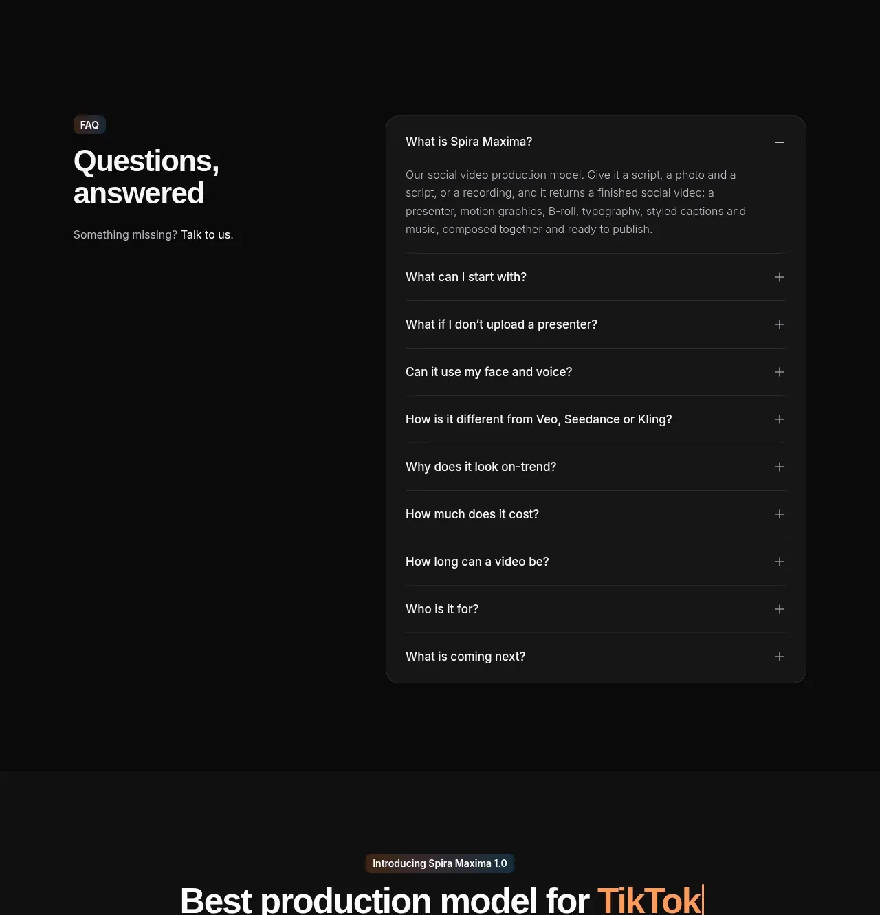
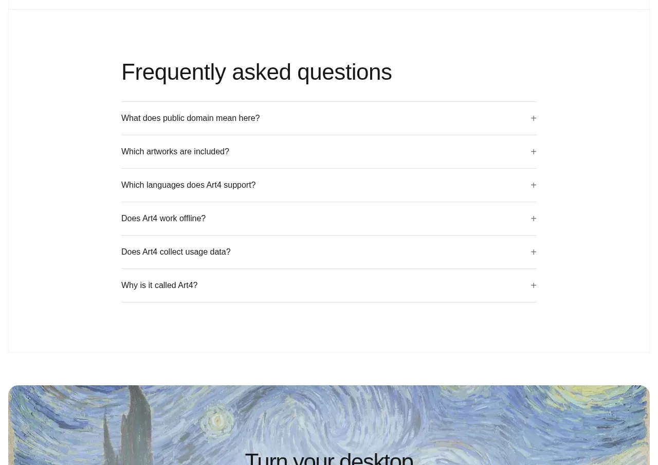
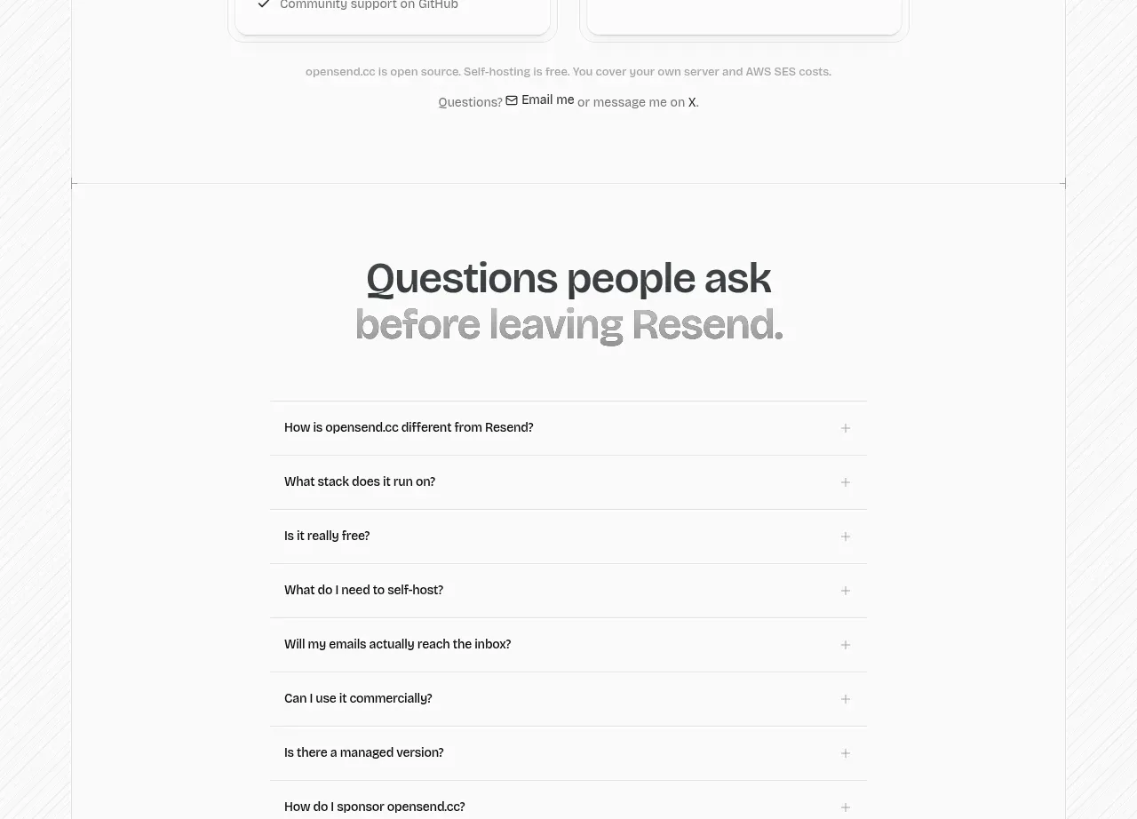
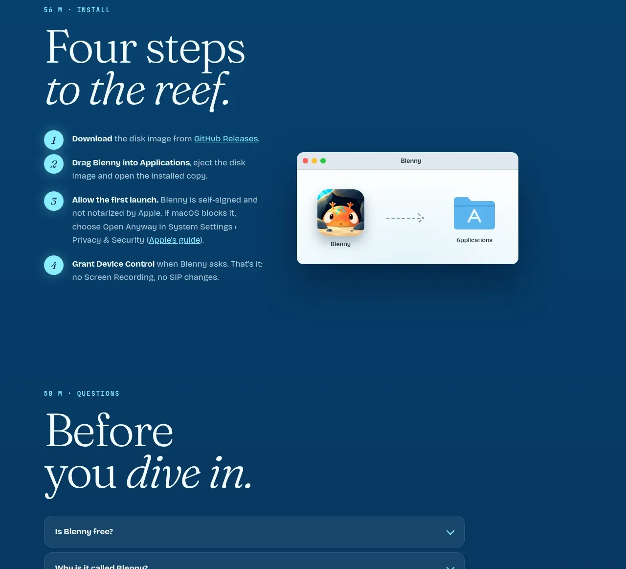
The FAQ uses a large editorial heading and a compact stack of rounded accordion rows with clear chevrons.
Prompt preview
## Reference images

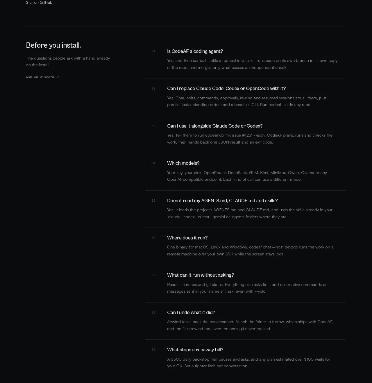
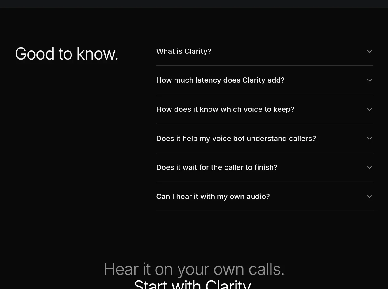
Study these alongside the description below: hierarchy, rhythm, spacing, colour. Build for the product you are asked about, using this design language.

- Component: https://kage-design-assets.t3.tigrisfiles.io/components/blenny/33d02076-57e4-4143-93c3-5008f6d9015f-1791180361-7.webp
- Full page it was cut from: https://kage-design-assets.t3.tigrisfiles.io/screenshots/blenny/33d02076-57e4-4143-93c3-5008f6d9015f-1791180160992-full.webp
- Component on Kage: https://kage.design/component/blenny-faq

## Before you start
Ask the user what their product is, who it is for, and what their brand voice and visual identity are. Apply the principles below to that product rather than reproducing this reference.

Create an FAQ section with a large two-line serif heading and a vertical accordion of seven questions. Each row should be a full-width rounded panel with bold question text, a right-aligned chevron, and enough padding for comfortable touch interaction. Use a deep navy background around #0a3f68, slightly lighter translucent panels around rgba(255,255,255,.10), a subtle border, and light text. Support one or multiple open items, animate height and chevron rotation modestly, and provide an instant reduced-motion mode. Use button semantics, keyboard operation, aria-expanded, and a visible focus ring. Leave generous whitespace above and below the accordion.

Never use logos, product names, copy, illustrations, or imagery from the reference.