kage
throxy.com
Design analysis
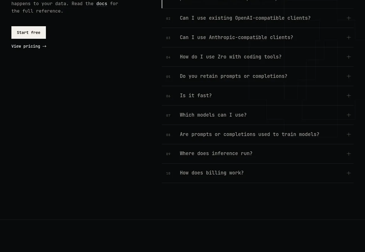
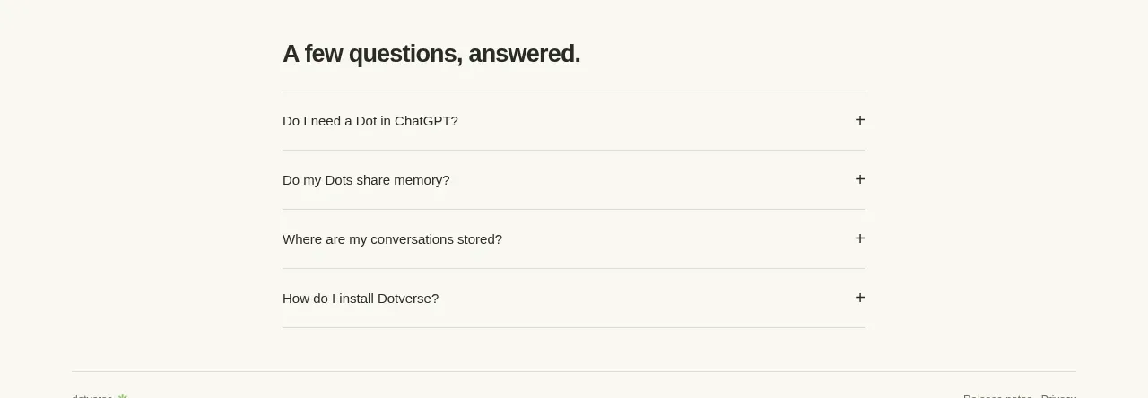
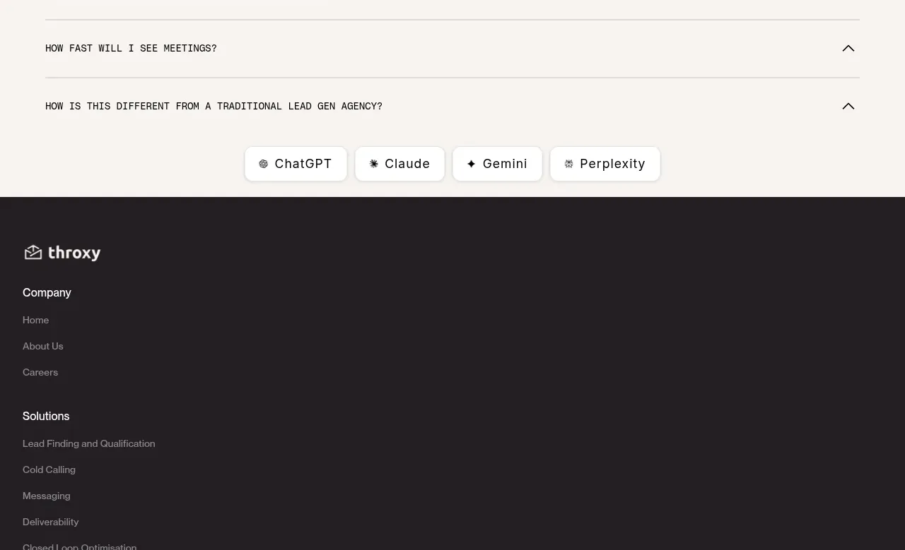
A simple FAQ uses a large heading and full-width horizontal accordion rows with compact uppercase labels and right-aligned chevrons.
Prompt preview
## Reference images

Study these alongside the description below: hierarchy, rhythm, spacing, colour. Build for the product you are asked about, using this design language.

- Component: https://kage-design-assets.t3.tigrisfiles.io/components/throxy/4d577be3-3944-4c06-b2f6-094c0e693ab7-1793253972-11.webp
- Full page it was cut from: https://kage-design-assets.t3.tigrisfiles.io/screenshots/throxy/4d577be3-3944-4c06-b2f6-094c0e693ab7-1793253814515-full.webp
- Component on Kage: https://kage.design/component/throxy-faq

### Before you start
Ask what the user's product, audience, and brand are, then apply these principles to that product.

Build a clean FAQ section on the same warm ivory background. Add a bold 32–40px heading, then render five or six full-width accordion rows separated by thin gray rules. Use compact 11–13px uppercase or small-label typography, generous 24–30px row padding, and a simple right-aligned chevron that rotates when open. Only one item needs to be open initially; animate height and opacity respectfully, support keyboard controls, and make the clickable target span the full row. Use #111011 text and #D9D5CE dividers.

Never: use logos, product names, copy, illustrations, or imagery from the reference.