kage
kage

Design analysis
A scrollytelling product page structured as a literal descent underwater: each section is a depth zone (Surface 0–3m, Reef 3–20m, Slope 20–35m, Deep below 35m) with a depth ruler at the viewport edge and huge ghosted depth numerals drifting behind the headings. The colour story carries the metaphor — a sunlit sandy hero fades through bright teal into a darkening navy as the page deepens — so the product's feature tiers (always visible, revealed on demand, hidden) are literally embodied in the gradient. Editorial serif display type with italic accents is paired with small mono eyebrow labels for a marine-logbook feel, while playful illustrated blenny fish and reef rocks keep it warm; glassy field-note cards and a real app screenshot ground the whimsy in concrete product detail. Lower sections trade illustration for density — a three-by-two trust grid, an honest "can't reach yet" limitation list, a four-step install, an accordion FAQ, and a bubble-shaped final download CTA — closing with a "back to the surface" link.
Prompt preview
## Reference images

Study these alongside the description below: hierarchy, rhythm, spacing, colour. Build for the product you are asked about, using this design language.

- Full page: https://kage-design-assets.t3.tigrisfiles.io/screenshots/blenny/33d02076-57e4-4143-93c3-5008f6d9015f-1791180160992-full.webp
- Above the fold: https://kage-design-assets.t3.tigrisfiles.io/screenshots/blenny/33d02076-57e4-4143-93c3-5008f6d9015f-1791180158579.webp
- Design on Kage: https://kage.design/designs/blenny-landing-page

# Rebuild this "depth zones" underwater product page design language

## Before you start
Ask the user what they are building, who it is for, and what brand assets they already have (name, colours, type). Wait for the answers. Everything below is applied to their product, not to the reference. The reference is a macOS menu-bar organiser with an underwater metaphor; the structure and visual system below can be re-skinned onto any product that has tiered modes, levels, or states — keep the metaphor only if it suits their product, otherwise keep the mechanics (progressive atmosphere change, depth ruler, ghosted numerals, logbook cards) with their own narrative.

## Page structure
Build one long single-page site, top to bottom, with a fixed slim macOS-style menubar nav at the very top (brand left; links: Features, How it Works, Safety, Install, FAQ; then a decorative row of tiny status-bar glyphs, a clock and date at the far right — playful chrome, one line tall).

1. **Hero (0m)** — warm sand-and-sunlit-water gradient background. Small mono uppercase eyebrow: product category + platform qualifier. Giant serif headline (three lines) with one italic emphasised word. Short two-to-three-line paragraph, then two buttons: one solid accent pill, one light secondary pill. Below the buttons a mono meta line (free & open source · license · chip · OS version). Right side: a large illustrated mascot scene anchoring the ground line; far right edge, a thin vertical depth ruler widget with tick marks and a live depth readout. Bottom of hero: "SCROLL TO GO UNDER ↓" in small mono caps.

2. **Zone 1 — first tier** — atmosphere brightens to saturated teal. Huge ghosted watermark numeral in the background. Mono eyebrow: tier name · depth range · behaviour ("always visible"). Serif headline with italic accent. Paragraph, then a narrow single-column list of three bold-lead bullet items. Below, a translucent glass "field note" card with a small mono header and two-line anecdote. End with a full-bleed illustrated scene (rock/terrain with mascot) spanning the content width.

3. **Zone 2 — second tier** — water deepens slightly. Ghosted numeral again. Same eyebrow/headline/paragraph rhythm. One interactive pill button (demo trigger). Large full-width illustration of the tier's environment. Glass field-note card below.

4. **Zone 3 — interaction mechanics** — headline becomes imperative: three short sentences, one italic word mid-line. Instead of bullets, a loose 3+1 grid of tiny circle-dot labels with bold lead-ins and short copy. Then a large light-mode app screenshot in a rounded window frame with traffic lights, toolbar tabs, and a status strip — the single most concrete moment on the page. Glass field-note card under it.

5. **Zone 4 — deepest tier** — darkest section of the page, near-navy. Ghosted numeral. Eyebrow, headline, short paragraph about hiding things completely. Left mostly empty — let the darkness breathe.

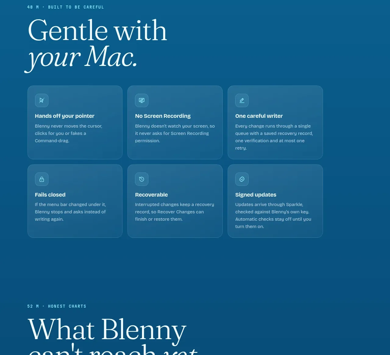
6. **Trust / safety grid** — eyebrow: depth number + tagline. Serif headline. Three-by-two grid of translucent glass cards: small glyph, bold title, two-to-three lines of body copy covering safety, permissions, recovery, updates.

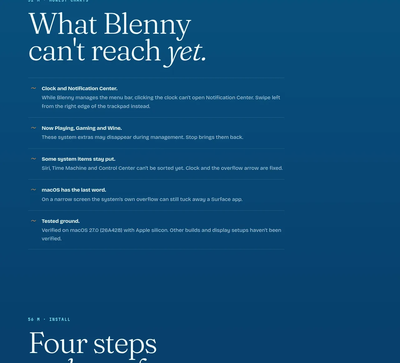
7. **Limitations section** — eyebrow marks it as "honest". Serif headline "What X can't reach yet." A vertical list of five items, each a small tilde marker + bold lead + explanation, separated by hairline rules. Wired-in links inline.

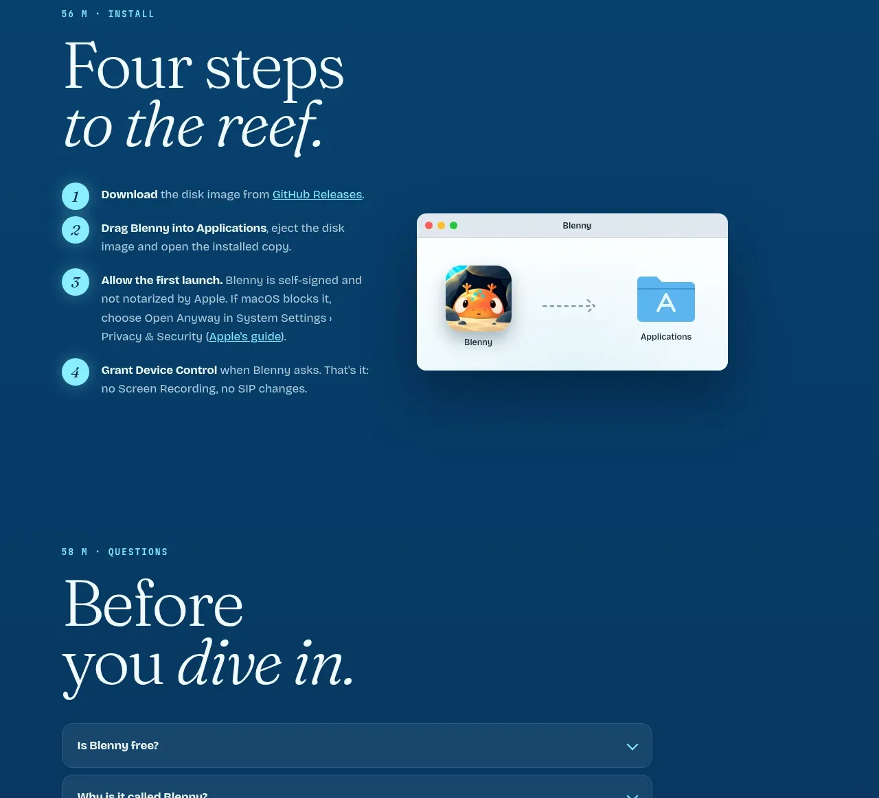
8. **Install section** — eyebrow "install". Headline "Four steps…". Numbered list 1–4: accent numerals in circles, bold step name, one-to-two lines including inline links. Right side: a small light window screenshot showing the drag-to-install flow.

9. **FAQ** — eyebrow "questions". Big serif two-word headline. Six to eight full-width accordion rows, dark translucent pills with rounded corners, question left, chevron right, generous vertical padding.

10. **Final CTA** — eyebrow "time to go back up". Centred large translucent bubble illustration containing a short label; beneath it the download button and a row of three ghost pill buttons (sponsor, donate, source).

11. **Footer** — single hairline-top row: contributors · license left, disclaimer right. Above it a centred mono "↑ BACK TO THE SURFACE" link.

## Design language
- **Atmosphere carries structure**: the page background is one continuous vertical gradient from warm sand (#E8D9B8-ish) through bright teal (#3D9DC4 → #1F7FA8) into deep navy (#123B54). Depth = darkness; each section's background is a slightly darker stop than the last. Never reset the gradient mid-page.
- **Serif display + mono instrumentation**: pair a high-contrast serif (e.g. a Garamond/Editorial-style face) at 56–96px for headlines, with italic serif for the emphasised word in each headline. Use a small mono face (uppercase, letter-spaced, ~11px) for eyebrows, ruler labels, field-note headers, and scroll hints. Body copy is the serif or a humanist sans at 15–16px, line-height ~1.6, max-width ~34em.
- **Ghosted numerals**: each depth zone places an enormous (200px+) very-low-opacity serif numeral (0m, 12m, 28m, 40m) behind/around the headline, partially cropped by the viewport edge. It orients the reader without competing.
- **Depth ruler**: a fixed right-edge vertical ruler with tick marks, mono labels, and a small current-depth readout that can update on scroll. Hairline strokes, no colour fill.
- **Glass cards on water**: field notes and trust cards use rgba-white backgrounds (8–14% opacity), 1px rgba-white borders, ~16px radius, backdrop blur, no drop shadows. Inside: mono uppercase header in the accent colour, then small serif body.
- **Accent discipline**: one warm accent (the reference uses orange/coral ~#F0762B) for eyebrow labels, numerals in step markers, the primary CTA pill, and tiny inline highlights. Everything else stays blue/white/ink. This warm-on-cool tension is the palette's engine.
- **Buttons**: solid accent pill (white text, ~28px radius, subtle downward pointer glyph), secondary pill in translucent white with dark text, ghost pills with hairline borders for tertiary actions.
- **Illustration rhythm**: alternate between full-bleed illustrated scenes (mascot + environment, roughly one per major zone) and UI screenshots in light window chrome. Illustrations sit on the gradient with no card behind them; screenshots get real window frames (traffic lights, tab bar, status strip).
- **Section transitions**: no divider rules between zones — the gradient shift plus the eyebrow label does the separation. Within sections, hairline rules (1px, low-opacity white) only between list rows.
- **Honesty as a feature**: give limitations their own styled section (tilde markers, hairline rows) rather than burying them; it reads as trustworthy, not negative.
- **Motion (where visible)**: scroll-hint chevron at hero end, one demo-trigger button, accordion chevrons. Keep everything slow and buoyant — no snappy easing; hover states are subtle opacity/border changes.

## Never
- No blenny fish, reef rocks, bubbles, or underwater mascots from the reference; no "Surface / Reef / Deep" tier names or dive-log copy.
- No macOS status-bar glyph strip or clock trick copied verbatim — rebuild any decorative chrome from the user's own product's UI.
- No reuse of the reference's headline wording, field-note anecdotes, FAQ questions, or install-step copy.
- Never present the result as Blenny or imply affiliation with it; the depth metaphor is the transferable idea, not the assets.
Components from this page
All components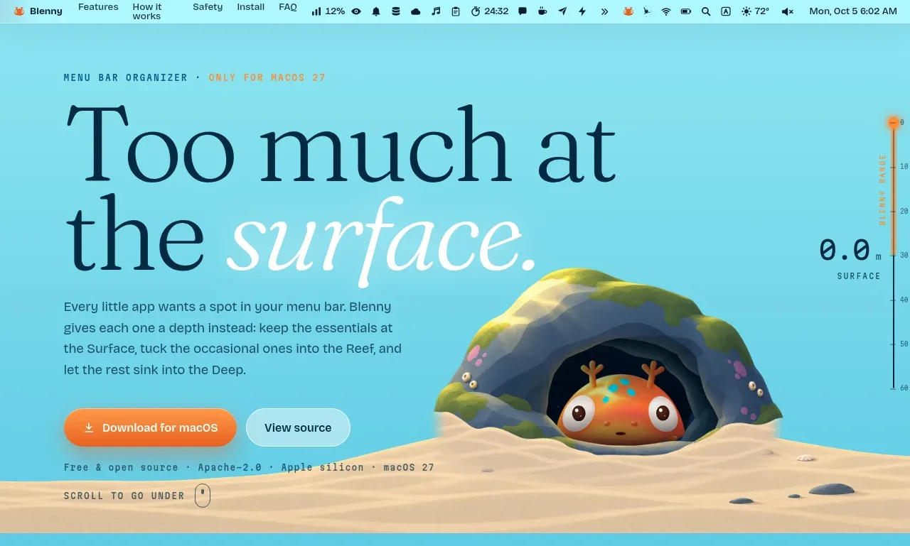
 Surface-level product hero
Blenny · Hero
Surface-level product hero
Blenny · Hero
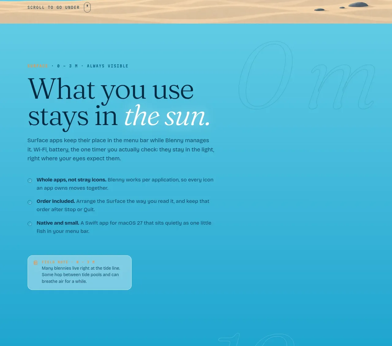 Always-visible surface features
Blenny · Feature grid
Always-visible surface features
Blenny · Feature grid
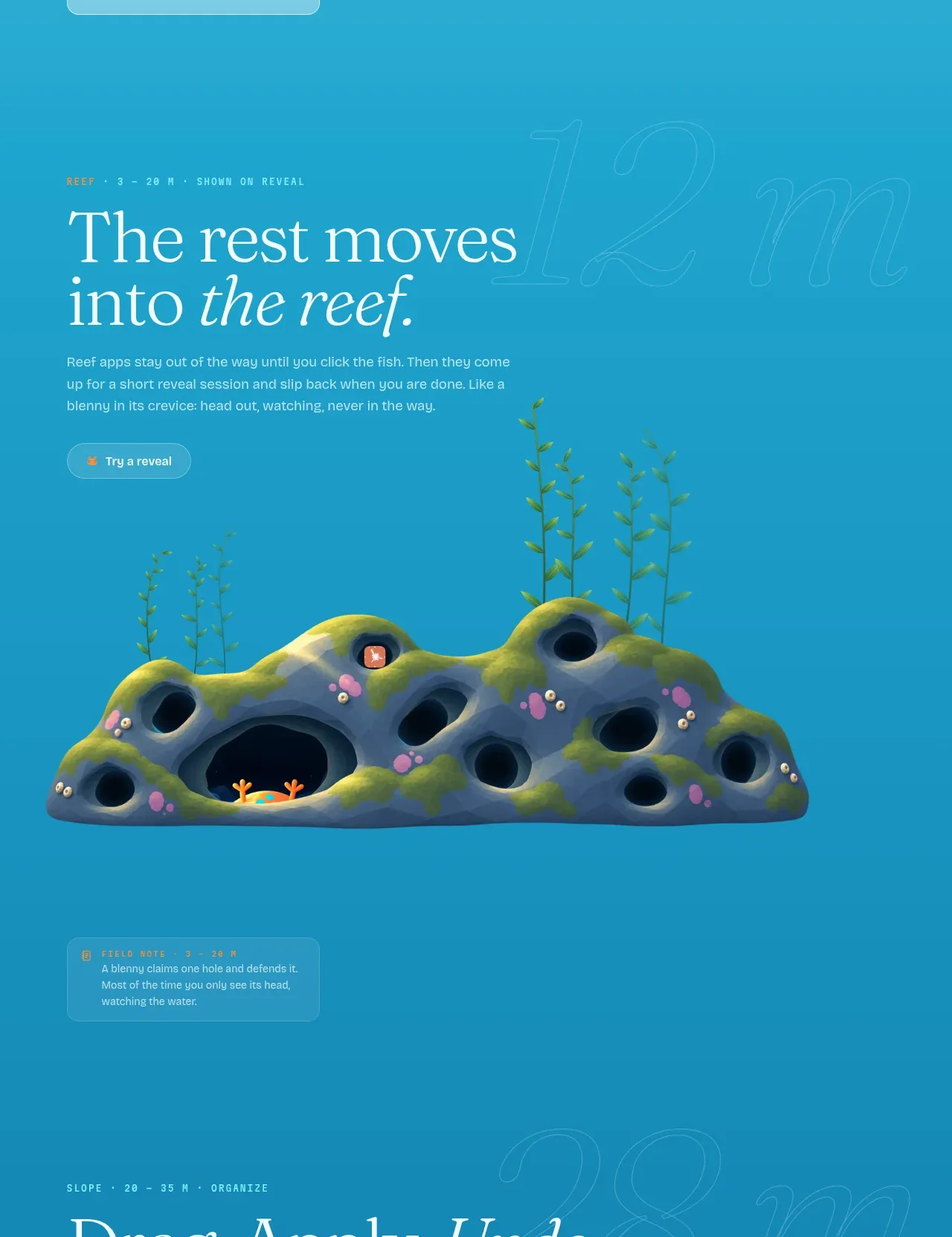 Revealable reef visual
Blenny · Gallery
Revealable reef visual
Blenny · Gallery
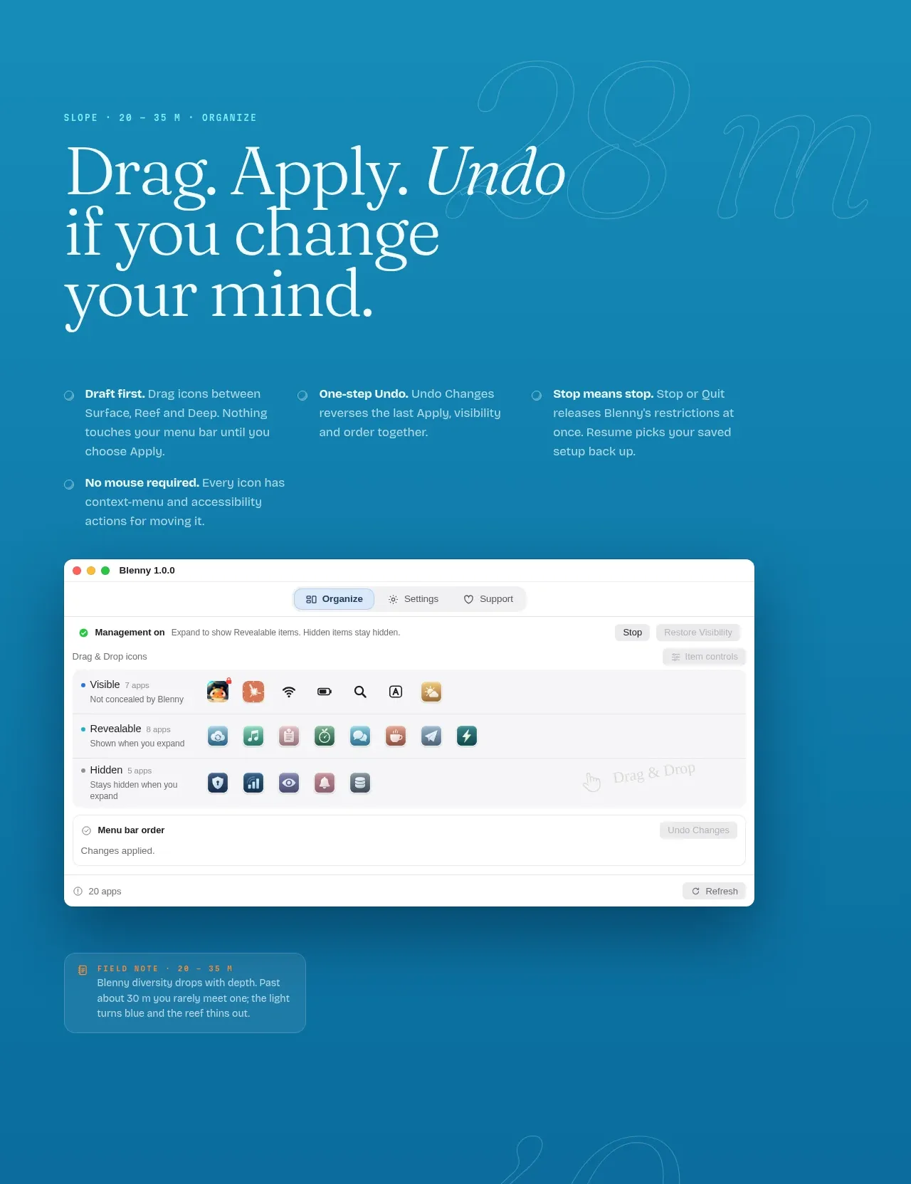 Organize workflow principles
Blenny · Feature grid
Organize workflow principles
Blenny · Feature grid
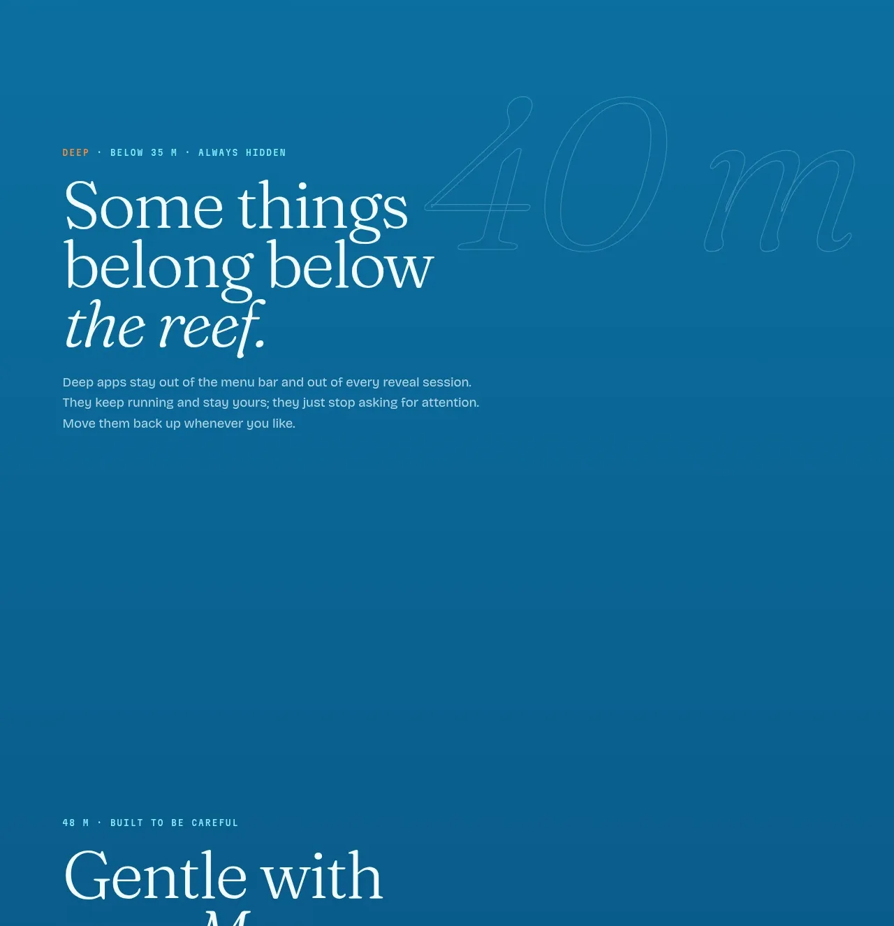 Deep mode feature cards
Blenny · Feature grid
Deep mode feature cards
Blenny · Feature grid
 Capability limitations list
Blenny · Table
Capability limitations list
Blenny · Table
 Installation steps
Blenny · Feature grid
Installation steps
Blenny · Feature grid
 Expandable questions
Blenny · FAQ
Expandable questions
Blenny · FAQ
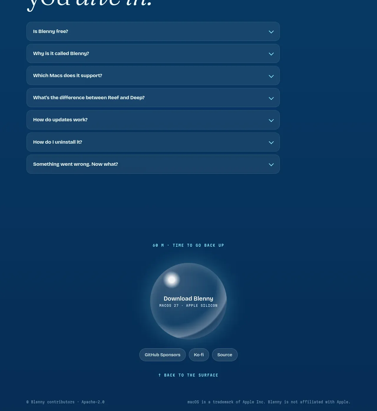 Final download call to action
Blenny · Call to action
Final download call to action
Blenny · Call to action