kage
kage
blinkist.com

Design analysis
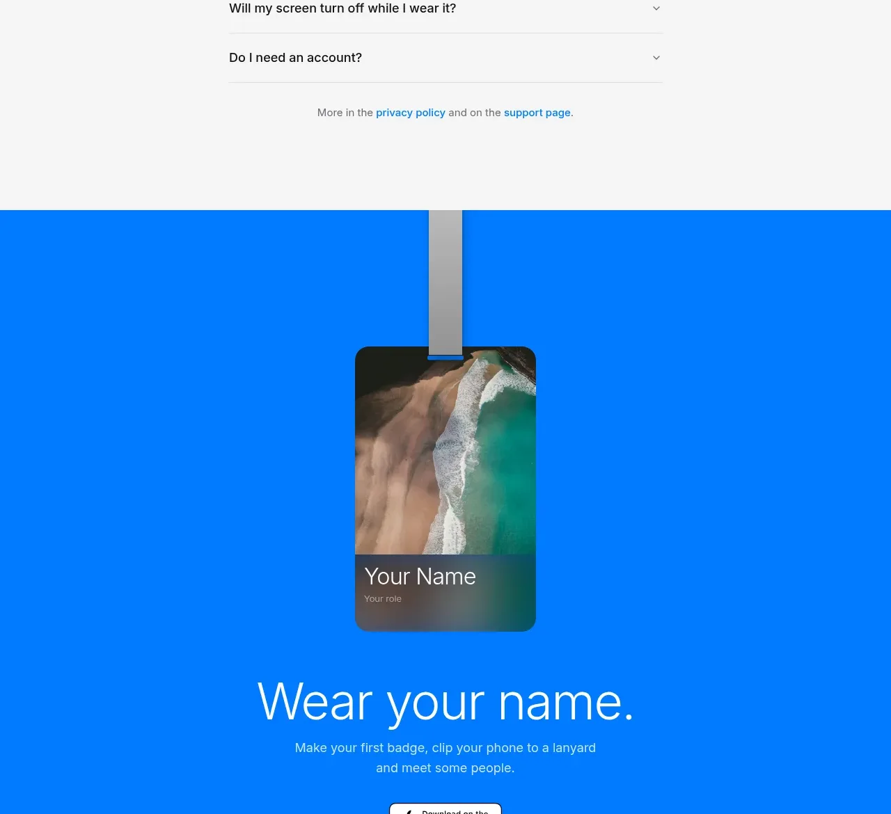
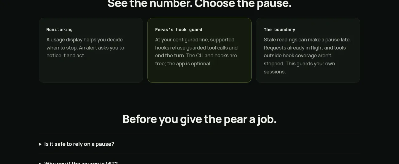
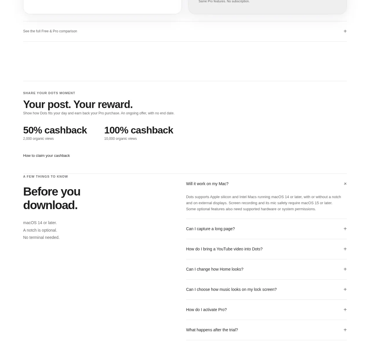
A centered question heading sits above a narrow accordion list with generous row spacing, subtle separators, and clear disclosure chevrons.
Prompt preview
## Reference images

Study these alongside the description below: hierarchy, rhythm, spacing, colour. Build for the product you are asked about, using this design language.

- Component: https://kage-design-assets.t3.tigrisfiles.io/components/blinkist-com/923d3302-3f7c-4bf2-9567-691903266cb3-1789146454-10.webp
- Full page it was cut from: https://kage-design-assets.t3.tigrisfiles.io/screenshots/blinkist-com/923d3302-3f7c-4bf2-9567-691903266cb3-1789146395050-full.webp
- Component on Kage: https://kage.design/component/blinkist-faq

## Before you start
Ask what the user's product, audience, and brand are, then apply these principles to that product rather than copying the reference.

Build an FAQ section with a centered heading and a constrained content width of roughly 480–560px. Render questions as full-width accordion rows with bold dark-navy labels, thin light-gray separators #d9dfdd, generous 20–24px vertical padding, and a right-aligned chevron. Animate expansion gently, allow only one or several items open according to the product need, and use proper button semantics with aria-expanded and accessible panel IDs. Keep the background white and the section vertically generous.

Never use the reference's logos, product names, copy, illustrations, or imagery.