kage
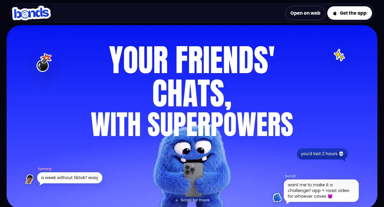
bonds.chat
Design analysis
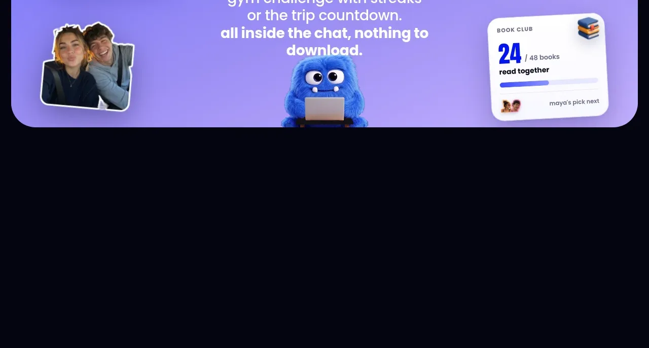
A lavender-blue panel explains that shared activities live inside the chat, supported by floating progress cards and photographic cutouts around a central headline.
Prompt preview
## Reference images

Study these alongside the description below: hierarchy, rhythm, spacing, colour. Build for the product you are asked about, using this design language.

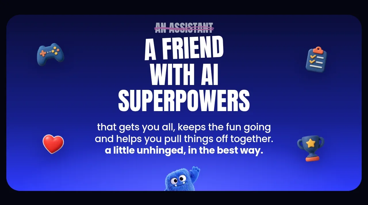
- Component: https://kage-design-assets.t3.tigrisfiles.io/components/bonds/92b84629-52db-439e-9b50-1b68fbcd9bda-1792562654-4.webp
- Full page it was cut from: https://kage-design-assets.t3.tigrisfiles.io/screenshots/bonds/92b84629-52db-439e-9b50-1b68fbcd9bda-1792562529975-full.webp
- Component on Kage: https://kage.design/component/bonds-hero-4

## Before you start
Ask what kinds of tasks, games, or shared activities your product enables and what proof would make that benefit credible. Apply the rules below using original content.

Build a playful feature panel with a soft lavender-to-periwinkle gradient (`#a6a0ff` to `#8a83ee`) and a large rounded container. Place a centered condensed headline in dark navy and white/accent emphasis, followed by a concise explanatory paragraph. Surround the copy with 3–4 offset mini-cards that represent real product outcomes: progress bars, counters, streaks, or collaborative status. Cards should be white, lightly shadowed, 14–18px rounded, and slightly rotated or layered for an energetic scrapbook feel. Keep the central reading path clear, constrain decorative cards on mobile, and use a bottom-centered visual anchor only when it supports the story.

Never: use the reference's logos, product names, copy, illustrations, imagery, or exact visual assets.