kage
kage
botbus.io
Design analysis
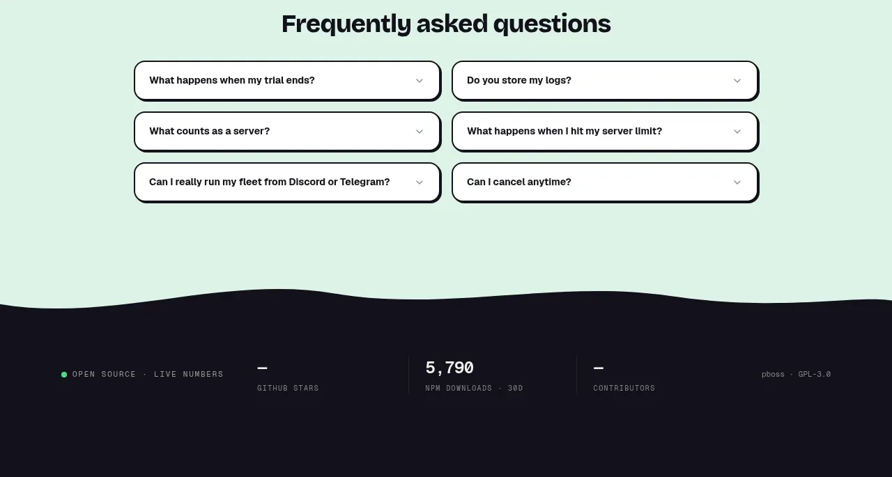
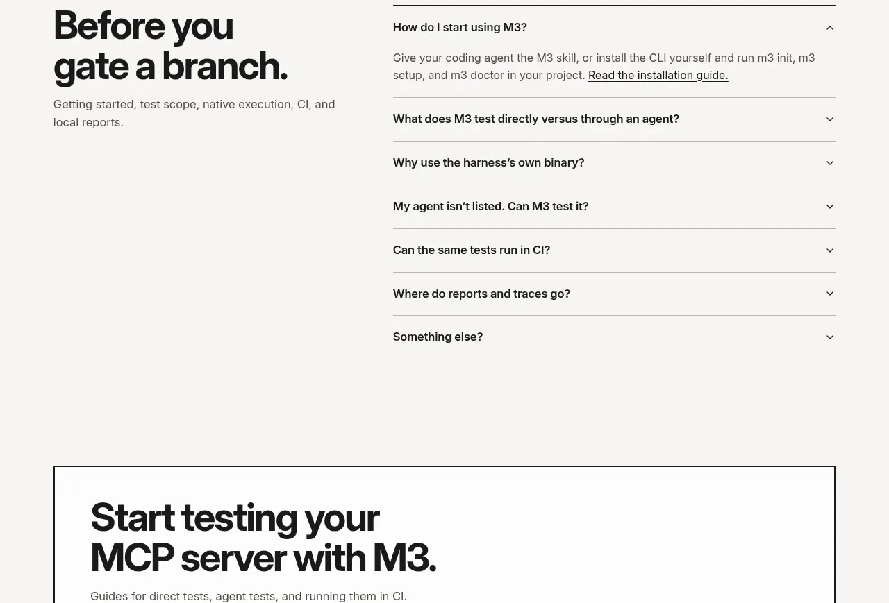
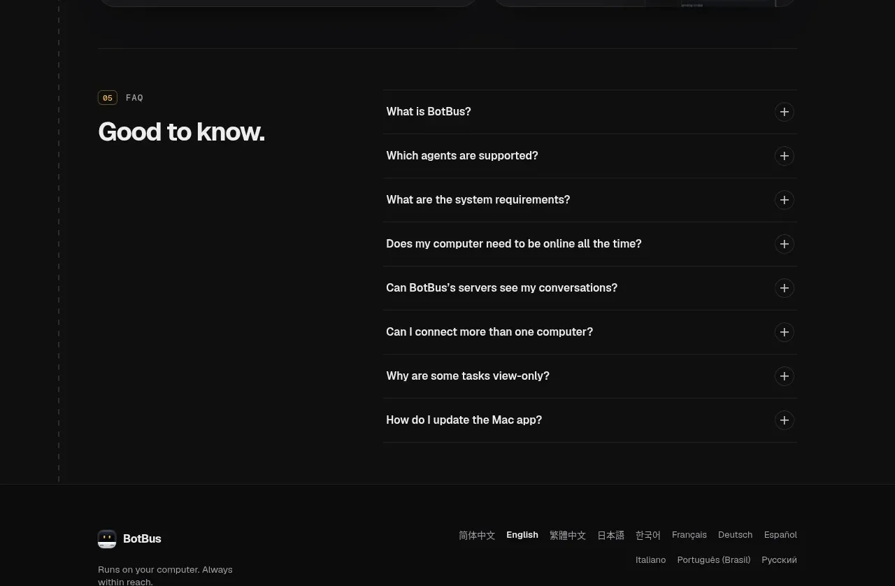
The FAQ uses a large left-aligned heading and a narrower right-hand accordion of separated questions, with plus controls that make the interaction immediately discoverable.
Prompt preview
## Reference images

Study these alongside the description below: hierarchy, rhythm, spacing, colour. Build for the product you are asked about, using this design language.

- Component: https://kage-design-assets.t3.tigrisfiles.io/components/botbus/3351c24c-0aff-40a1-9a6d-203e8c2d3da7-1791525846-7.webp
- Full page it was cut from: https://kage-design-assets.t3.tigrisfiles.io/screenshots/botbus/3351c24c-0aff-40a1-9a6d-203e8c2d3da7-1791525750475-full.webp
- Component on Kage: https://kage.design/component/botbus-faq

## Before you start
Ask what the user's product and brand are, then apply the principles below to that product rather than reproducing this reference.

Create a dark FAQ section with a two-column layout: a large short heading on the left and a vertical accordion list on the right. Each question should occupy a full-width row separated by thin #262626 rules, with bold 14–16px text and a small circular plus/minus control aligned to the far right. Allow only one item to expand at a time or clearly support multiple open items. Use generous 20–26px row padding, #101010 background, white question text, muted answer text, and a subtle warm accent for focus states. Ensure keyboard navigation, visible focus rings, and aria-expanded semantics. Stack the heading above the accordion on small screens.

Never: use logos, product names, copy, illustrations, or imagery from the reference.