kage
kage
Design analysis
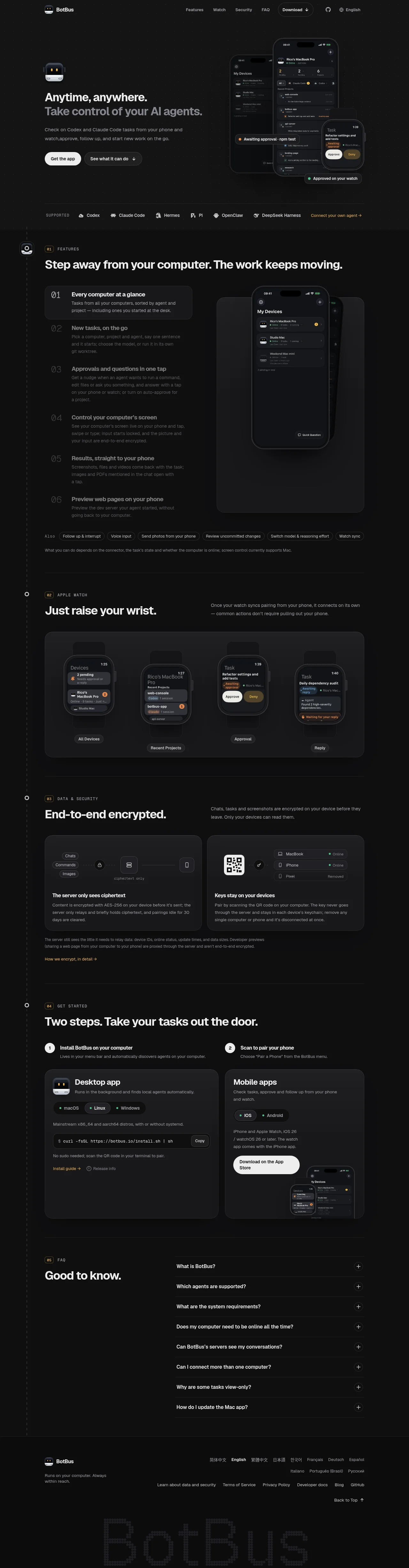
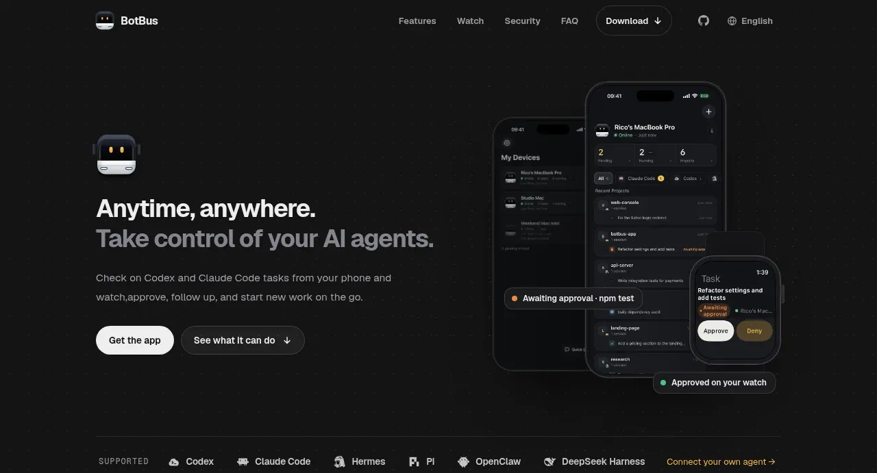
A near-black developer-tool landing page that runs on one amber accent, spent sparingly on numbered section chips (01–05), inline arrow links and 'awaiting approval' status states, with green reserved strictly for online dots. The hero pairs a two-tone headline (white clause over gray clause) with fanned iPhone mockups, then the page settles into a numbered narrative — feature list with one active row expanded into a bordered card beside a device panel, a four-watch strip, encryption diagram cards, a two-step install grid with platform pills and a copyable curl command, and a headline-left/accordion-right FAQ. A faint dotted left rail with ring nodes stitches the sections into a timeline, and the footer closes with a language row, legal links and an oversized halftone-dotted brand wordmark cropped by the page edge.
Prompt preview
## Reference images

Study these alongside the description below: hierarchy, rhythm, spacing, colour. Build for the product you are asked about, using this design language.

- Full page: https://kage-design-assets.t3.tigrisfiles.io/screenshots/botbus/3351c24c-0aff-40a1-9a6d-203e8c2d3da7-1791525750475-full.webp
- Above the fold: https://kage-design-assets.t3.tigrisfiles.io/screenshots/botbus/3351c24c-0aff-40a1-9a6d-203e8c2d3da7-1791525748176.webp
- Design on Kage: https://kage.design/designs/botbus-landing-page

## Before you start
Ask the user what product this page is for, who its primary users are, and what brand assets they already have (name, logo, colours, typeface, real app screenshots). Also ask which platforms to showcase and whether there is an install command or store link to feature. Wait for the answers before writing any code — everything below is applied to their product, not to the reference site.

## Page structure
1. **Top nav** — one dark bar: wordmark plus small mascot mark left; centred anchor links to the sections below (Features, Watch, Security, FAQ); right side a pill "Download" button with dropdown caret, a source-repo icon and a language picker.
2. **Hero** — two columns. Left: small mascot icon, two-tone headline (first clause white, second clause mid-gray on a new line), one-paragraph gray subline, then two pill CTAs — solid white primary ("Get the app") and a dark outlined anchor ("See what it can do ↓"). Right: three overlapping phone mockups fanned at slight angles showing a device list, a task thread and an approval card with Approve/Deny buttons, plus a small floating status toast overlapping the frames.
3. **Supported strip** — thin quiet band: uppercase "SUPPORTED" label, a row of integration wordmarks, ending in an amber text link "Connect your own agent →".
4. **01 · Features** — opens with the numbered label pattern (amber numeral chip + uppercase section name) and a full-width statement headline. Body in two columns: left, six numbered feature rows (large ghost-gray numerals, title + two-line description) where the active row expands into a bordered card; right, a rounded panel holding one large phone mockup. Below: an "Also:" row of small outline chips naming secondary features, then one line of gray fine print scoping platform support.
5. **02 · Apple Watch** — headline left ("Just raise your wrist."), supporting paragraph right. One wide rounded panel with four watch mockups side by side (device list, projects, an approval card with white Approve / amber Deny buttons, a reply screen), each captioned by a small pill label beneath the panel.
6. **03 · Data & Security** — headline left ("End-to-end encrypted."), supporting paragraph right. Two equal cards containing diagrams built from the same chips and hairline connectors as the UI: one showing data chips → padlock → "ciphertext only" → device icon, one showing a QR code and key icon feeding a device status list with green Online dots and one Removed row. Close with two lines of amber fine print and an amber detail link.
7. **04 · Get started** — numbered label, full-width headline, then two columns each led by a numbered step title and one-liner: a desktop card (app icon, platform pills, an architecture note, a terminal-style command row with a Copy button, two text links) and a mobile card (platform pills, requirement text, a white store button, a cropped phone screenshot).
8. **05 · FAQ** — label plus headline "Good to know." left; right, a single-column accordion of ~8 questions with hairline dividers and circular + toggles.
9. **Footer** — wordmark and one-line tagline left; a wrapped row of language links with the current one highlighted; a row of legal/product links; "Back to Top ↑" right-aligned; at the very bottom an oversized halftone/dotted rendition of the user's own brand name, cropped by the page edge, as a graphic signature.

## Design language
- **Canvas**: near-black page background (~#0c0c0c), slightly lighter section panels (~#151515), card surfaces (~#1b1b1b). Separation comes from 1px hairline borders (white at ~8–10% alpha) and 16–24px corner radii — not shadows. Only device mockups get soft ambient shadow.
- **Accent discipline**: one amber/gold accent (~#e5b04a) reserved for numbered section chips, inline arrow links, "awaiting" status chips and the deny/destructive-adjacent button; green (~#4ade80) appears only as online/success dots. Everything else lives on a white→gray scale. Primary buttons invert the theme: white pill, near-black text; secondary buttons are dark outlined pills.
- **Type**: a single grotesque sans family throughout. Hero ~56–64px with two-tone emphasis (white clause, gray clause); section statements ~40–48px; feature/card titles ~18–20px semibold; body 15–16px in mid-gray (~#9a9a9a); labels and fine print 11–12px uppercase with wide tracking, often prefixed by a small amber numeral.
- **Wayfinding**: number every section (01–05) with the repeated label pattern, and run a faint dotted vertical rail with small ring nodes down the left margin so a long page reads as a timeline the CTAs can anchor into.
- **Rhythm and density**: alternate image-heavy and text-heavy bands — dense hero imagery → sparse logo strip → list-driven features → split headline/panel sections → diagram cards → instructional two-step grid → accordion → graphic footer. Cap content at ~1100–1200px with ~120px vertical section padding.
- **Diagrams as UI**: build explanatory graphics (encryption flow, pairing steps) from the same chips, pills, status dots and hairline connectors used in the product mockups, so security and setup sections read as product UI rather than illustration.
- **Status language**: colour-code real app states (Awaiting approval = amber, Approved/Online = green, Removed = dimmed) inside mockups so screens feel live rather than decorative.
- **Motion**: restrained — smooth accordion expansion, hover brightening on chips and links, anchor-scroll CTAs ("See what it can do ↓", "Back to Top ↑"). No parallax or heavy animation.

## Never
- Never reuse the reference product's name, bus mascot/logo, taglines, headline copy, FAQ questions, install command or security claims verbatim — write equivalents for the user's product.
- Never reproduce the integration wordmarks shown in the supported strip; use the user's actual integrations.
- Never reuse the phone/watch screenshots; rebuild device mockups from the user's own product UI.
- Never present the result as the reference product or imply any affiliation.
Components from this page
All components
 Minimal dark navigation bar
BotBus · Navigation
Minimal dark navigation bar
BotBus · Navigation
 Agent control hero
BotBus · Hero
Agent control hero
BotBus · Hero
 Supported tools strip
BotBus · Logo cloud
Supported tools strip
BotBus · Logo cloud
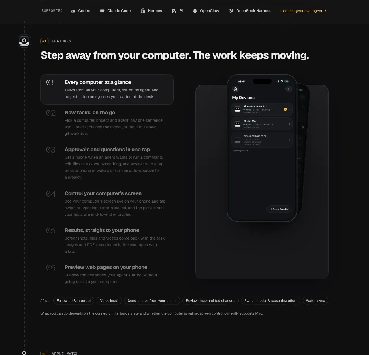 Core feature walkthrough
BotBus · Feature grid
Core feature walkthrough
BotBus · Feature grid
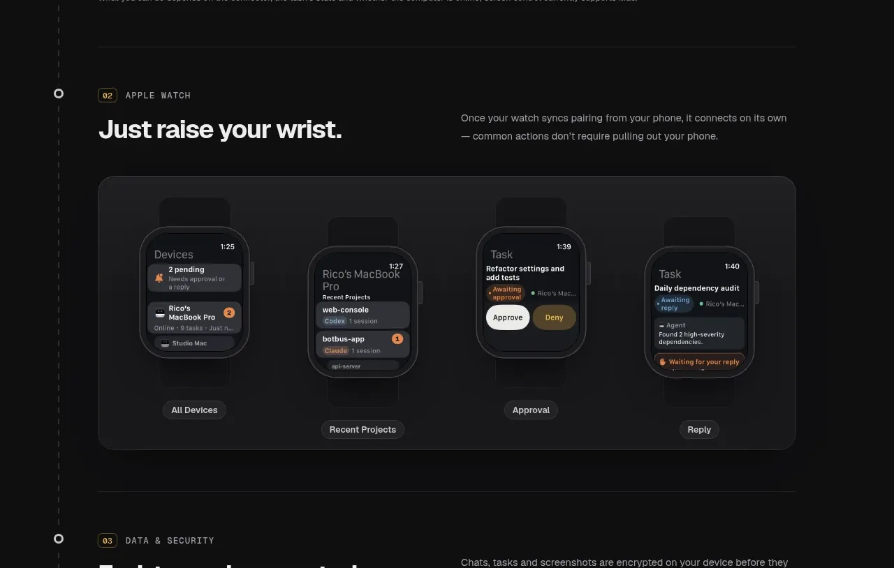 Wearable workflow showcase
BotBus · Feature grid
Wearable workflow showcase
BotBus · Feature grid
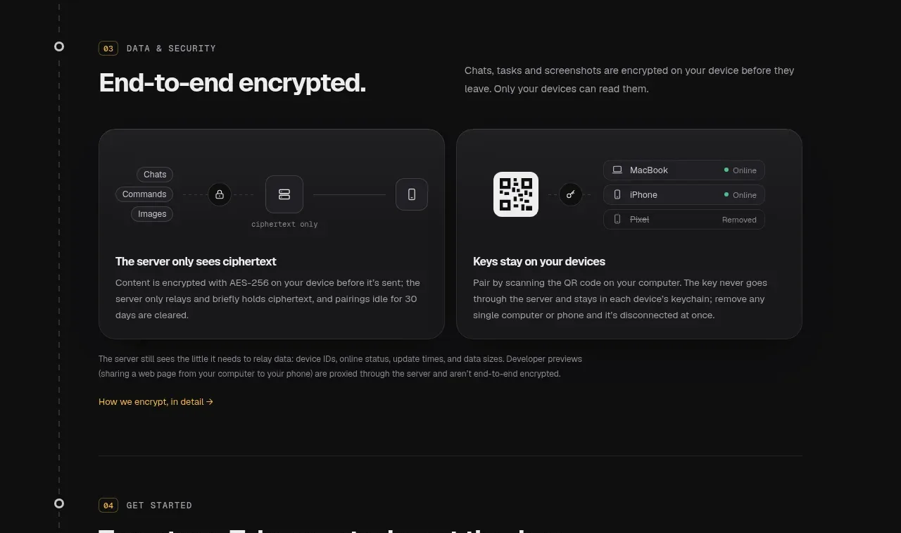 Privacy and security cards
BotBus · Feature grid
Privacy and security cards
BotBus · Feature grid
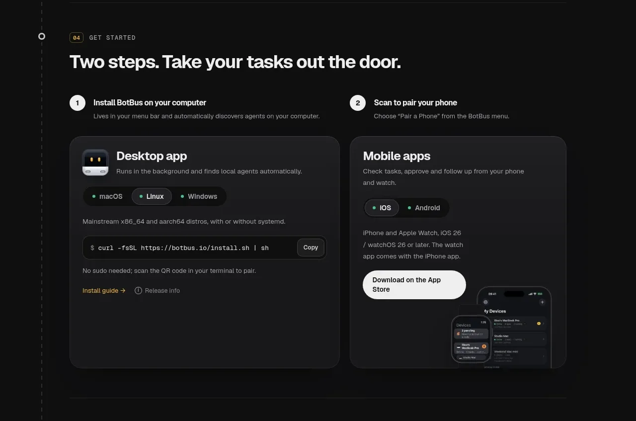 Two-step onboarding cards
BotBus · Feature grid
Two-step onboarding cards
BotBus · Feature grid
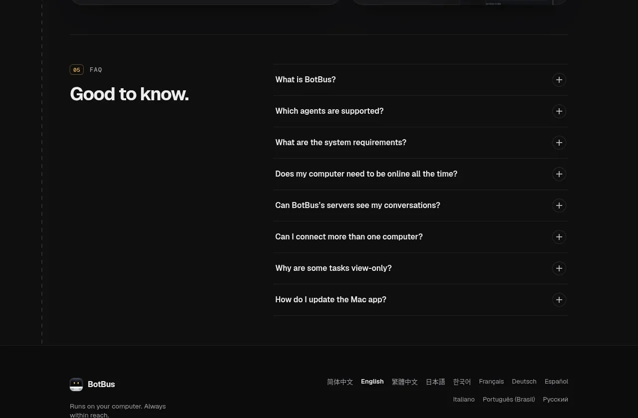 Expandable FAQ
BotBus · FAQ
Expandable FAQ
BotBus · FAQ
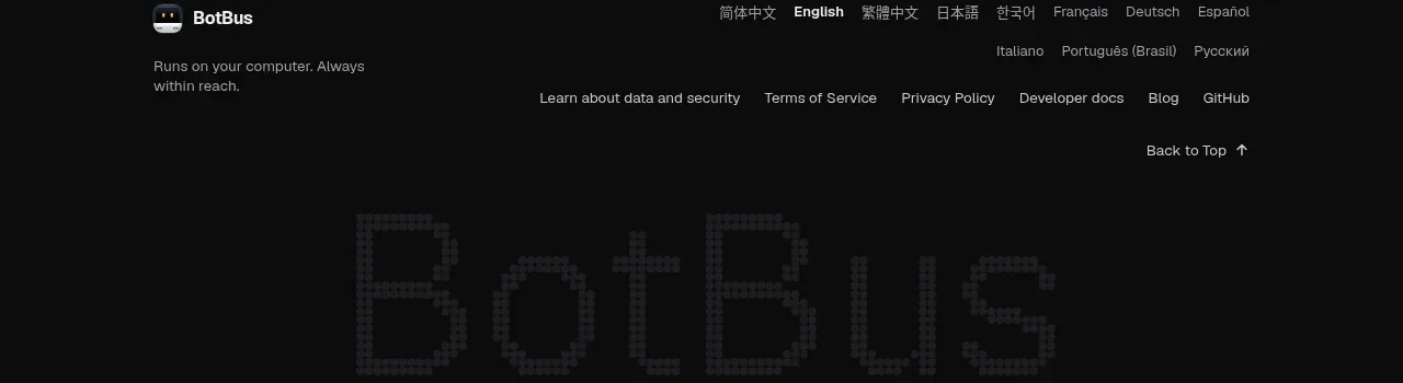 Multilingual product footer
BotBus · Footer
Multilingual product footer
BotBus · Footer