kage
kage
botbus.io

Design analysis
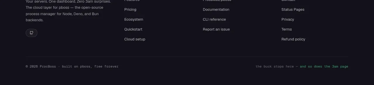
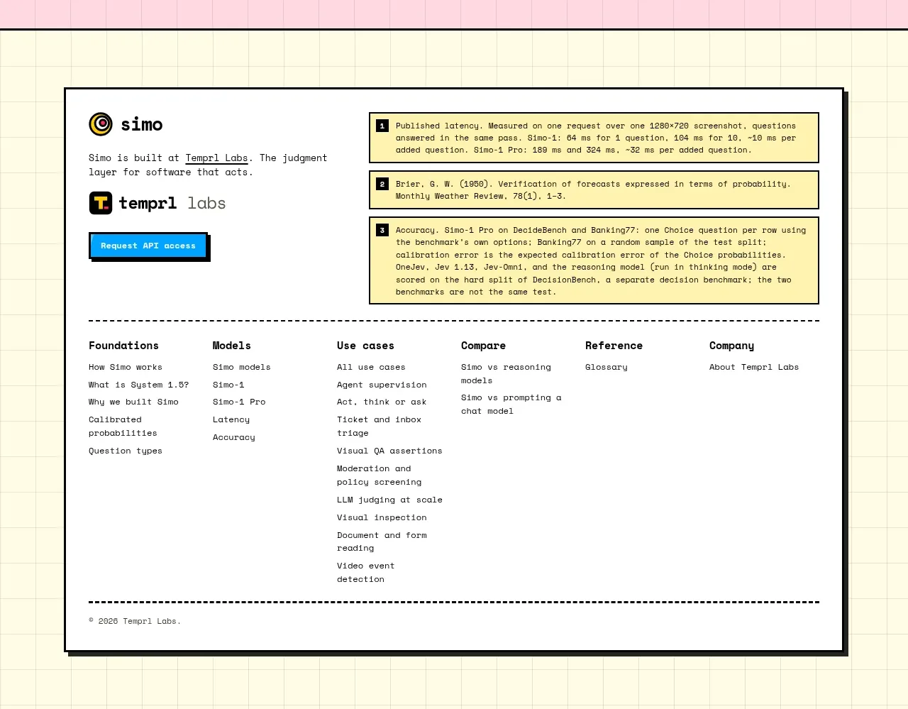
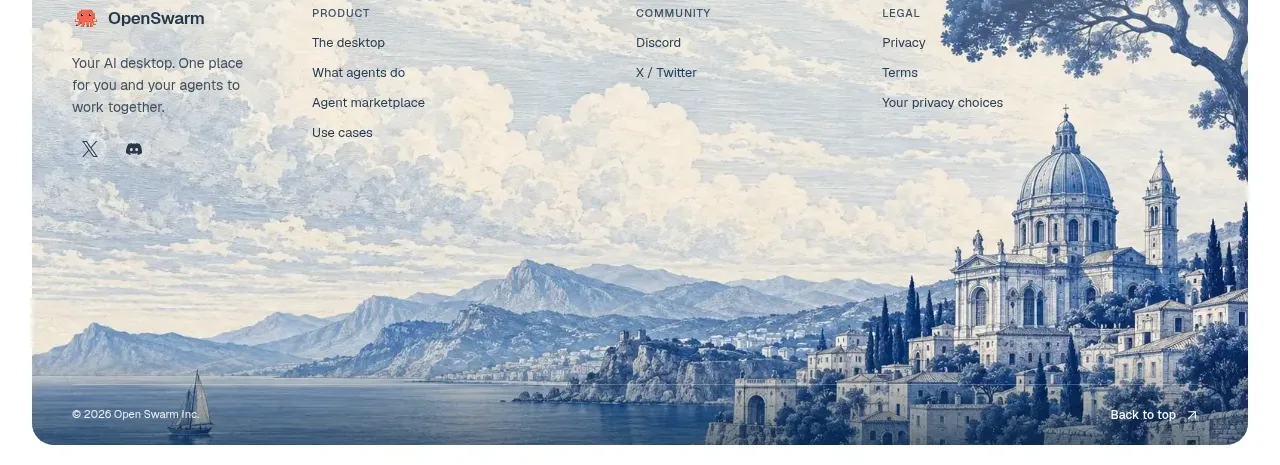
The footer closes the page with a compact brand block, grouped resource/legal links, language choices, a back-to-top affordance, and an oversized low-contrast wordmark treatment.
Prompt preview
## Reference images

Study these alongside the description below: hierarchy, rhythm, spacing, colour. Build for the product you are asked about, using this design language.

- Component: https://kage-design-assets.t3.tigrisfiles.io/components/botbus/3351c24c-0aff-40a1-9a6d-203e8c2d3da7-1791525846-8.webp
- Full page it was cut from: https://kage-design-assets.t3.tigrisfiles.io/screenshots/botbus/3351c24c-0aff-40a1-9a6d-203e8c2d3da7-1791525750475-full.webp
- Component on Kage: https://kage.design/component/botbus-footer

## Before you start
Ask what the user's product and brand are, then apply the principles below to that product rather than reproducing this reference.

Build a spacious dark footer with a thin top rule and a centered max-width container. Put a compact brand block on the left with a small mark, short description, and muted text. On the right, provide a wrapped language selector row and a second row of product, legal, documentation, and social links. Add a clear but understated back-to-top link. Optionally place a huge low-opacity typographic brand treatment behind or below the content, ensuring it remains decorative and accessible. Use #0d0d0d background, #777 secondary text, #dedede active links, 12–14px type, 24–32px gaps, and a warm accent only for hover or selected states. Collapse into stacked groups on mobile.

Never: use logos, product names, copy, illustrations, or imagery from the reference.