 kage
kage
capacity.so
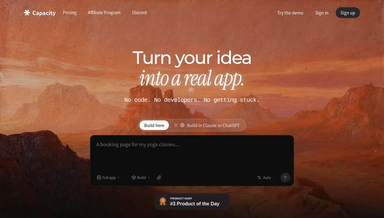
Design analysis
The hero uses a cinematic warm landscape, oversized mixed-style headline, concise promise, segmented build-mode control, prompt composer, and social-proof badge to make the product immediately interactive.
Prompt preview
## Reference images

Study these alongside the description below: hierarchy, rhythm, spacing, colour. Build for the product you are asked about, using this design language.

- Component: https://kage-design-assets.t3.tigrisfiles.io/components/capacity-so/08f2bf80-ea5b-4604-8f5e-193c94acfc56-1791551993-1.webp
- Full page it was cut from: https://kage-design-assets.t3.tigrisfiles.io/screenshots/capacity-so/08f2bf80-ea5b-4604-8f5e-193c94acfc56-1791551914192-full.webp
- Component on Kage: https://kage.design/component/capacity-hero

## Before you start
Ask what the user's product is, what users should accomplish first, and what brand, colors, and tone it should have. Then design this hero around those answers.

Create a full-width, high-impact hero directly beneath the navigation. Use an atmospheric background treatment with a dark gradient overlay for legibility, but choose original imagery or texture appropriate to the user's brand. Center an oversized headline with a clean sans-serif line paired with an italic or display accent line. Place a short supporting statement below, then a compact pill-like mode switcher and a large dark prompt composer with placeholder text, tool/build selectors, attachment affordance, and submit button. Finish with a small credibility badge beneath the composer. Use warm off-white text, muted translucent controls, near-black panels such as #101010, soft borders around #ffffff14, radius 14–18px, and spacing that gives the hero room to breathe. Add focus states, keyboard support, and responsive stacking.

**Never:** use logos, product names, copy, illustrations, or imagery from the reference.
More components
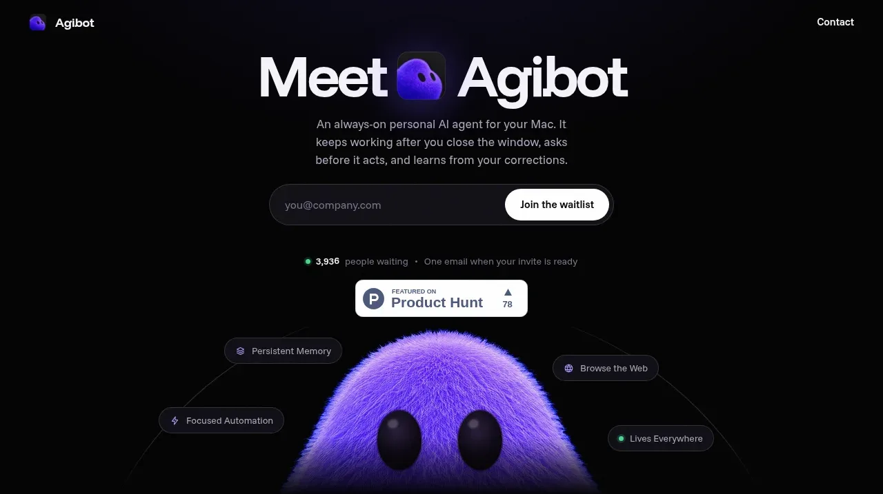
 Waitlist hero with character visual
Agibot · Hero
Waitlist hero with character visual
Agibot · Hero
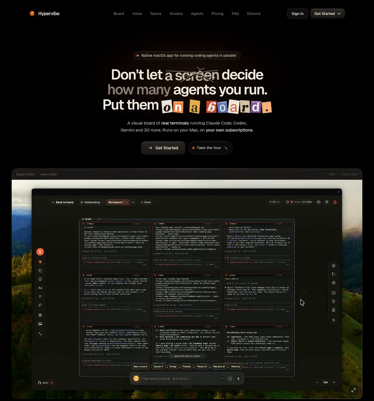
 Hero with product visual
Hypervibe · Hero
Hero with product visual
Hypervibe · Hero
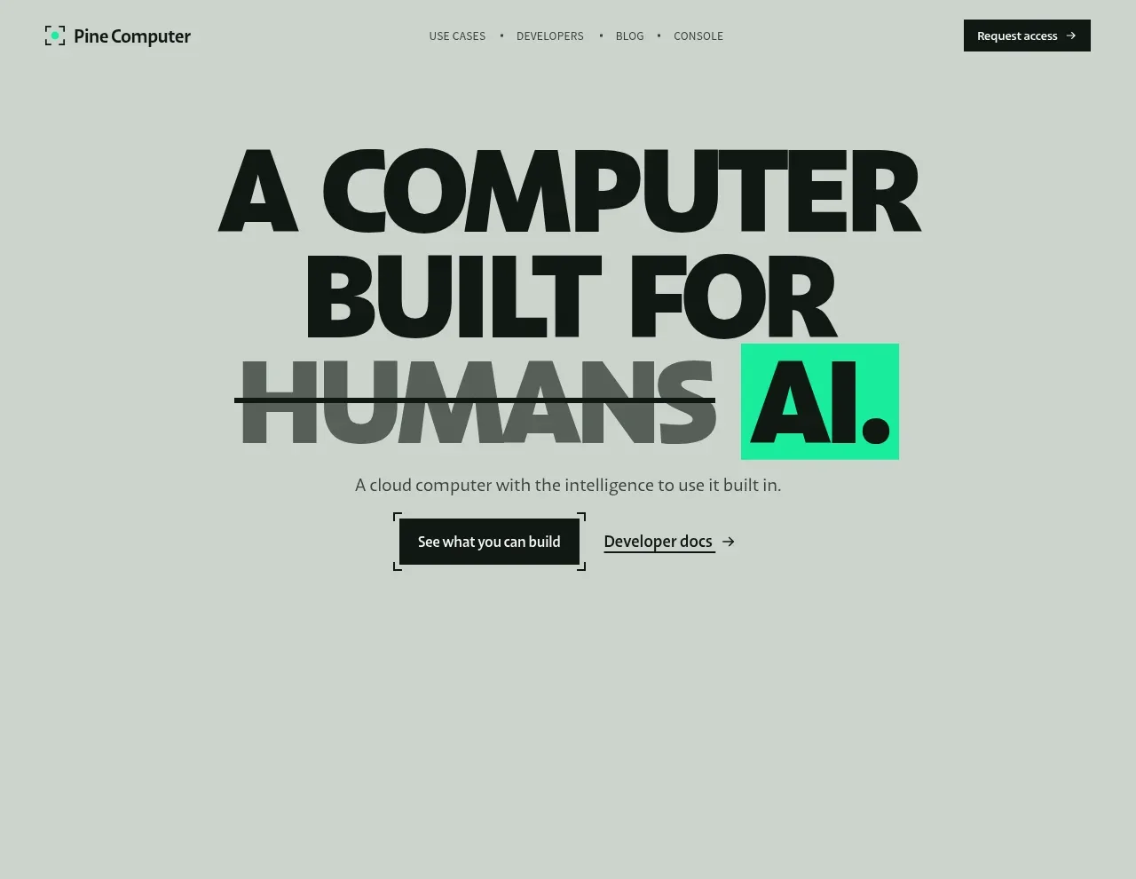
 Oversized human-first hero
Pine Computer · Hero
Oversized human-first hero
Pine Computer · Hero
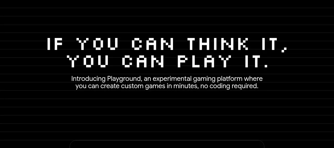
 Introductory product statement
Playground by Google Labs · Hero
Introductory product statement
Playground by Google Labs · Hero
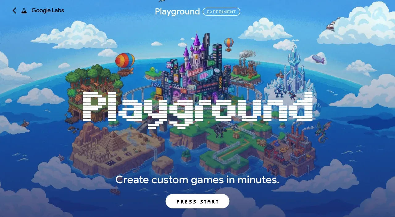 Pixel-art world hero
Playground by Google Labs · Hero
Pixel-art world hero
Playground by Google Labs · Hero
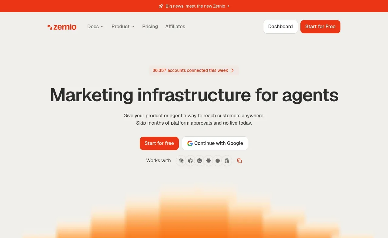
 Marketing infrastructure hero
Zernio · Hero
Marketing infrastructure hero
Zernio · Hero