kage
kage
zernio.link

Design analysis
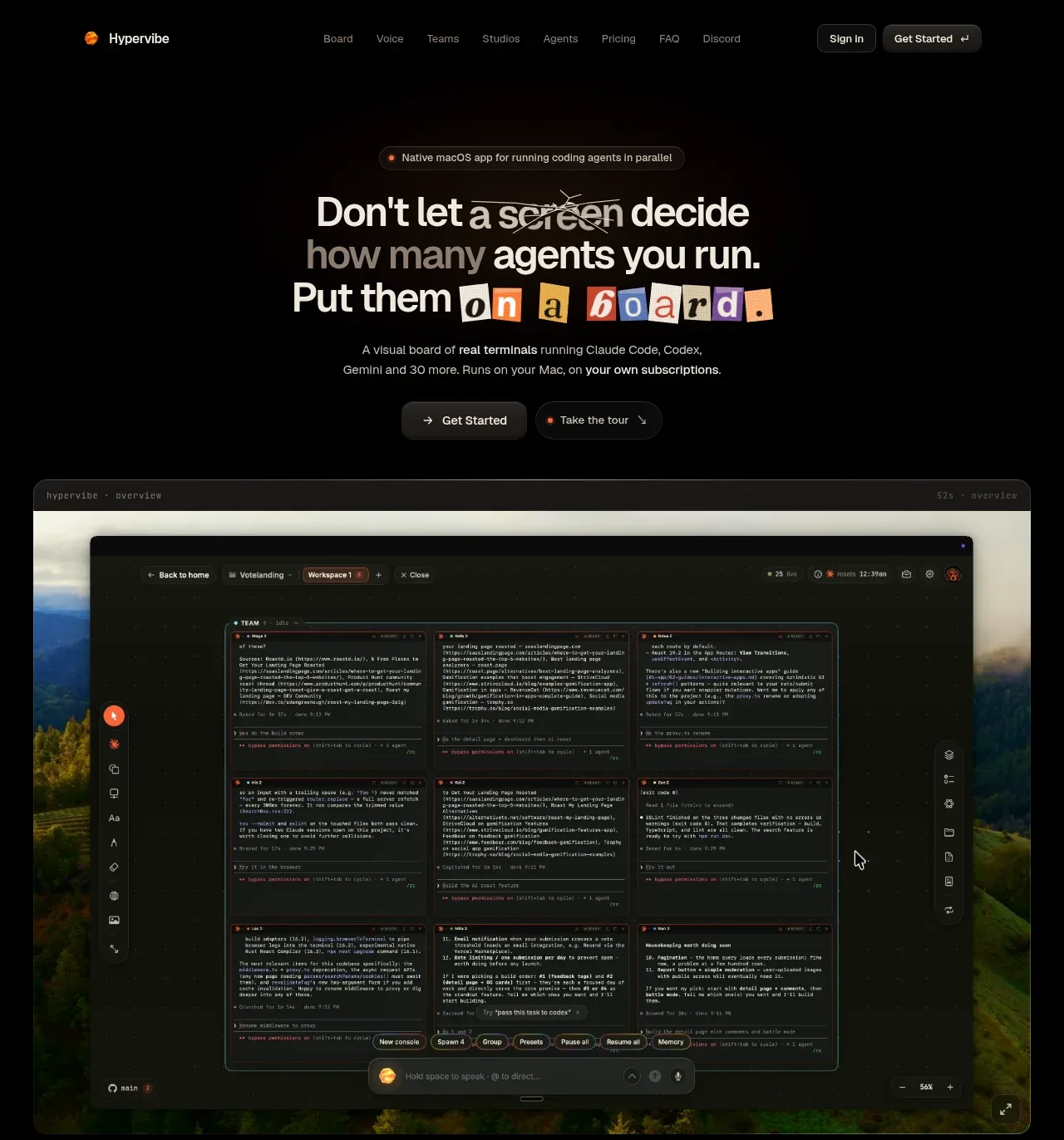
The hero uses a centered eyebrow, oversized one-line headline, concise supporting copy, paired CTAs, trust-platform icons, and a soft orange architectural glow as the visual anchor.
Prompt preview
## Reference images

Study these alongside the description below: hierarchy, rhythm, spacing, colour. Build for the product you are asked about, using this design language.

- Component: https://kage-design-assets.t3.tigrisfiles.io/components/zernio/c501b537-d018-43e7-982b-563c0d4d1135-1791612289-1.webp
- Full page it was cut from: https://kage-design-assets.t3.tigrisfiles.io/screenshots/zernio/c501b537-d018-43e7-982b-563c0d4d1135-1791612175252-full.webp
- Component on Kage: https://kage.design/component/zernio-hero

## Before you start
Ask what the user's product, audience, and brand are, then apply the following principles to that product rather than copying the reference.

Create a centered hero directly below the navigation. Use a small accent-colored eyebrow above a bold, dark headline sized around 38–48px on desktop, followed by two short lines of supporting copy. Add a primary orange-red button beside a white or pale secondary button, then a compact row of “works with” or trust indicators. Reserve substantial vertical whitespace and finish with a wide, abstract, softly blurred orange-red gradient/step visual that rises from the bottom edge; it should feel like a system visualization, not a literal illustration. Use an off-white background around #f5f4f1, dark text around #282725, muted copy around #77746f, and accent #ef4525. Keep all content centered and constrain text to roughly 560px.

Never: use logos, product names, copy, illustrations, or imagery from the reference.