kage
kage
hypervibe.so
Design analysis
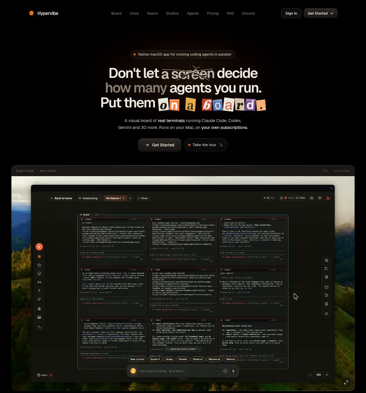
The hero pairs a large editorial headline and two actions with a wide product screenshot, making the product’s central promise immediately legible.
Prompt preview
## Reference images

Study these alongside the description below: hierarchy, rhythm, spacing, colour. Build for the product you are asked about, using this design language.

- Component: https://kage-design-assets.t3.tigrisfiles.io/components/hypervibe/0f025394-2dff-4c9b-be5f-8e394ec4a30f-1791699112-1.webp
- Full page it was cut from: https://kage-design-assets.t3.tigrisfiles.io/screenshots/hypervibe/0f025394-2dff-4c9b-be5f-8e394ec4a30f-1791699070438-full.webp
- Component on Kage: https://kage.design/component/hypervibe-hero

## Before you start
Ask what the user's product does, who the target customer is, and what single action the hero should drive. Ask for the brand colors and visual assets, then apply these rules to that product.

Build a dark, centered hero beneath a compact navigation. Use a small pill-shaped eyebrow, a large 3-line headline with mixed emphasis, and a concise supporting sentence. Put two compact CTAs below the copy: one filled warm accent button and one subtle secondary button. Keep the hero copy centered in a narrow column, with an editorial sans/serif contrast if appropriate, a very dark background (#050505), warm orange-red accent (#ff7547), off-white headline (#f1eee8), and muted gray copy (#8b8985). Add a large rounded product preview below the actions, framed with a thin dark border and soft shadow; it should dominate the lower hero while remaining fully visible. Use 16–24px radius, 1px borders, and responsive scaling. Add reduced-motion behavior for any animated preview.

### Never
- Never use logos, product names, copy, illustrations, or imagery from the reference.
- Never copy the reference headline, screenshot, interface, or exact CTA wording.
- Never add decorative visuals that obscure the product promise.