kage
kage
labs.google
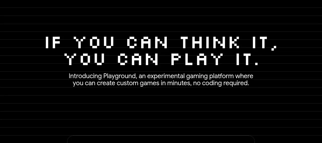
Design analysis
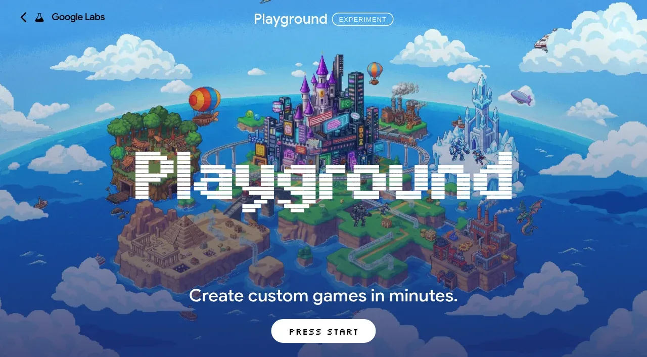
A black, ruled-paper-like content band uses a large centered statement and short explanatory copy to define the product before demonstrating it.
Prompt preview
## Reference images

Study these alongside the description below: hierarchy, rhythm, spacing, colour. Build for the product you are asked about, using this design language.

- Component: https://kage-design-assets.t3.tigrisfiles.io/components/playground-by-google-labs/93d2afab-1def-4986-9178-dd9a071e412b-1791612310-3.webp
- Full page it was cut from: https://kage-design-assets.t3.tigrisfiles.io/screenshots/playground-by-google-labs/93d2afab-1def-4986-9178-dd9a071e412b-1791612198337-full.webp
- Component on Kage: https://kage.design/component/playground-by-google-labs-hero-2

## Before you start
Ask what the user's product does, what belief or promise should introduce it, and what tone the brand uses. Apply the principles below to that product rather than copying the reference.

Design an introductory statement section on a nearly black canvas. Add a subtle horizontal rule texture or grid at low opacity, then center a distinctive headline with a short paragraph beneath it. Give the headline a dramatic display treatment while keeping the body copy at roughly 16–18px and a readable max width of 560–680px. Use generous vertical padding—roughly 96–150px—and center-align the content. Start with #050505 background, #F5F5F5 text, and #8E8E8E rules, then adapt to the user's brand. Keep the texture decorative and never let it compete with text; support reduced motion and responsive type scaling.

Never: use logos, product names, copy, illustrations, or imagery from the reference.