 kage
kage
kugelaudio.com
Design analysis
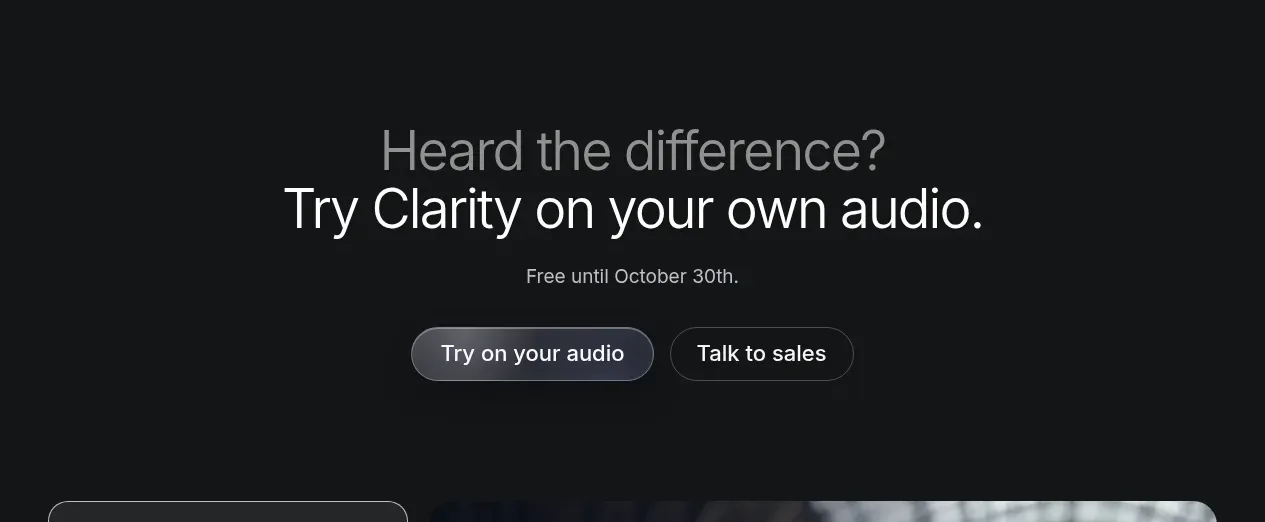
A compact centered CTA follows the demonstration with a two-line invitation, urgency/supporting detail, and paired primary and secondary actions.
Prompt preview
## Reference images

Study these alongside the description below: hierarchy, rhythm, spacing, colour. Build for the product you are asked about, using this design language.

- Component: https://kage-design-assets.t3.tigrisfiles.io/components/clarity/18084f24-bf00-4b1e-9761-c33f370871f3-1790921030-4.webp
- Full page it was cut from: https://kage-design-assets.t3.tigrisfiles.io/screenshots/clarity/18084f24-bf00-4b1e-9761-c33f370871f3-1790920906751-full.webp
- Component on Kage: https://kage.design/component/clarity-cta

## Before you start
Ask what the user's product is, who it serves, and what their brand personality and primary conversion goal are. Apply the following principles to that product rather than reproducing the reference.

Build a centered conversion band on a subtly lighter dark surface. Use a two-line heading where the first line is muted and the second line is bright, followed by one short sentence and two horizontally aligned rounded buttons. Keep the section intentionally sparse with 80–120px vertical padding. Use a large responsive heading around 38–56px, a 14–16px supporting line, and clear button hierarchy: a soft filled gradient primary button and a transparent bordered secondary button. Approximate colours: #151719 background, #b0b4b9 muted heading, #f1f2f3 active heading, #5e6570 primary button, and #2a2e33 border. Stack buttons on mobile and make the primary action visually dominant without using aggressive colour.

Never: use logos, product names, copy, illustrations or imagery from the reference.
More components

 Network growth CTA
godaylight.com · Call to action
Network growth CTA
godaylight.com · Call to action
 Split closing CTA
godaylight.com · Call to action
Split closing CTA
godaylight.com · Call to action

 Closing conversion banner
FastRouter.ai · Call to action
Closing conversion banner
FastRouter.ai · Call to action

 Final download call to action
Blenny · Call to action
Final download call to action
Blenny · Call to action

 Visual download call to action
Art4 · Call to action
Visual download call to action
Art4 · Call to action

 Sponsor call to action
opensend.cc · Call to action
Sponsor call to action
opensend.cc · Call to action