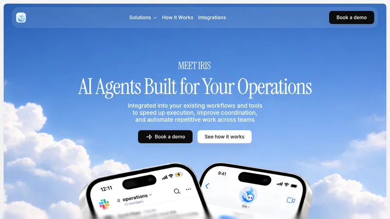
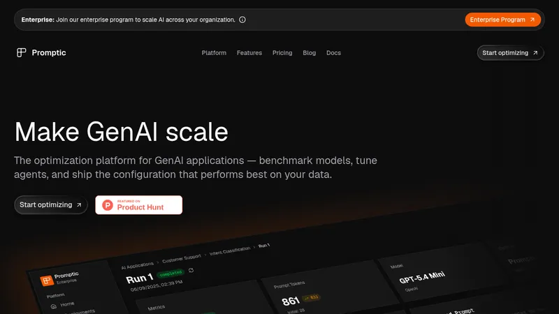
kage
kage

Design analysis
A near-black, almost fully monochrome landing page for a real-time audio AI model, opened by an oversized single-word hero wrapped in fine waveform contour lines. The signature device is the two-line headline where the first line sits dimmed gray and the second lands in white — repeated in the hero, section openers, pricing and final CTA. The page rhythm alternates centred statements with asymmetric two-column sections, a full-bleed cinematic photo carrying an interactive play/toggle audio demo, and dense engineering tables (DNSMOS benchmarks with segmented toggles, bold own-product numbers vs gray competitor numbers) before closing with a two-card pricing grid, a hairline FAQ accordion and an EU/GDPR-signalled footer. Depth comes from subtle surface-tone shifts, 1px low-opacity hairlines and dark photo overlays rather than shadows; the only chroma on the entire page is the small orange waveform mark in the logo.
Prompt preview
## Reference images

Study these alongside the description below: hierarchy, rhythm, spacing, colour. Build for the product you are asked about, using this design language.

- Full page: https://kage-design-assets.t3.tigrisfiles.io/screenshots/clarity/18084f24-bf00-4b1e-9761-c33f370871f3-1790920906751-full.webp
- Above the fold: https://kage-design-assets.t3.tigrisfiles.io/screenshots/clarity/18084f24-bf00-4b1e-9761-c33f370871f3-1790920903475.webp
- Design on Kage: https://kage.design/designs/clarity-landing-page

# Build a dark monochrome AI-product landing page in the style of a premium European audio-AI model site

## Before you start
Ask the user what they are building, who it is for, and what brand assets they already have (name, colours, typeface, logo). Wait for the answers before writing any code. Everything below is a design language to apply to *their* product — do not reproduce the reference product, its name, copy, logo or photography.

## Page structure
Build the page top to bottom with these sections:

1. **Floating pill nav** — a centred, rounded, translucent dark bar holding a small wordmark with a compact mark glyph, two text links, and one filled pill CTA button. It floats over the hero.
2. **Hero** — a huge single-word display headline (the product name) in white, set over a background of fine, topographic/waveform contour lines in near-invisible gray. Below it, a centred two-line sub-headline (first line dimmed), a short 2-line supporting paragraph in gray, and a tiny uppercase "SCROLL" micro-label with a thin vertical rule.
3. **Two-column intro** — left column: a two-line heading ("problem. / promise." pattern, second line dimmed); right column (~2x width): three short paragraphs of plain explanatory body copy in gray. No decoration, pure typographic contrast.
4. **Full-width media panel** — a nearly full-bleed, large-radius rounded dark block for a product demo/video, with visible side margins so it reads as an object on the canvas.
5. **Full-bleed photo demo** — edge-to-edge moody photograph of a person using the product in a noisy environment, darkened with an overlay. Left-aligned overlay content: a two-line headline, a small label, two lines of copy, then an interactive row: a circular play button and a toggle switch labelled to suggest an A/B "before/after" audio demo.
6. **Centred CTA break** — two-line centred headline (first line dimmed), a one-line urgency/pricing hint, and two pill buttons: one light-filled primary, one hairline-outline secondary.
7. **Use-case tabs** — left column: two stacked tab cards, the active one with a visible 1px border and white text, the inactive one dimmed; right: a large rounded photo card with overlaid caption, supporting copy, and a small spec pill (e.g. a latency number in a light capsule followed by an explanatory phrase).
8. **Benchmarks** — heading in the two-line device, then two stacked sub-blocks. Each has: a sub-heading, a small "dataset · metric, higher is better" source note, a segmented pill toggle (two conditions), and a minimal data table: hairline row rules only, metric labels in the first column with tiny subscript codes, the own product's numbers in bold white with its latency noted, competitor columns in dim gray. The second table widens to compare five systems.
9. **Pricing** — two-line headline ("free period. / then the price."), then a two-card grid inside one bordered container: left card the free tier (big price, "until" qualifier, two-line description, primary pill button), right card the usage tier (big per-unit price, VAT micro-note, description, secondary pill button), with a small circular arrow between them. Below: a single-row Enterprise strip (label, two-line description, outline "Talk to sales" button) and a one-line legal/VAT fine print.
10. **FAQ** — left column: a short "Good to know." heading; right column: five to six accordion rows separated by hairlines, each a question in medium-weight white with a chevron on the right.
11. **Final CTA** — centred two-line headline, a one-line pricing recap containing an underlined inline "See pricing" link, and the same two pill buttons as the earlier CTA break.
12. **Footer** — left brand block: logo with a small warm waveform mark, a one-line positioning statement, physical address, and a compliance badge (circular flag icon + label). Right: four link columns (Product / Resources / Company / Legal). Below: a row of supported languages and a row of comparison links, then a single copyright line with "Built in [country]".

## Design language
- **Canvas**: near-black page background (#0a0a0a–#111214). Data and pricing sections sit on a slightly lighter surface (#141416–#17181a) inside large-radius containers, so sections change tone instead of colour. Use wide side margins (~5–8vw) and a single content max-width.
- **Colour discipline**: the page is monochrome. White #ffffff for primary text and winning numbers; gray #8b8d91 for secondary copy, inactive states and competitor data; hairline borders at rgba(255,255,255,0.08–0.12). Allow exactly one warm accent colour (e.g. #e6a23c) used *only* in the logo mark and compliance badge — never in buttons, links or headings. Warmth comes from photography, not UI colour.
- **Headline device**: reuse the two-line pattern throughout — line 1 in ~55–65% gray, line 2 in white, same size, tight leading. Display sizes 72–120px with slightly negative letter-spacing; one neo-grotesque sans family for everything; body copy 15–17px gray at 1.6 line height; micro-labels uppercase, ~11px, letterspaced; tiny subscript annotations (metric codes, units) set at ~10px gray next to labels.
- **Rhythm**: never repeat the same layout twice in a row. Alternate centred statements → asymmetric two-column text → full-width media → full-bleed photo → centred CTA → tabbed feature → dense data → card grid → split FAQ → centred close → footer. Vertical padding between sections is generous, ~120–160px, but data sections tighten up to signal density.
- **Components**: fully-rounded pill buttons — primary is light gray/white fill with near-black text, secondary is transparent with a 1px white/20% border and white text; circular icon buttons for play; toggle switches and segmented two-option pill toggles for interactive comparisons; spec pills (small light capsule + dim explanatory text) for numbers like latency; media and photo cards with 16–24px radius.
- **Tables**: hairline horizontal rules only, no zebra striping, no vertical lines; own-product column values bold white, competitors dim; caption the dataset and metric above each table and add a segmented toggle so conditions can be flipped.
- **Depth & imagery**: no drop shadows anywhere — hierarchy comes from surface tone, hairlines and scale. Photography is cinematic, dark, real-environment, always with a dark gradient overlay so white text stays legible; photos should show real people in the noisy contexts the product fixes.
- **Motion**: subtle only — fade/slide reveals on scroll, an animated scroll cue, functional toggles and accordion expand; nothing bouncy or decorative.
- **Trust texture**: sprinkle engineering credibility — real metric names with dataset captions, concrete latency figures, VAT/legal fine print, physical address, compliance badge, "built in [country]" line.

## Never
- Never use the reference product's name ("Clarity"), the company name or wordmark, the waveform logo, or any of its copy ("Remove the noise. Keep the voice.", "Mute the room, keep the speaker", "Clear calls in the café", etc.).
- Never reuse the café or train-station photographs, or any stock photo resembling them — source or commission imagery fitting the user's own domain.
- Never introduce accent colours beyond the single logo accent; keep buttons, links, tables and headings monochrome.
- Never invent fake benchmark numbers presented as third-party comparisons — if the user has no data, use clearly placeholder values and keep the table structure.
- Never present the result as the reference product or imply any affiliation with it.
Components from this page
All components
 Floating product navigation
Clarity · Navigation
Floating product navigation
Clarity · Navigation
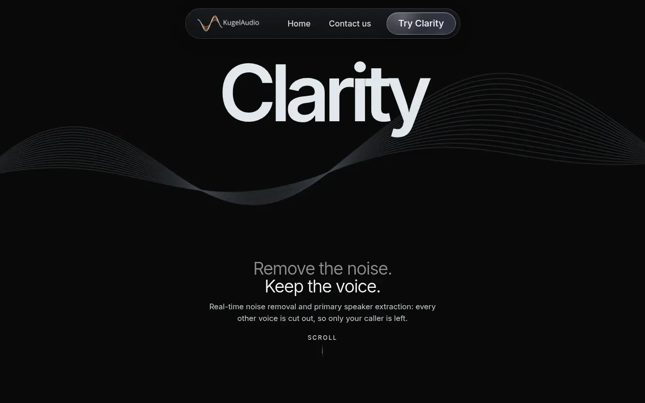 Noise-removal hero
Clarity · Hero
Noise-removal hero
Clarity · Hero
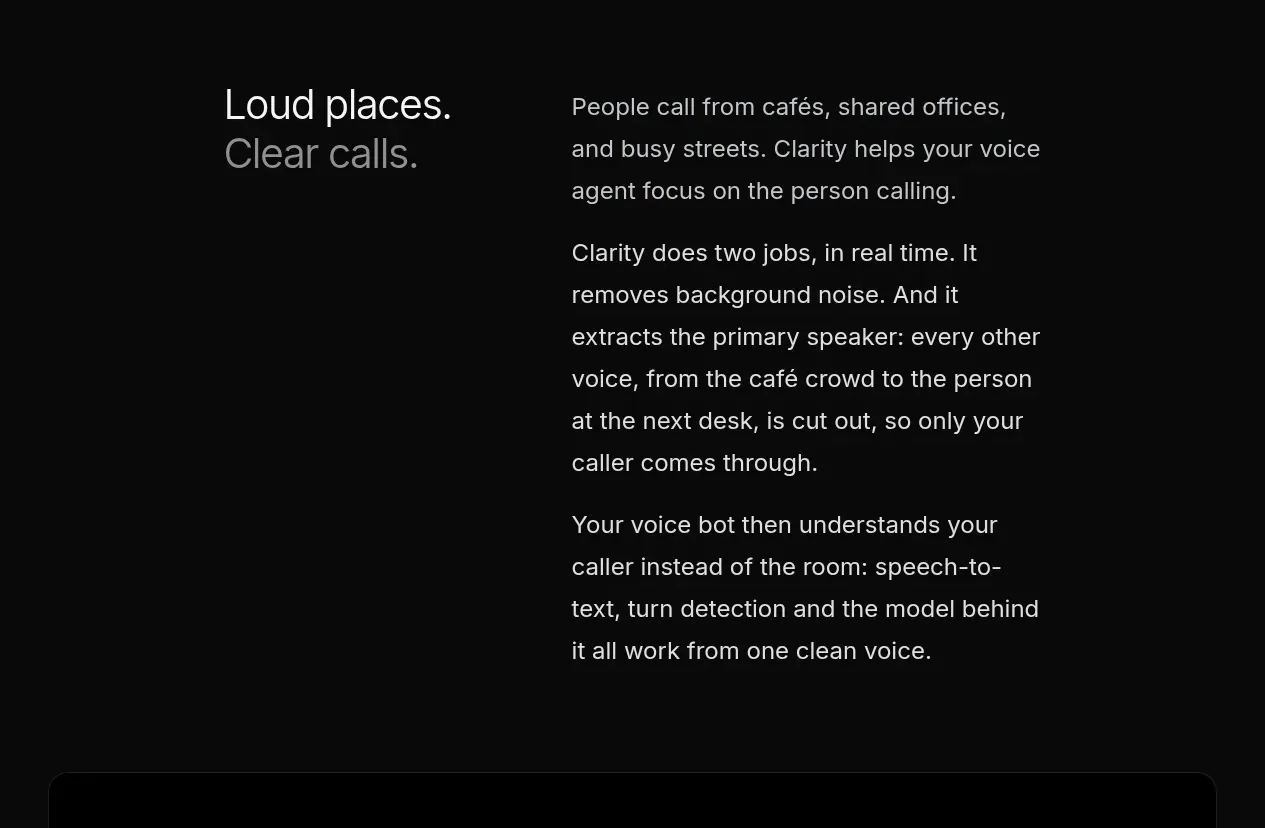 Problem and mechanism introduction
Clarity · Feature grid
Problem and mechanism introduction
Clarity · Feature grid
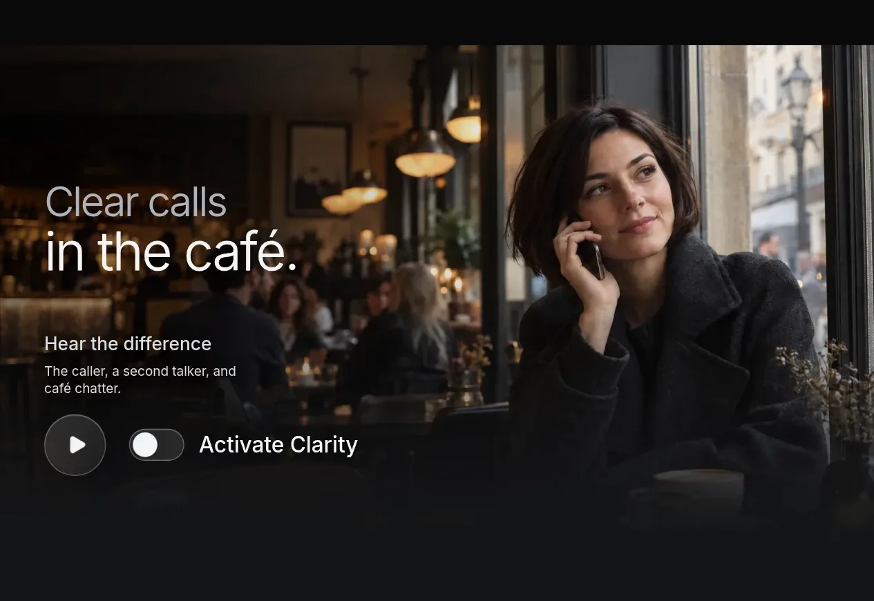 Contextual audio demonstration
Clarity · Gallery
Contextual audio demonstration
Clarity · Gallery
 Try the product invitation
Clarity · Call to action
Try the product invitation
Clarity · Call to action
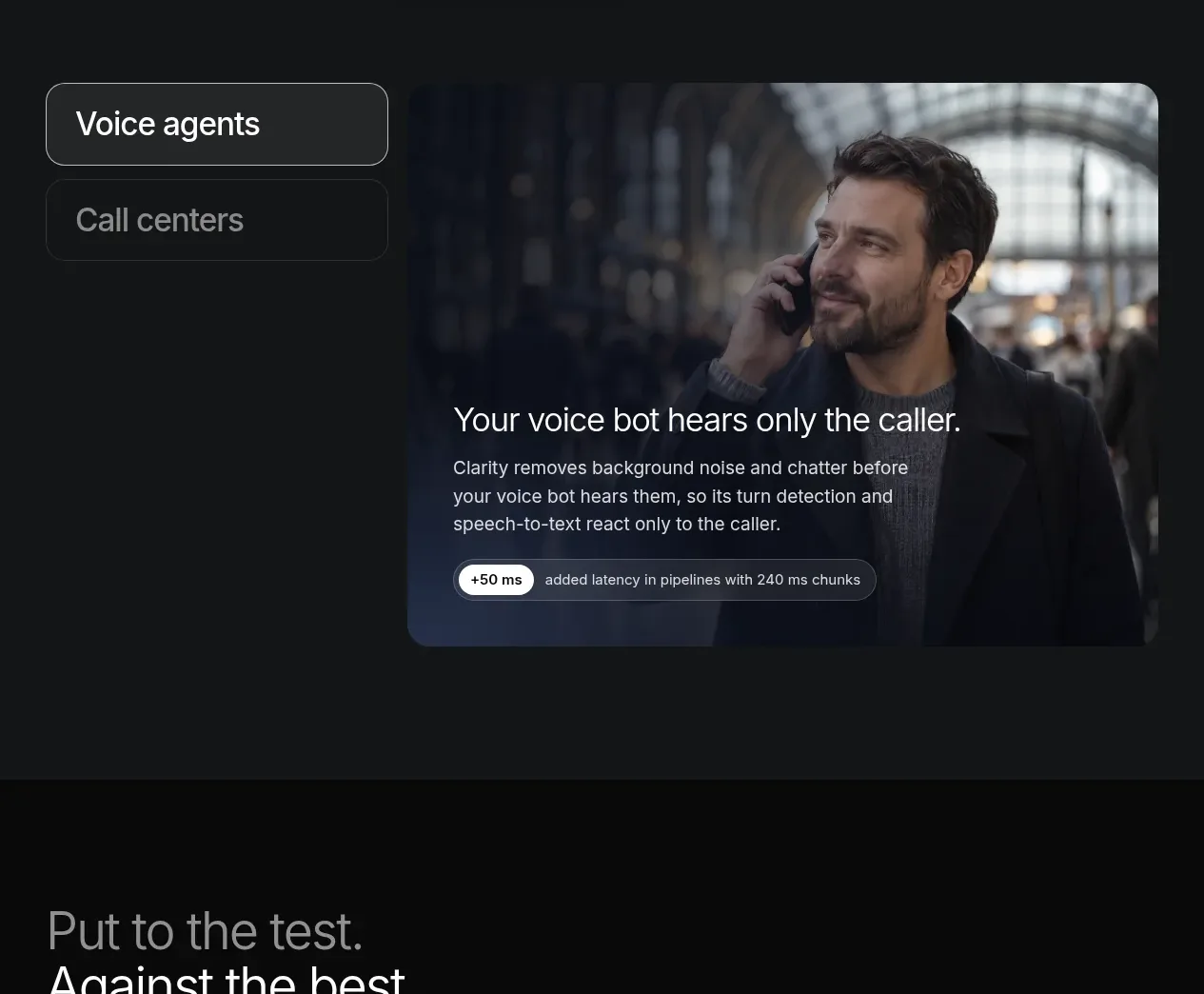 Use-case media tabs
Clarity · Tabs & steps
Use-case media tabs
Clarity · Tabs & steps
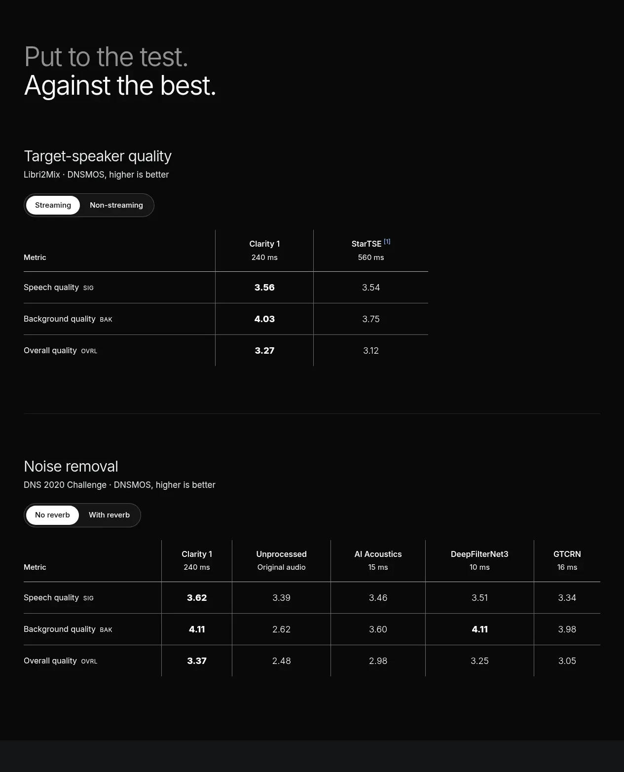 Benchmark comparison tables
Clarity · Table
Benchmark comparison tables
Clarity · Table
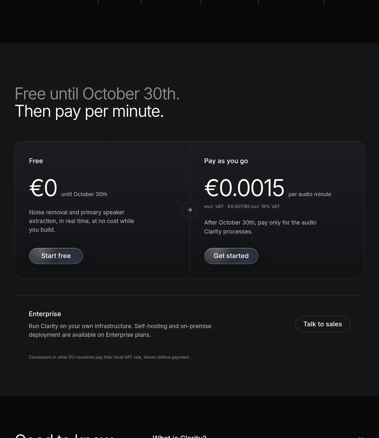 Usage-based pricing
Clarity · Pricing table
Usage-based pricing
Clarity · Pricing table
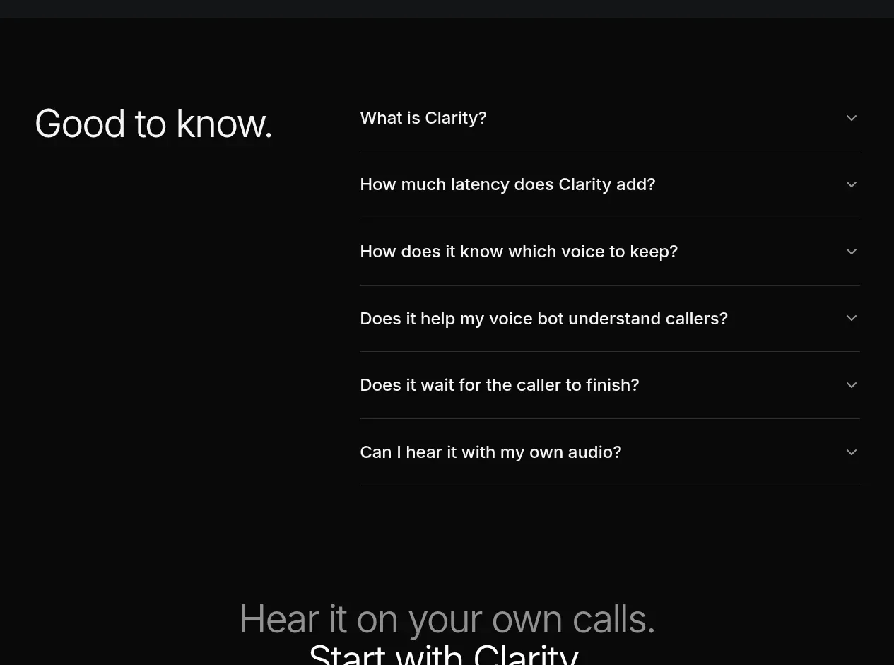 Product FAQ
Clarity · FAQ
Product FAQ
Clarity · FAQ
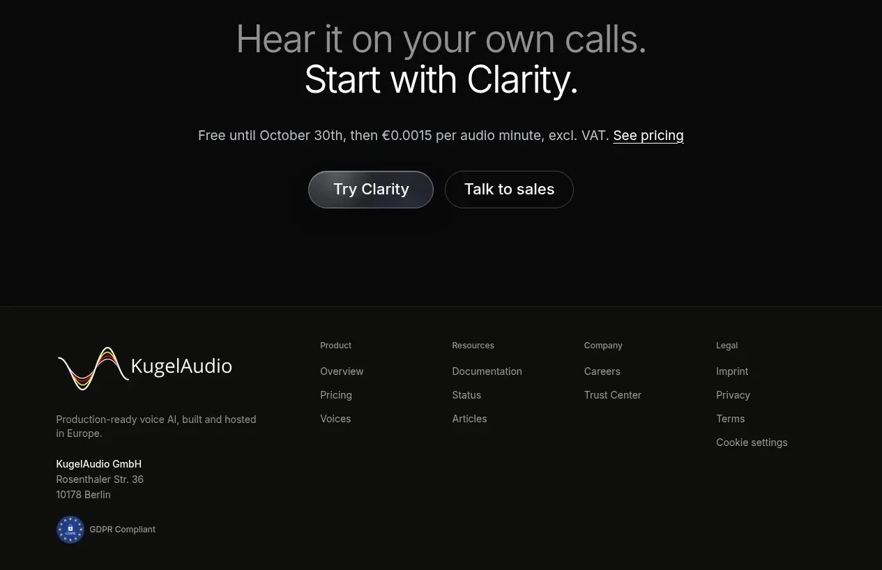 Final conversion CTA
Clarity · Call to action
Final conversion CTA
Clarity · Call to action
 Multi-column company footer
Clarity · Footer
Multi-column company footer
Clarity · Footer