kage
kage
kugelaudio.com
Design analysis
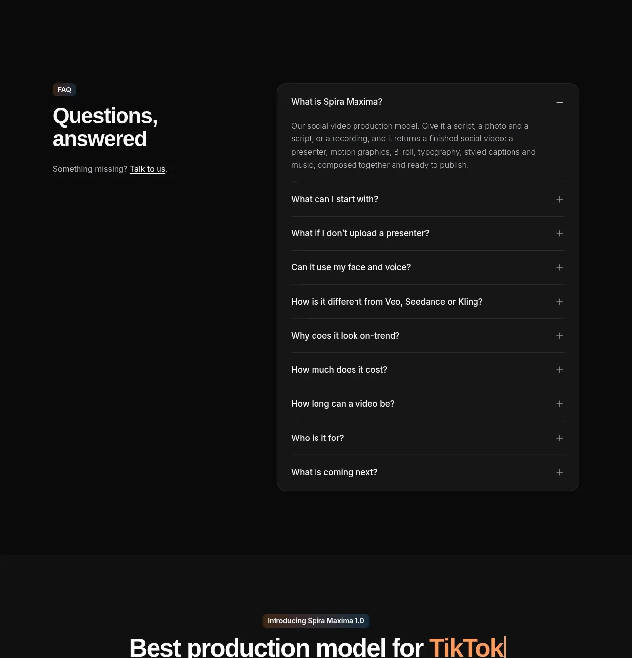
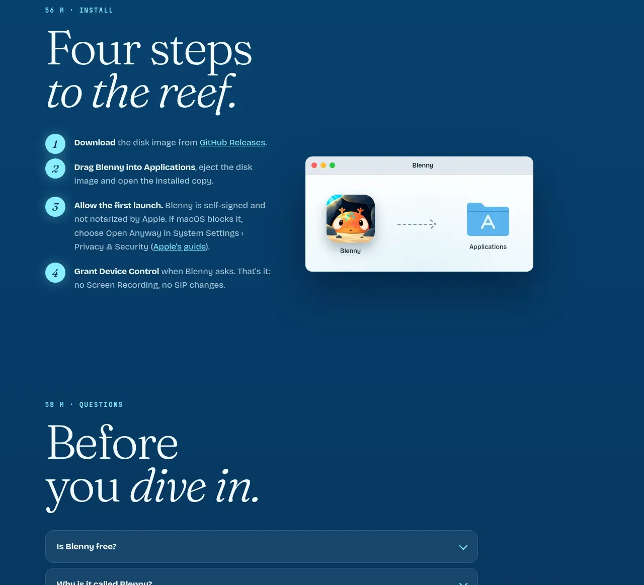
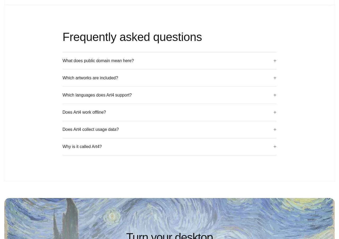
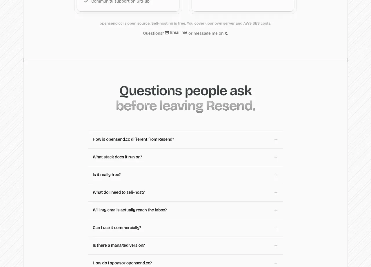
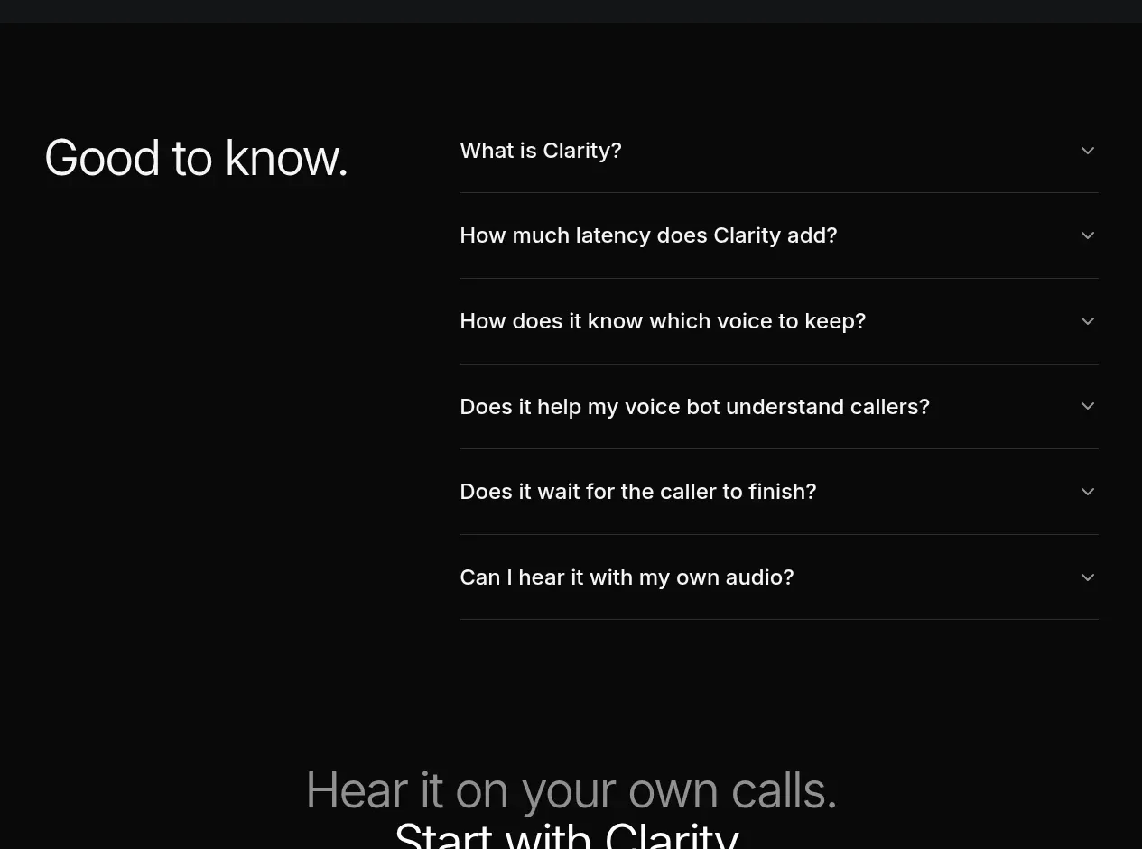
A quiet FAQ uses a strong left-side heading and a disciplined accordion list on the right, keeping each question easy to scan.
Prompt preview
## Reference images

Study these alongside the description below: hierarchy, rhythm, spacing, colour. Build for the product you are asked about, using this design language.

- Component: https://kage-design-assets.t3.tigrisfiles.io/components/clarity/18084f24-bf00-4b1e-9761-c33f370871f3-1790921031-8.webp
- Full page it was cut from: https://kage-design-assets.t3.tigrisfiles.io/screenshots/clarity/18084f24-bf00-4b1e-9761-c33f370871f3-1790920906751-full.webp
- Component on Kage: https://kage.design/component/clarity-faq

## Before you start
Ask what the user's product is, who it serves, and what their brand personality and primary conversion goal are. Apply the following principles to that product rather than reproducing the reference.

Build a dark FAQ section with a two-column layout: a large heading on the left and a vertical accordion list on the right. Each question should occupy a generous row with a thin bottom rule and a chevron aligned to the far right. Use 28–44px heading type, 16–18px question type, and 28–36px row padding. Keep the list width readable and let expanded answers animate height and opacity without shifting the entire page excessively. Use #080909 background, #edf0f2 questions, #8d9399 collapsed chevrons, and #282c31 dividers. Make each item a real button with aria-expanded and an associated answer region; allow multiple or single expansion according to the product's support strategy. Stack the heading above the list on mobile.

Never: use logos, product names, copy, illustrations or imagery from the reference.