kage
kage
kugelaudio.com

Design analysis
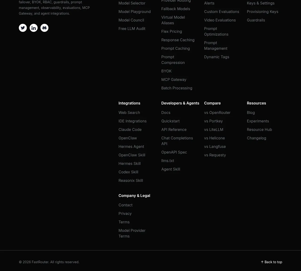
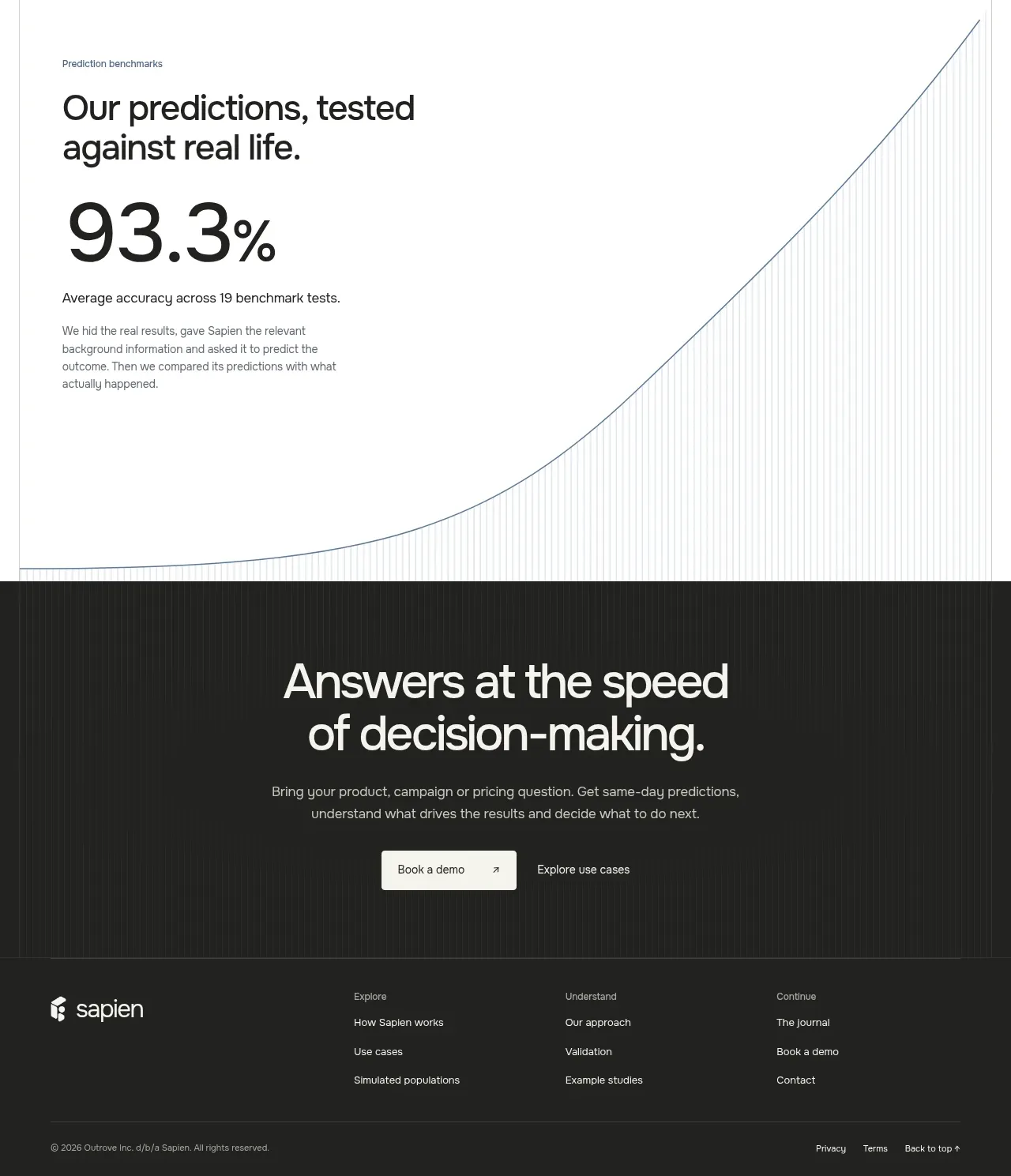
The footer closes with brand/company information, grouped navigation links, compliance details, language links, and a restrained copyright line.
Prompt preview
## Reference images

Study these alongside the description below: hierarchy, rhythm, spacing, colour. Build for the product you are asked about, using this design language.

- Component: https://kage-design-assets.t3.tigrisfiles.io/components/clarity/18084f24-bf00-4b1e-9761-c33f370871f3-1790921032-10.webp
- Full page it was cut from: https://kage-design-assets.t3.tigrisfiles.io/screenshots/clarity/18084f24-bf00-4b1e-9761-c33f370871f3-1790920906751-full.webp
- Component on Kage: https://kage.design/component/clarity-footer

## Before you start
Ask what the user's product is, who it serves, and what their brand personality and primary conversion goal are. Apply the following principles to that product rather than reproducing the reference.

Build a dark multi-column footer with a subtle top border. Put the brand area and short descriptor on the left, grouped link columns in the middle and right, and a lower utility row for compliance, languages, legal links, and copyright. Use a small, quiet typographic scale: 13–14px group headings, 12–13px links, and 11–12px legal metadata. Keep the grid aligned to a consistent max-width and use generous horizontal gaps with 48–72px top padding. Approximate colours: #0d0f0f background, #d9dcdf brand text, #8c9298 links, #535960 rules, and #6f757b metadata. Include visible keyboard focus, sufficient contrast, and a responsive collapse into stacked groups on small screens. Use the user's own brand mark only when provided.

Never: use logos, product names, copy, illustrations or imagery from the reference.