kage
kage
kugelaudio.com
Design analysis
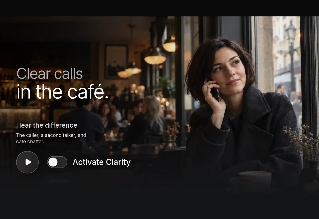
A large immersive media panel demonstrates the product in a believable noisy environment, with overlaid explanatory text and a prominent play/activation control.
Prompt preview
## Reference images

Study these alongside the description below: hierarchy, rhythm, spacing, colour. Build for the product you are asked about, using this design language.

- Component: https://kage-design-assets.t3.tigrisfiles.io/components/clarity/18084f24-bf00-4b1e-9761-c33f370871f3-1790921030-3.webp
- Full page it was cut from: https://kage-design-assets.t3.tigrisfiles.io/screenshots/clarity/18084f24-bf00-4b1e-9761-c33f370871f3-1790920906751-full.webp
- Component on Kage: https://kage.design/component/clarity-gallery

## Before you start
Ask what the user's product is, who it serves, and what their brand personality and primary conversion goal are. Apply the following principles to that product rather than reproducing the reference.

Create an immersive demonstration panel with a large landscape media area and rounded corners, using an original product-relevant video or image supplied by the user. Add a dark gradient overlay so white text remains readable. Position a large two-line contextual headline toward the lower-left, followed by a short explanation and an interaction row containing a circular play button, a toggle or state control, and a clear action label. Use 24–52px responsive headline type, 15–18px supporting copy, and generous inset padding around 48px on desktop. The media should feel edge-to-edge inside a max-width container with a 16–24px radius. Use #101214 overlays, #f3f4f5 text, #aeb3b8 secondary text, and #d7dbe0 controls. Make play, toggle, and keyboard focus states obvious; provide captions or accessible alternative text.

Never: use logos, product names, copy, illustrations or imagery from the reference.