kage
kage
cloudflare.com
Design analysis
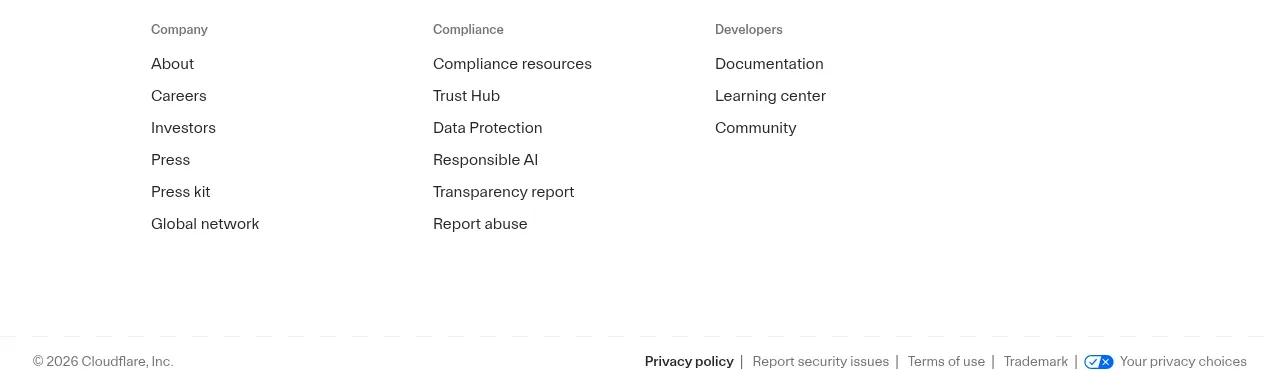
The footer organizes a broad set of site links into labeled columns, with a wordmark area above a compact legal and privacy bar.
Prompt preview
## Reference images

Study these alongside the description below: hierarchy, rhythm, spacing, colour. Build for the product you are asked about, using this design language.

- Component: https://kage-design-assets.t3.tigrisfiles.io/components/cloudflare-com/1ca6ff30-a094-43e2-8124-fd26c9356e55-1789213792-8.webp
- Full page it was cut from: https://kage-design-assets.t3.tigrisfiles.io/screenshots/cloudflare-com/1ca6ff30-a094-43e2-8124-fd26c9356e55-1789213761908-full.webp
- Component on Kage: https://kage.design/component/cloudflare-footer

## Before you start
Ask what pages, support resources, legal links, social channels, and regional requirements the user's product needs. Apply the organization principles below.

Build a responsive footer on white or a very light neutral background. Start with a brand area, then organize links into 3–5 labeled columns such as product, resources, company, developers, and compliance. Use 13–14px link text, 12px muted section labels, 8–12px vertical spacing, and ample horizontal gutters. End with a thin divider and a compact legal row containing copyright, privacy, terms, accessibility, and preference controls. On mobile, collapse columns into accessible accordions; preserve visible legal links and keyboard navigation. Use near-black text (`#202020`) and muted gray (`#6b6b6b`) with clear hover and focus states.

### Never
- Never use logos, product names, copy, illustrations, or imagery from the reference.
- Never omit privacy, terms, or accessibility affordances when they are required.
- Never create a wall of ungrouped links.